data-viz-workshop-2021
There is no ideal way
Is there an ideal way to visualize a data set? No.
It depends on:
- the type of data you have, e.g., table, network, spatial, and temporal
- context of the data
- tasks your want to perform, e.g., identify trends, compare values
- questions you want to answer
- messages you want to deliver
1. Aspect ratio
The ratio between the width and the height of a rectangle is called its aspect ratio. It is the ‘width’ divided by the ‘height’. An aspect ratio of 1:1 describes a square, while 4:3 (or 1.33:1) is a landscape rectangle, and 16:9 is a much wider landscape rectangle. While the width is usually larger than the height in film and photography, there is no reason this is the case in other applications like charts.
A wrong aspect ratio is usually easy to detect in a photograph because the image appears stretched or squished.

But, in a chart, you will see that things aren’t nearly as noticeable.
When applied to visualization, the aspect ratio describes the area occupied by the data in the chart, even if the overall chart area might be larger. A change in aspect ratio means a difference in the angle of the lines, etc.
The graphic below shows the world population growth over the years. The world population is growing exponentially (roughly), and this plot displays so.

Here is the same plot with width-height ratio decreased, i.e., a smaller aspect ratio. In this plot, it seems that the world population is increasing factorially, which is even faster than exponential.

And, here is the same plot with width-height ratio increased, i.e., a larger aspect ratio. In this plot, it seems that the world population is growing almost linearly.

As you can see, the wider the aspect ratio, the flatter the perceived slope, and the taller the aspect ratio, the steeper the perceived slope.
So, what is the correct aspect ratio for a chart?
2. Banking to 45 degrees
In a 1988 paper, Bill Cleveland’s group proposed that the average line slope in a line chart should be 45°. This has been dubbed banking to 45° and has turned into one of the common wisdom in visualization to determine the ideal aspect ratio.
For your plot, choose an aspect ratio such that the slopes of the plot’s line segments are around 45°.
The figure below shows the space of line comparisons parameterized by mid-angle and slope ratio. The middlemost column (45°) is what we should aim for when drawing our plots. Source: An empirical model.

But ultimately, it comes down to the message you want to deliver. Truth matters the most, after all.
3. Scales
Baseline (start with a zero nor not) is a factor to consider when designing charts.
Another factor to consider is the X-axis (horizontal) and the Y-axis (vertical) scale.
Consider the two charts below that plot the company profit per month, in two different scales:

So, which of the two plots above is the correct way to plot the profit?
Here is another example containing a bar chart and a lollipop chart.

Bar charts, lollipop charts, histograms, and their variants should have a 0-baseline—unless you want to increase the chances of misunderstanding (which some people do, unfortunately!). - Alberto Cairo.
With a 0-baseline, if the length of all the bars is too long, use a dot plot instead.
But, sometimes, the strict practice of the 0-baseline rule may backfire.
Here is an example.

This should not be plotted with the 0-baseline:

Here is another example.

This should also not be plotted with the 0-baseline:

We can derive a flexible and straightforward rule from these observations. Rather than trying to include a 0-baseline in all your charts invariably, use logical and meaningful baselines instead.
4. Multi-scale plotting
A challenging situation appears when comparing widely different variables. In the first row of the chart below, a few data points are so large that they make the smaller ones almost impossible to tell apart. What to do? First, think of the purpose of these charts: is it to highlight the largest values over the bulk of little ones? If that’s what you need, leave the charts as they are (only the first row). But what if you want readers to be able to see both the large and the small values clearly? You’ll need at least two charts, each with its scale, as shown in the second row of the same figure.

If your data vary so much that presenting them all on a single chart renders it useless, plot your data in several charts with dissimilar scales. If only a few values are large, you can use a logarithmic scale.
5. Radar, bar, or parallel coordinate chart
The three radar charts below display the metrics of three basketball players (artificial data). These charts are OK if all we need is a general and quick picture of the strengths and weaknesses of the players, and this plot may be marginally valuable to get the big picture.

If we display the data on a bar chart, it is much easier to compare players.

Next, we display the same data using a parallel coordinates chart. This graphic may be helpful to spot relationships between variables. For instance, it lets us see that there is a correlation between assists and rebounds. All these analysis can be performed with the radar charts, but it takes more effort: if you want to compare the performance of the three athletes in one metric, your eyes need to hop from radar chart to radar chart.

In general, many suggest using the parallel coordinates chart over the radar chart.
But, radar charts help us see the overlapping area between the items being compared almost in no time. For example, in the following radar chart, Ford overlaps more with Peugeot, suggesting that the two are more similar.

6. Visualize two quantities
Say, I ask you to create three sketches to visualize the following two quantities. How will you plot them?

The most likely results are:

Here are some 45 ways communicate two quantities. Which is the best and why?
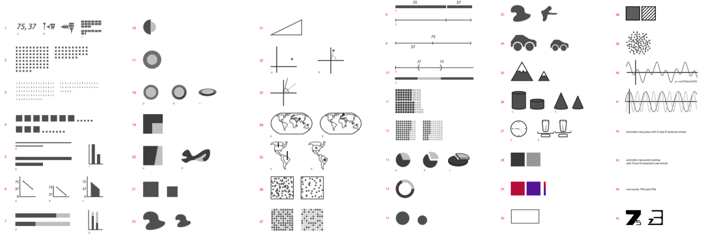
There are numerous ways to draw even just two numbers … is there an ideal way to visualize a data set? There isn’t.
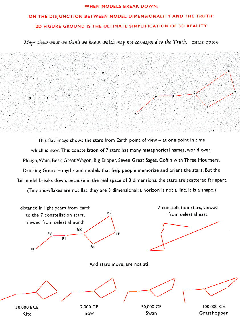
7. 2D figure is the ultimate simplification of 3D+ reality