data-viz-workshop-2021
Visualizations should be naked
Generally, when we create a visualization, we fantasize about introducing more colors, facts, images, etc. They sometimes look good and can be memorable, but it leads to visual clutter most of the time, making our work loath by the audience.
We are so familiar with images that we neglect the text accompanying the photos. Instagram gained its popularity in a short interval of time – the power of images.
As people won’t read through the text, our graphs have to be self-explanatory and can’t be open to others’ interpretations. They shouldn’t detract from the information with bright colors and bold fonts, with a high cognitive load on the user.
Thus, a naked visualization is a better option.
1. How can we make our visualization naked?
To make visualizations naked, there is an interesting graphical heuristic named, data-ink ratio. Data-Ink is defined as the “non-erasable core of the graphic.” The data-ink ratio is the portion of ink (i.e., pixels) that makes up data information on the view.
Data-ink is the non-erasable core of a graphic, the non-redundant ink arranged in response to variation in the numbers represented. It is the ink on a graph that represents the data.
Data-ink ratio is the amount of “data”-ink divided by the total ink required to print the graphic.
Remove the elements that don’t add new information to the graphic, i.e., using less ink (chart elements) is more effective, attractive, and imperative for viewers.
1. Above all else, show data
Induce the viewer to think about the substance rather than methodology, graphic design, the technology of visual production, or something else.
2. Maximize the data-ink ratio
To make the data-ink ratio high, most of the pixels/ink (non-background colors) in your graphic should be busy showing the ‘data.’
3. Erase non-data ink
How to erase non-data ink?
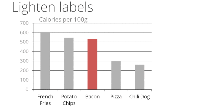
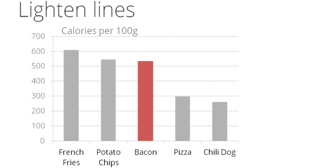
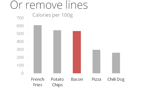
If your graphic has heavy grids, remove them.
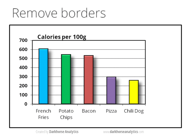
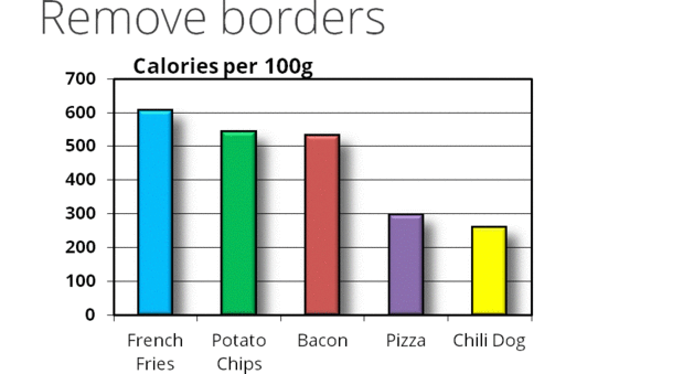
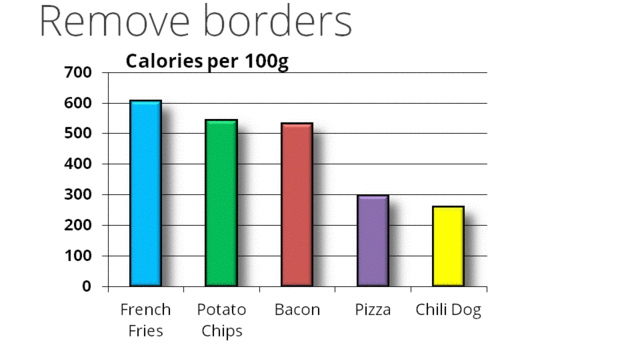
If your graphic is enclosed, consider removing the enclosing on the sides. They may not be necessary.
Prune graphics by replacing bars with single lines, erasing non-data ink, eliminating lines from axes, and starting x/y axes at the data values.
Avoid over busy grids, excess ticks, redundant representation of simple data, boxes, shadows, pointers, legends.
Every bit of ink on a graphic requires a reason.
4. Revise and edit.
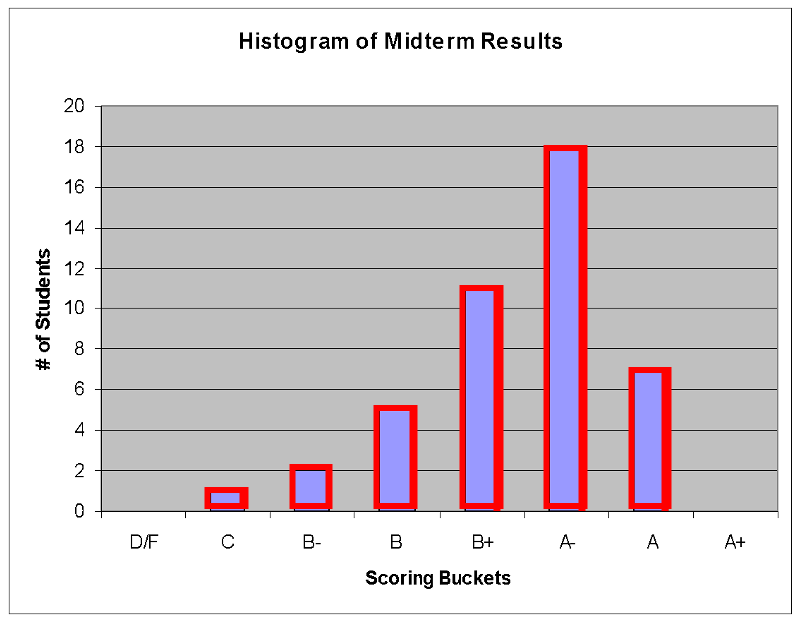
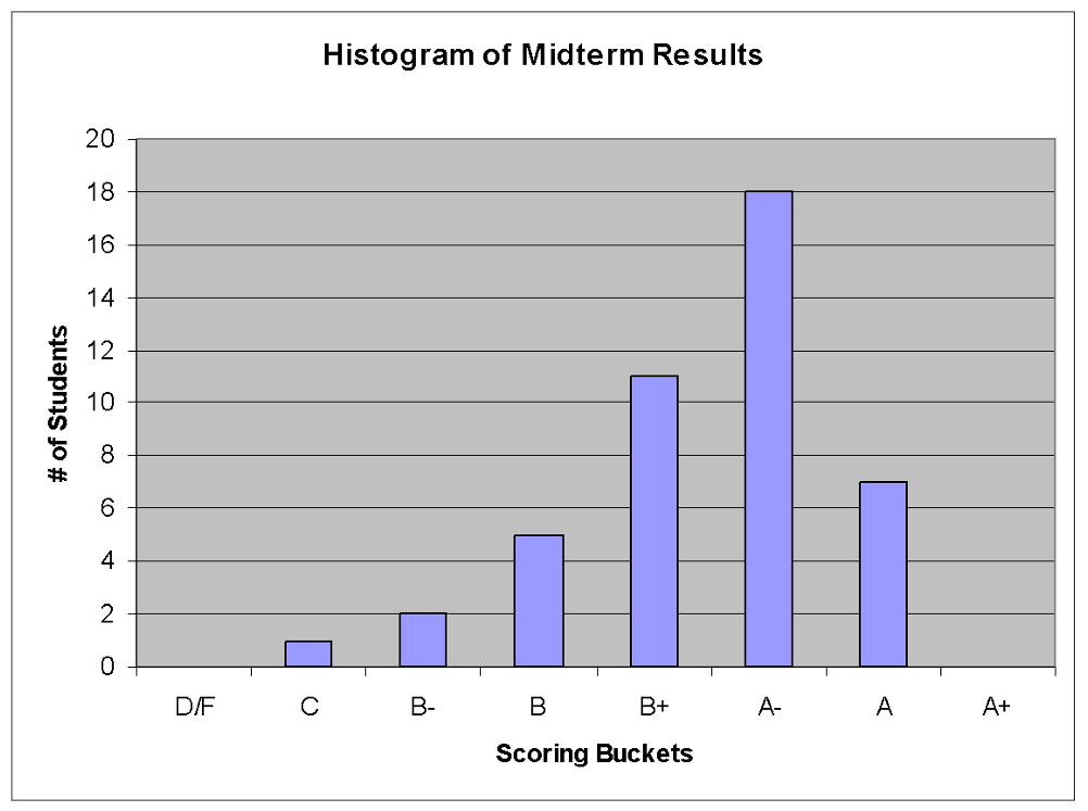
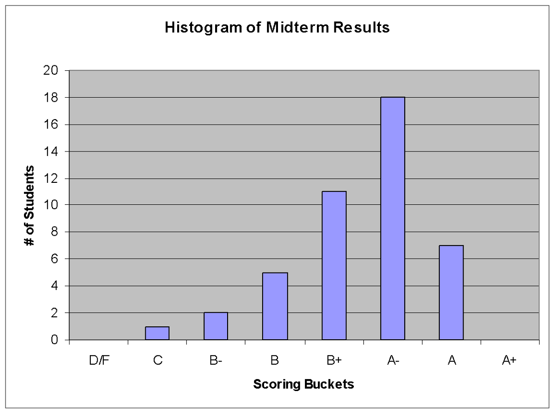
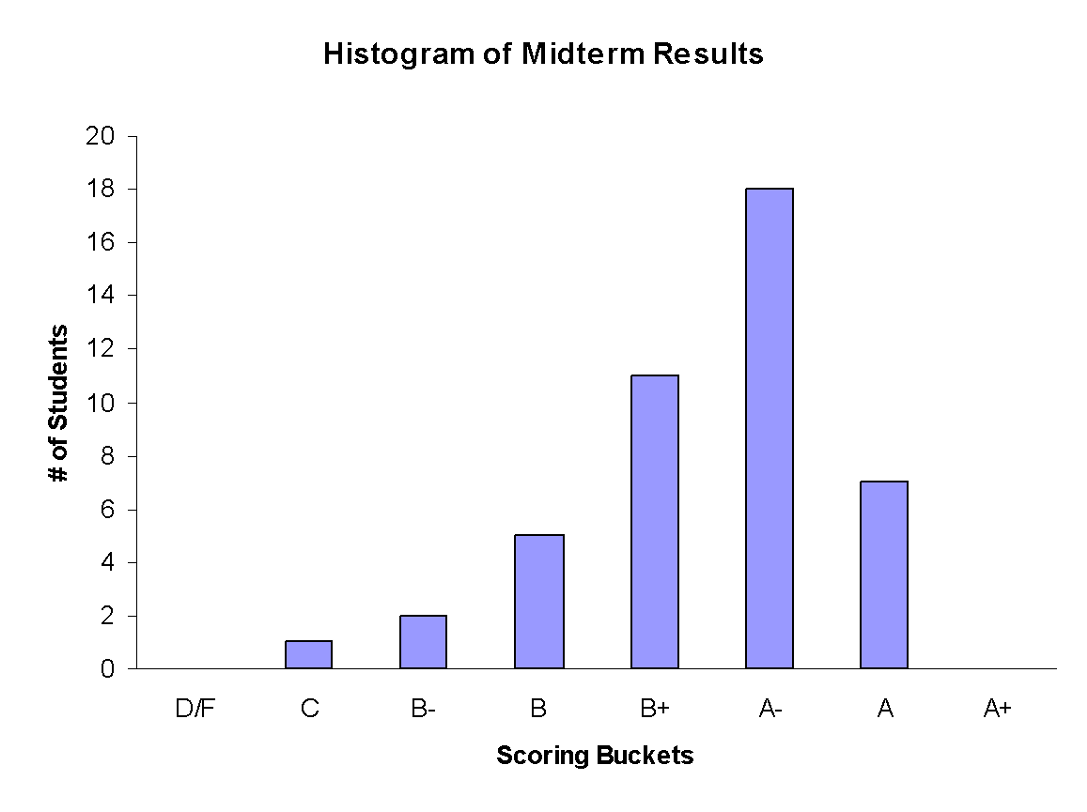
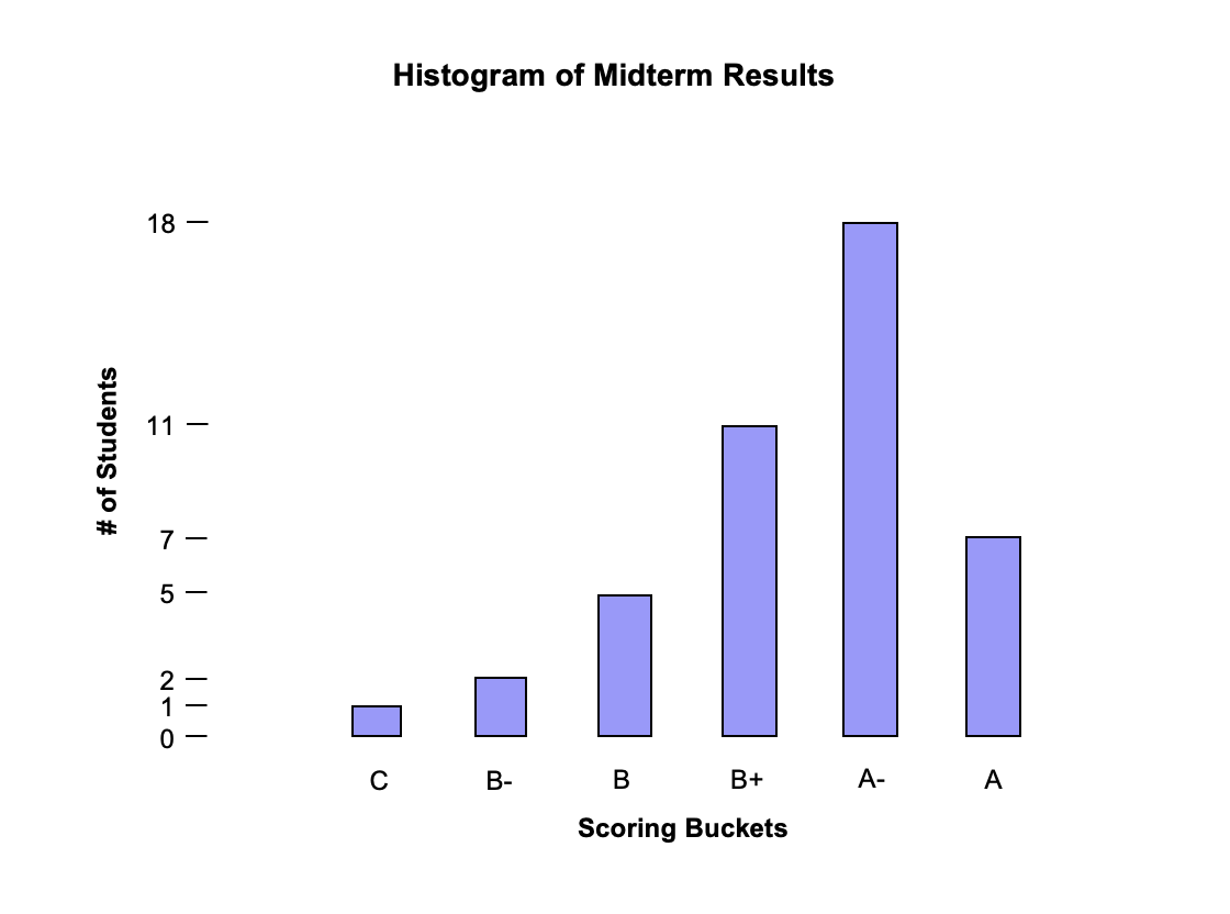
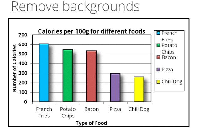
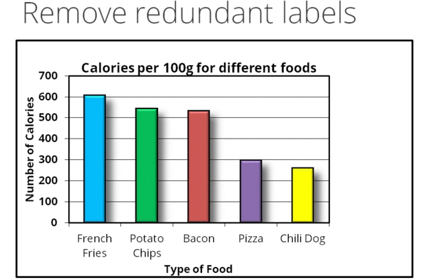
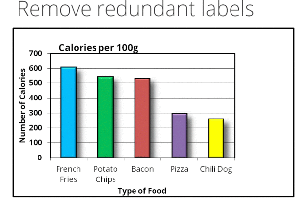
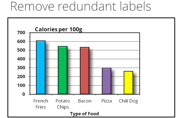
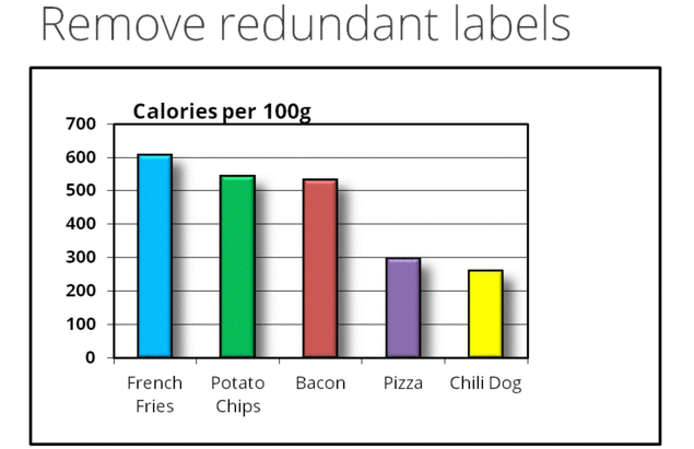
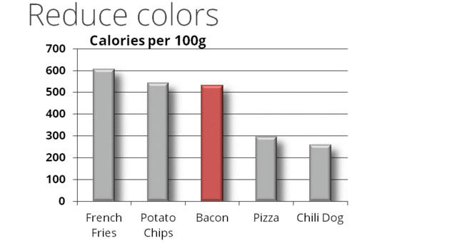
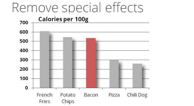
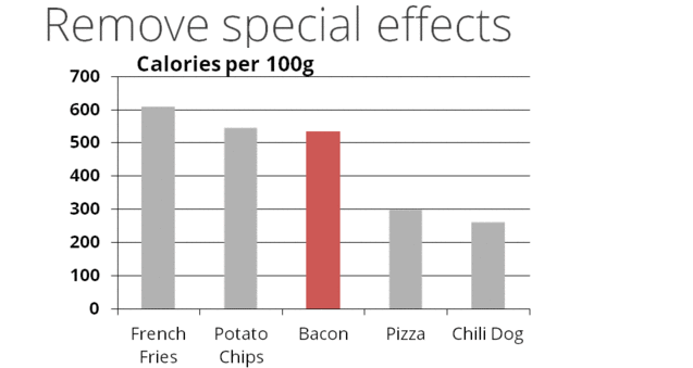
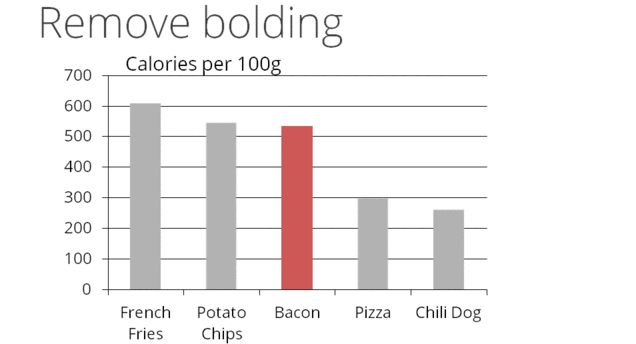
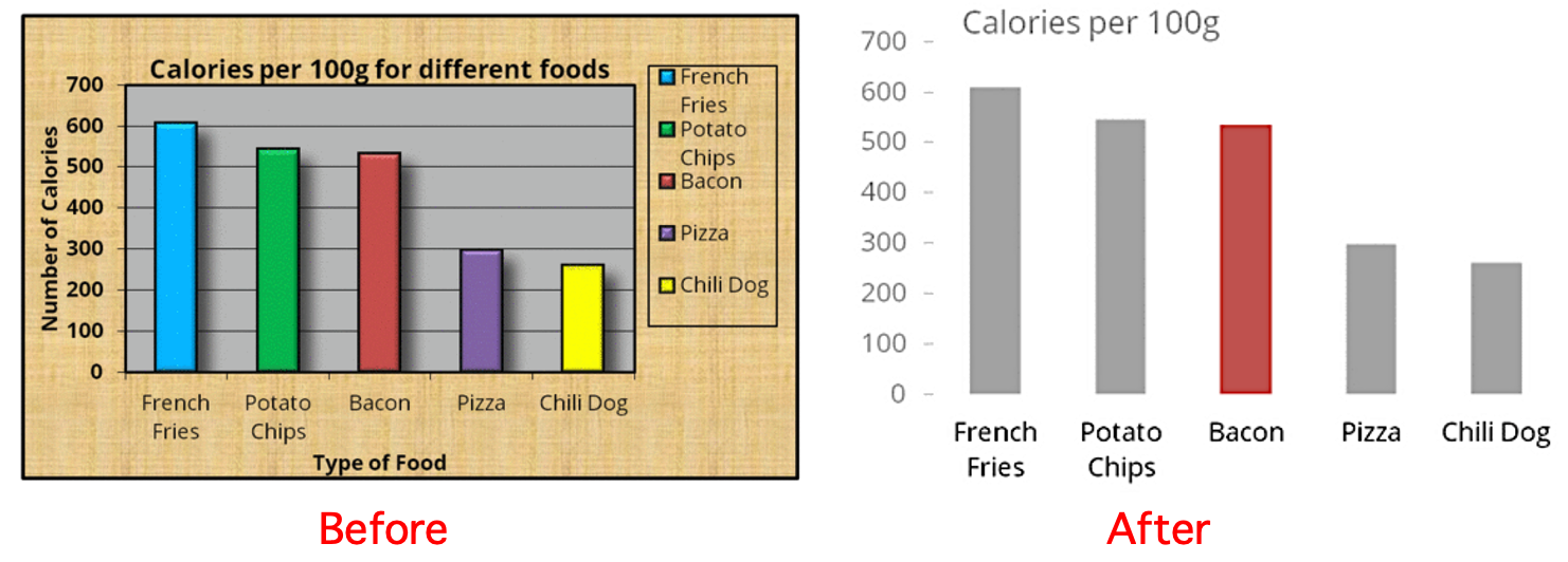
Here is an example of how a graphic cab be revised to increase data-ink ratio.


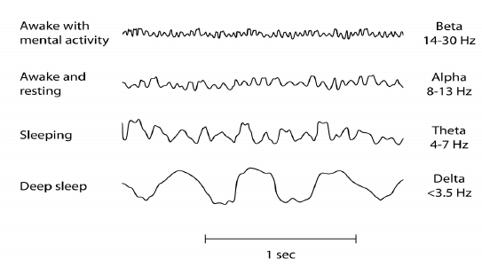
Here is an example with a very high data-ink ratio. It’s an electroencephalogram – a graph that records the electrical activity from the brain. All these graphics have a data-ink ratio of 1.
Extraneous elements, such as background grids and tick lines, should be removed or visible enough to serve their purpose but not detract from the relevant information.
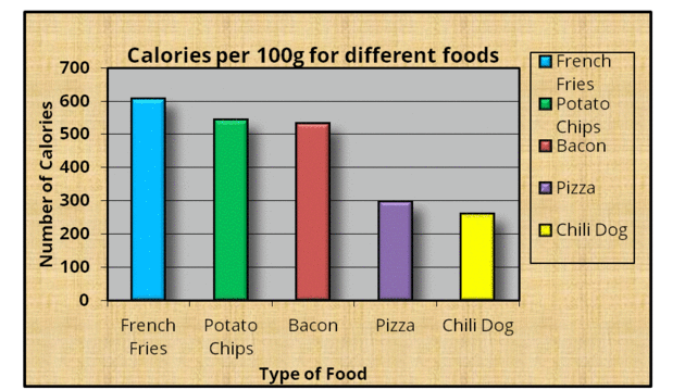
Here is our last example.
Signal and background compete in the diagram below, as the electrocardiogram trace line becomes caught up in a thick grid.
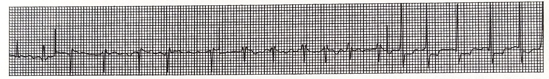
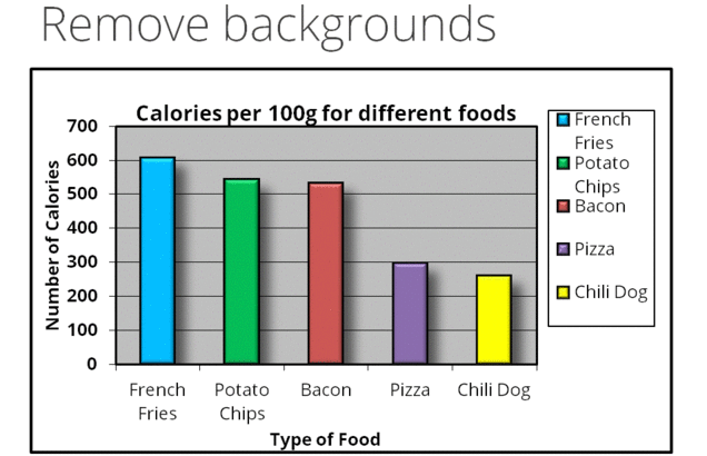
The grid can be screened down (and/or re-colored):