data-viz-workshop-2021
1. Marey’s train schedule
Everyone is familiar with the usual layout of train timetables that plot arrival and departure times against a list of destinations.
But what if we plotted this information differently?
In 885, E.J. Marey, a French scientist and pioneer photographer of movement (chronophotography), proposed a graphical train schedule with a timetable and graphic representation of speed.
Here is what Marey proposed for the Paris-Lyon train service.
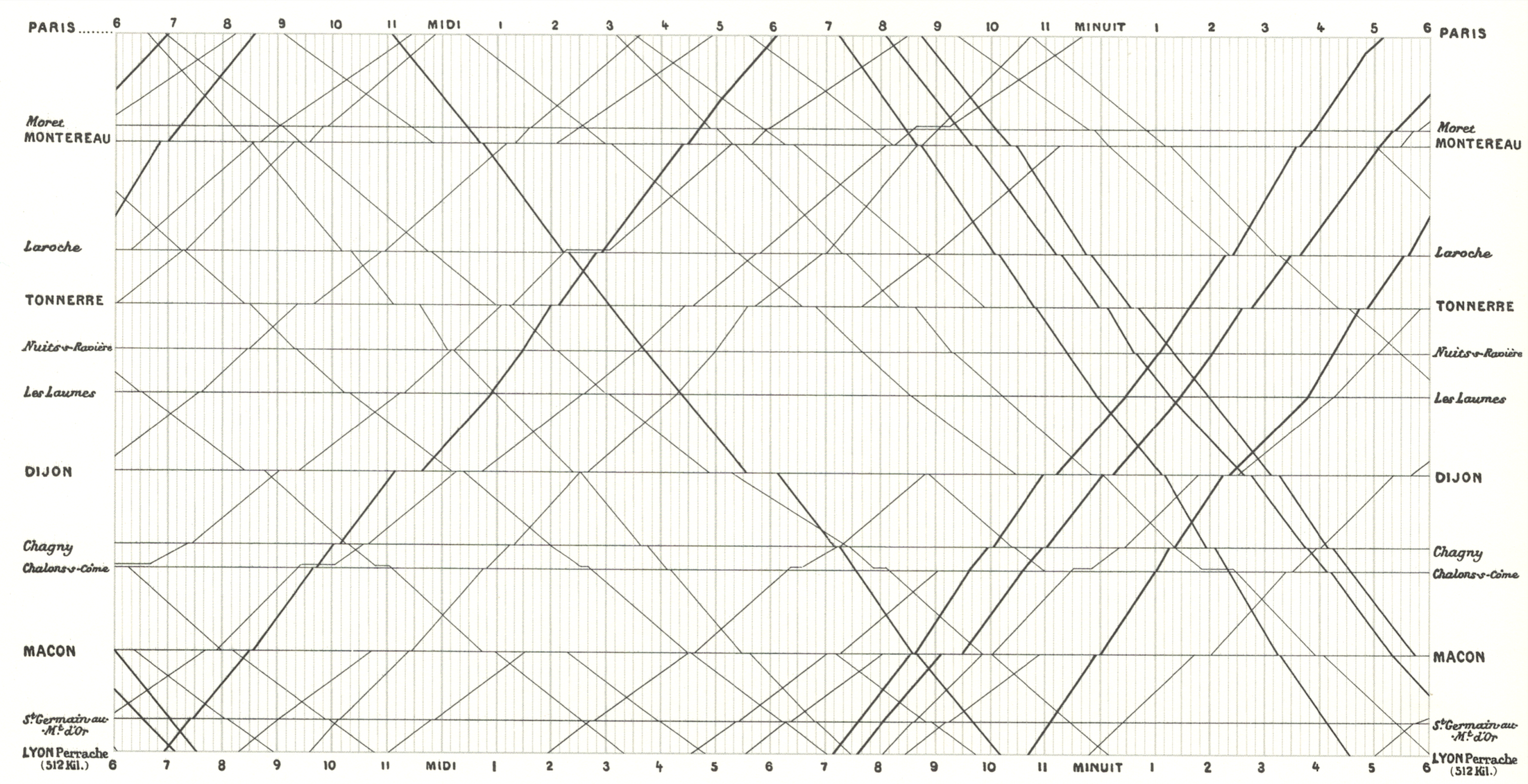
A very remarkable representation of time-oriented information shows the train schedule for the track Paris to Lyon graphically.
In a 2D diagram, Marey placed the individual train stops according to their distance in a list on the vertical axis and time on the horizontal axis.
Thus, horizontal lines are used to identify the individual stops, and a vertical raster is used for timing information. The individual trains are represented by diagonal lines running from top left to bottom right (Paris – Lyon) and bottom left to top right (Lyon – Paris). The slope of the line gives information about the train’s speed – the steeper the line, the faster the respective train is traveling.
The horizontal sections of the trains’ lines indicate if the train stops at the respective station and how long the train stops. On top of that, the density of the lines provides information about the frequency of trains over time. This leads to a clear and powerful representation showing complex information at a glance while allowing for in-depth analysis of the data.
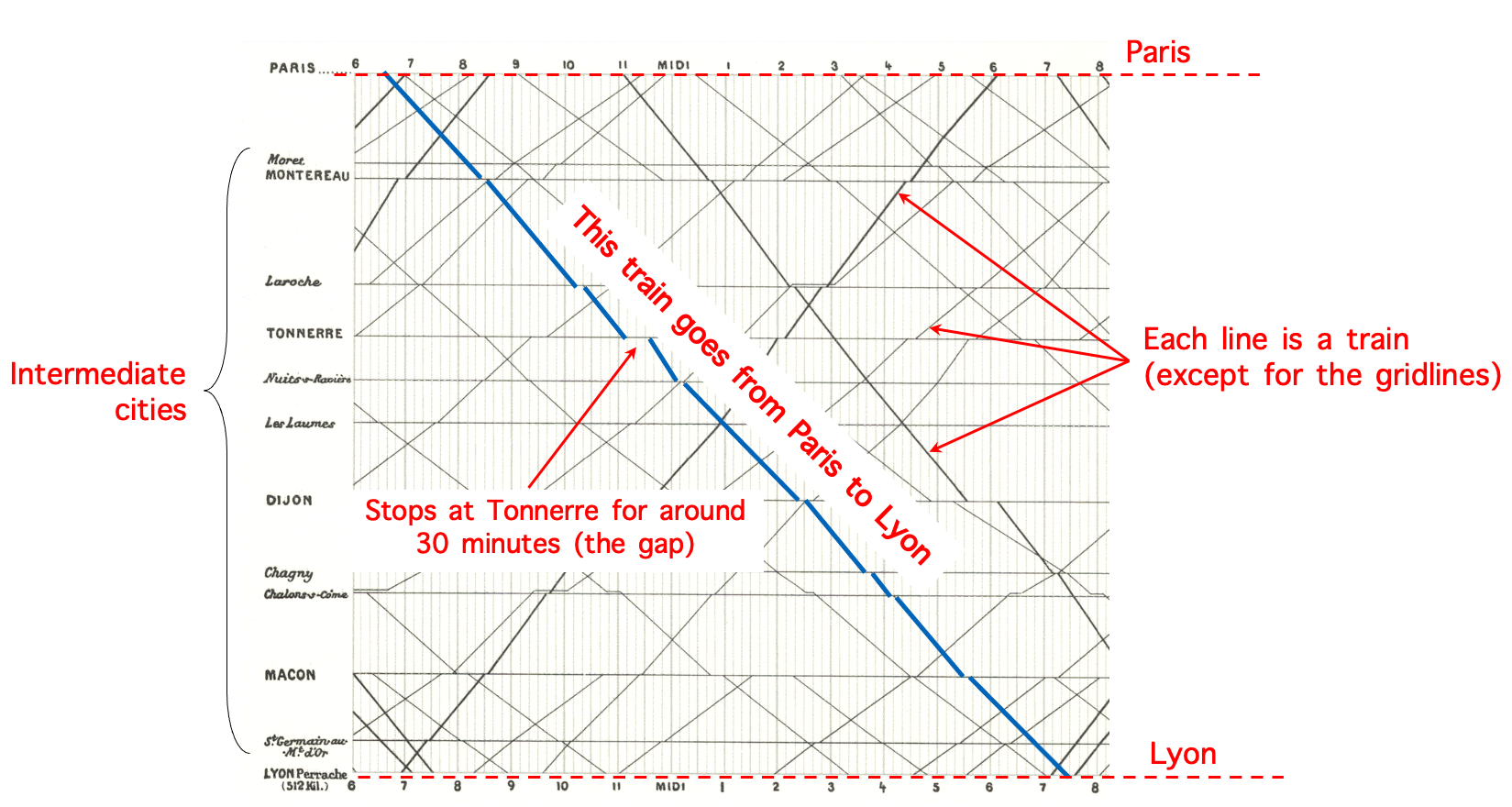
Marey train schedule:
- x-axis: time of the day beginning six and ending at six
- y-axis: the individual train stops according to their distance in a list on the vertical axis
- horizontal line length: stop length
- slope: speed
- intersection: time/place of crossing
Here is the train schedule again, labeled this time.
A question for you:
Can you highlight the fastest train and the slowest train trips in the schedule?
2. Charles-Joseph Minard’s map of Napoleon’s flawed Russian campaign: An ever-current classic
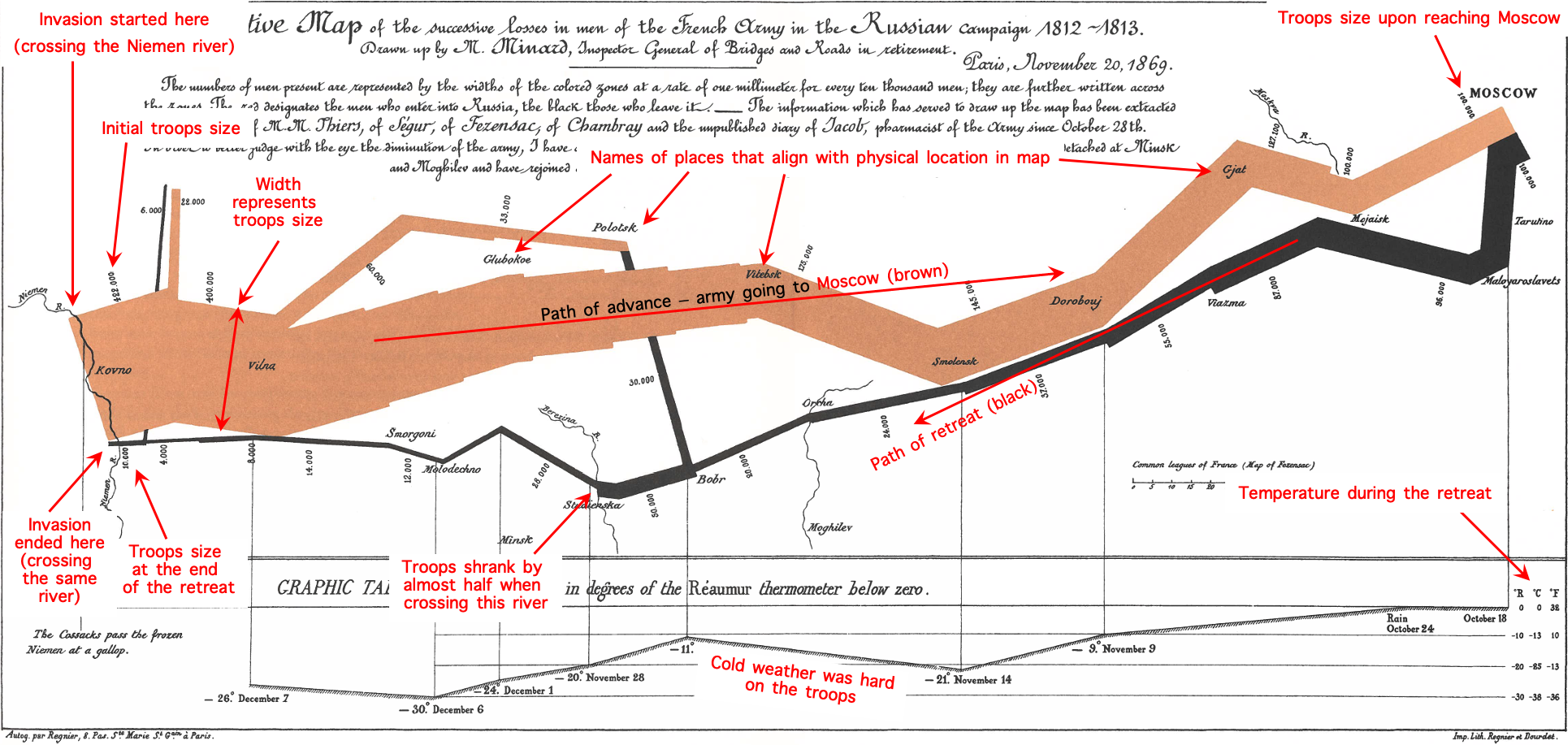
Edward Tufte calls the graphic the “best statistical drawings ever created.” Because it is a classic, it makes sense to try to understand it. But the original Minard’s graphic is in French.
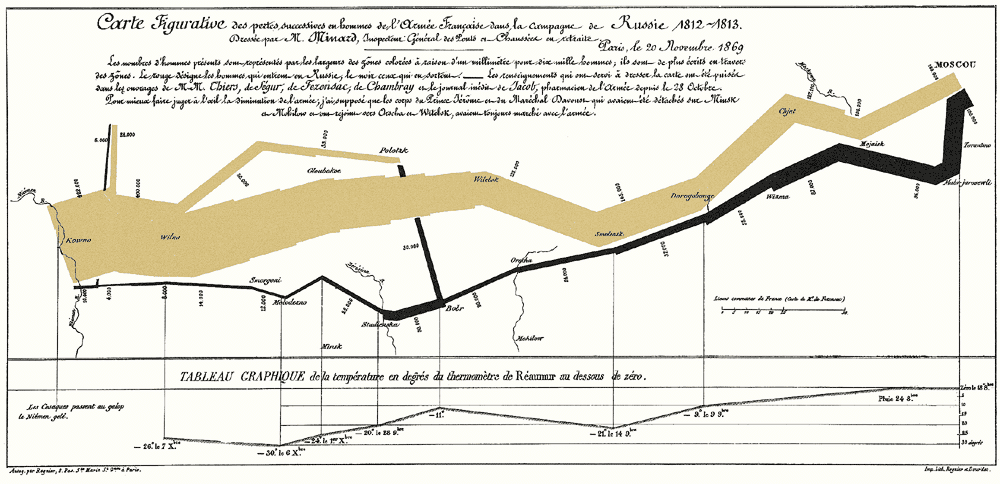
Someone, probably Edward Tufte’s group, has developed a high-resolution English version of the map, which is at your hands.
But, to analyze this graphic, we have to go 200 years back.
The year is 1812, and Napoleon is doing pretty well for himself. He has most of Europe under his control, except for the UK. No matter how many times he tried to invade them, he couldn’t break through their defenses. He planned to place an embargo on them, forcing the other European countries to stop trade with the UK, weakening them enough so that Napoleon could invade and take over easily.
Czar Alexander of Russia saw that Napoleon was becoming too powerful, so he refused to participate in this embargo. Angry at Czar Alexander’s decision, Napoleon gathered a massive army of over 400,000 to attack Russia in June 1812. While Russia’s troops are not as numerous as France’s, Russia has a plan. Russian troops keep retreating as Napoleon’s troops move forward, burning everything they pass, ensuring that the French forces could not take anything from their environment. Eventually, the French army followed the Russian army all the way to Moscow during October, suffering major losses from lack of food. By the time Napoleon gets to Moscow, he knows he has to retreat. As winter settles into Europe and the temperature drops, Napoleon’s troops suffer even more losses, returning to France from lack of food, disease, and weather conditions.
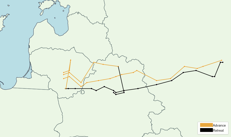
Here is the path that his troops took to and from Moscow.
And, the same path on the map:
We have also created a labeled version of the map that you have at hand. Please zoom in and out as needed.
Analysis of the Minard’s plot - It begins and ends at the Niemen river crossing
The figure below zooms in on some of the map’s details.
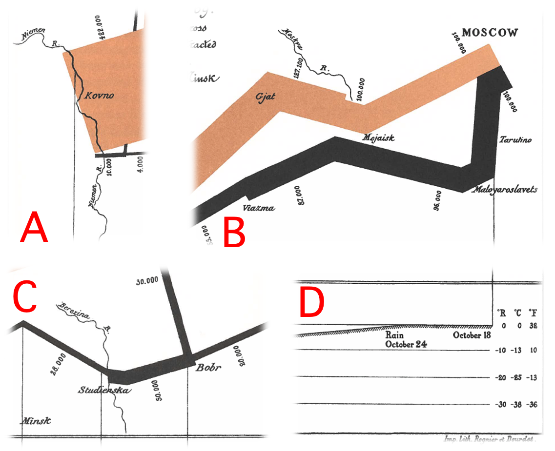
A - The Neman river and its surrounding territory. This is where the invasion both started and ended. It is the most dramatic aspect of the map because it shows the big difference between the number of soldiers at the start and end of the campaign.
B - The Moskva river and its surrounding. This portion of the map highlights an interesting absence of time because Minard did not clarify that Napoleon stayed in Moskva for about a month. This omission is important because the flow line alone gives readers the misleading impression that the army moved at a uniform rate.
C - The Berezina river and its surrounding. This portion displays the French army’s losses while crossing the river, and Napoleon’s troops shrank by almost half. This detail exemplifies how well Minard used geography to communicate his statistics.
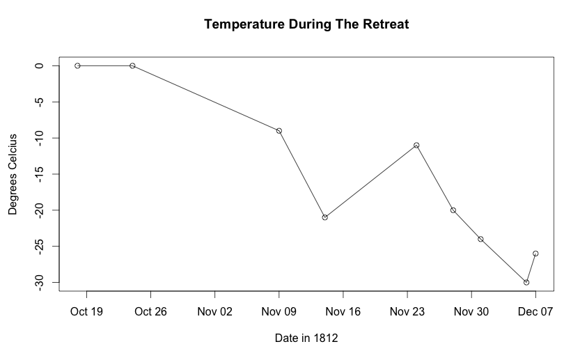
D - The temperature during the retreat. It shows the scale bar and part of the temperature diagram used in Minard’s map. When he made his map, France still used its own Réaumur temperature scale. Its zero degree indicates the same temperature as that on the Celsius scale. Measurements compare as follows: −10°R equals −13°C°, −20°R equals −25°C, and −30°R equals −38°C. In Fahrenheit, these would equal 9°F, −13°F, and −36°F.
Here is a plot of the temperature experienced by Napolean’s troops when winter settled in on the return trip.
We have many dimensions of data that take several individual graphs to represent. Minard’s graphic is quite clever because of its ability to combine all of the dimensions. He shows these various details without distracting text or labels as well. For example, he displays the points where Napoleon’s troops divide into subgroups by breaking out the main bar into branches. He adds thin lines to represent river crossings on the return trip that further decimated Napoleon’s diminishing troops. And he showed the drastic loss in life from Napoleon’s decision in just a single corner of the diagram.
What does the map show us?
- Forces visual comparisons (the upper lighter band is showing the large army going to Moscow vs. the narrow dark band showing the small army returning).
- Shows causality (the temperature chart at the bottom).
- Captures multivariate complexity (size of army, location, direction, temperature, and time).
- Integrates text and graphic into a coherent whole.
- Illustrate high-quality content (complete and accurate data, presented to support Minard’s argument against war).
- Place comparisons adjacent to each other, not sequentially (people forget if they have to go from page to page ).
- Use the smallest effective differences (i.e., avoid bold colors, heavy lines, distracting labels, and scales).
Minard’s map exemplifies many of the fundamental principles of analytical design:
Principle 1: Comparisons: Show comparisons, contrasts, differences.
Principle 2: Causality, mechanism, structure, explanation: Show causality, mechanism, structure, explanation
Principle 3: Multivariate analysis: Show multivariate data; that is, show more than 1 or 2 variables.
Principle 4: Integration of evidence: Completely integrate words, numbers, images, diagrams.
Principle 5: Documentation: Thoroughly describe the evidence. Provide a detailed title, indicate the authors and sponsors, document the data sources, show complete measurement scales, point out relevant issues.
Principle 6: Content counts most of all: Analytical presentations ultimately stand or fall depending on the quality, relevance, and integrity of their content.
Two questions for you:
- How many dimensions are there in Minard’s plot? What are they?
- Why is Minard’s graph challenging to understand?