data-viz-workshop-2021
Graphical integrity
For some people, one of the first things that come to mind when they think about statistical charts is “lie.” Undoubtedly, some graphics distort the underlying data, making it hard for the viewer to learn the truth. But data graphics are no different from words in this regard, for any means of communication can be used to deceive. There is no reason to believe that graphics are especially vulnerable to exploitation by liars; in fact, most of us have pretty good graphical lie detectors that help us see right through frauds.
During much of the twentieth century, people assumed that data graphics were mainly devices for showing the obvious to the ignorant. Therefore graphics had to be alive, communicatively dynamic, overdecorated and exaggerated (otherwise the audience would fall asleep in the face of those boring statistics).
In the late 1960s, after John Tukey made statistical graphics respectable (he also invented the box plot), the trend to view that graphics were only for decorating a few numbers was gradually ended.
Of course, false graphics are still with us. Deception must always be confronted and demolished, even if lie detection is no longer at the forefront of research.
Graphical excellence begins with telling the truth about the data.
Sometimes the fact that numbers have a magnitude as well as order is simply forgotten:
1. Distortion
A graphic does not distort if the visual representation of the data is consistent with the numerical representation. When then is the “visual representation” of the data? As physically measured on the surface of the graphic? Or the perceived visual effect? How do we know that the visual image represents the underlying numbers?
One satisfactory answer to these questions is to use a table to show the numbers. Tables usually outperform graphics in reporting on small data sets of 20 numbers or less. The power of graphics comes in the display of large data sets.
At any rate, given the perceptual difficulties, the best we can hope for is some uniformity in graphics (if not in the perceivers) and some assurance that perceivers have a fair chance of getting numbers right.
Two principles lead toward these goals and, in consequence, enhance graphical integrity:
1. As physically measured on the surface of the graphic itself, the representation of numbers should be directly proportional to the numerical quantities represented.
2. Clear, detailed, and thorough labeling should be used to defeat graphical distortion and ambiguity. Write out explanations of the data on the graphic itself. Label important events in the data.

2. Lie factor
A graphic misrepresentation may be measured using Lie Factor.

If the lie factor is equal to one, the graphic might be doing a reasonable job of accurately representing the underlying numbers. Lie Factors greater than 1.05 or less than 0.95 indicate substantial distortion, far beyond minor inaccuracies in plotting.
Consider the graphic below:
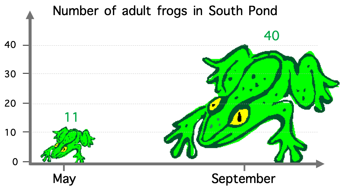
The number of adult frogs in May is 11, and that in September is 40. The graphic shows a larger frog with not just increased height but also increased width. The size of the larger frog (in the area) is almost 16 times of the smaller frog (because we see the area, not just height).
Here,
Size of the effect in data (percentage change in the number of frogs)
= ( (40 - 11) / 11 ) * 100 % = 264% increase
And, size of effect shown in the graphic (percentage change in the area of the two frogs)
= ( ( Arealarge frog - Areasmall frog ) / Areasmall frog ) * 100 %
= ( ( 40 * 40 - 11 * 11 ) / (11 * 11) ) * 100 %
= ( ( 1600 - 121 ) / 121 ) * 100 %
= 1200 % increase
Lie Factor = 1200 / 264 = 4.5
which is too big!
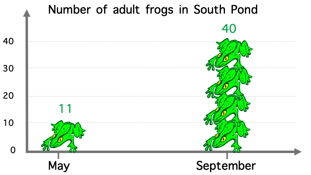
Here is an improved graphic with lie factor close to 1.
3. Design and data variation
Each part of a graphic generates a visual expectation about its other parts, and, in the economy of graphical perception, these expectations often determine what the eye sees. Deception results from the incorrect extrapolation of visual expectations generated at one place on the graphic to other places.
A scale moving in regular intervals, for example, is expected to continue its march to the very end in a consistent fashion, without the muddling or trickery of non-uniform changes.
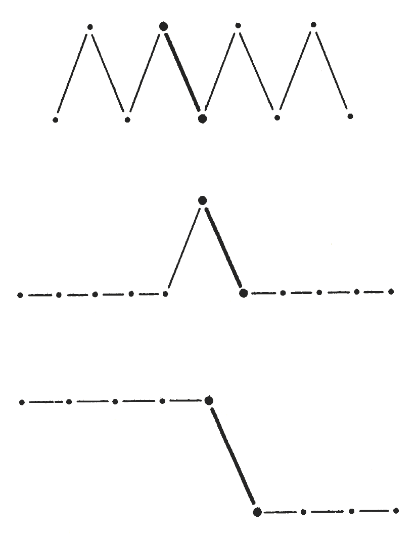
Here is an irregular scale used to display a pseudo-decline.
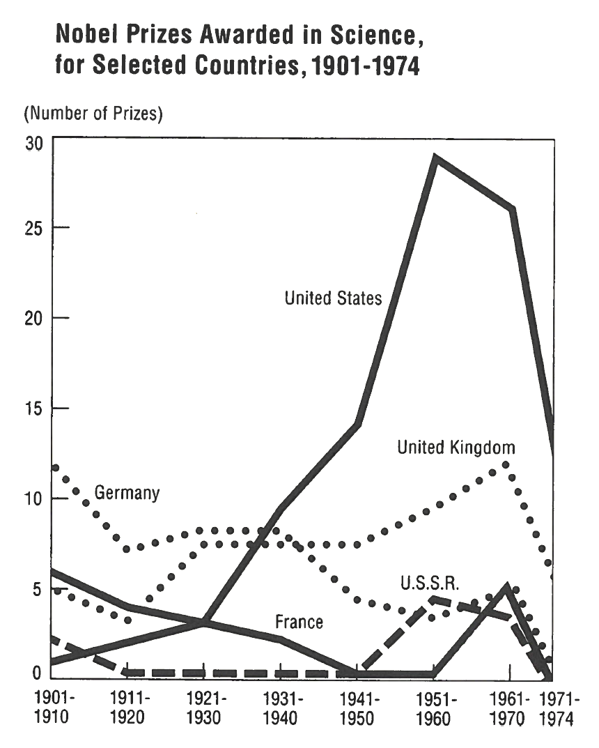
The first seven increments on the horizontal scale are ten years long, masking the rightmost interval of four years. Consequently, the conspicuous feature of the graphic is the apparent fall of curves at the right, particularly the decline in prizes won by the people from the United States (the heavy, dark line) in the most recent period. This effect results solely from design variation.
It is a big lie, since in reality, the U.S. curve turned sharply upward in the post-1970 interval. The correction, with the actual data for 1971-80, is shown below:
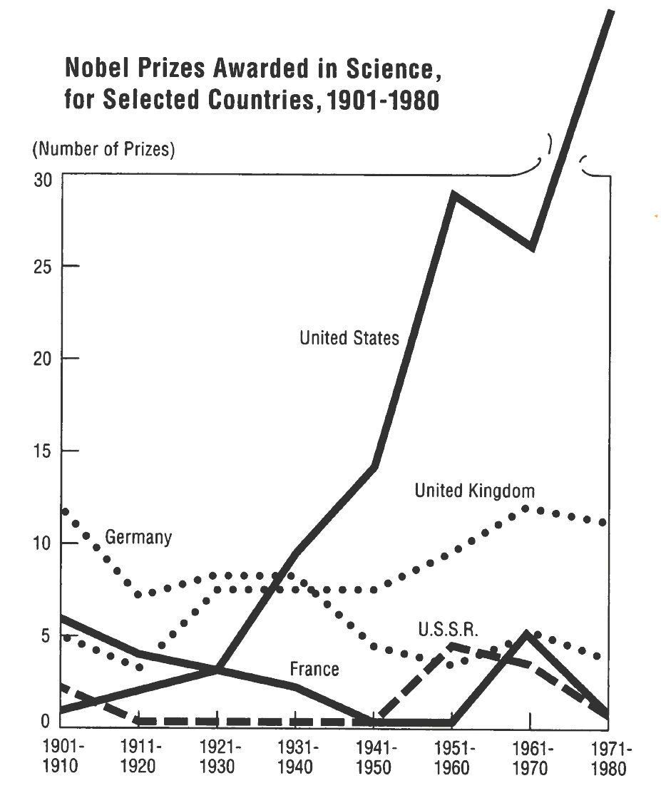
But such a design variation should also be avoided.
Show data variation, not design variation. Design variation corrupts displays.
4. Context is essential for graphical integrity
To be truthful and revealing, data graphics must bear on the question at the heart of quantitative thinking: “Compared to what?”
The emaciated, data-thin design should always provoke suspicion, for graphics often lie by omission, leaving our data sufficient for comparisons.
Graphis must not quote data out of context.
This display below leaves all the important questions unanswered:
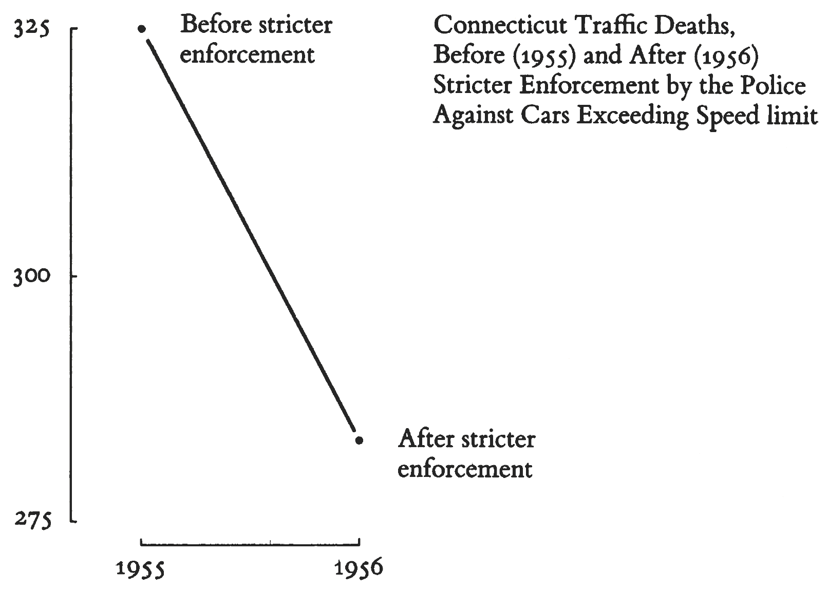
A few more data points add immensely to the account:
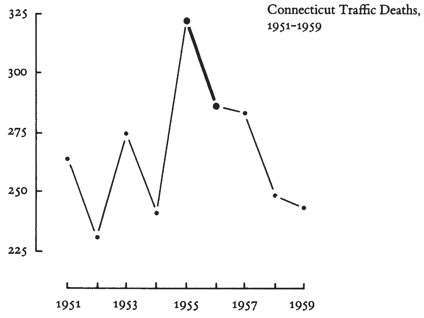
Imagine the very different interpretations other possible time-paths surrounding the 1955-1956 change would have:
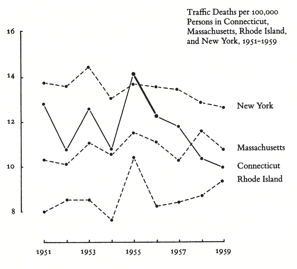
Comparison with the adjacent states give a still better context, revealing it was not only Connecticut that enojyed a decline in traffic fatalities in the year of crackdown on speeding:
5. Learn to catch lying graphics
Lying graphics cheapen the graphical art everywhere. Since lies often show up in news reports, millions of images are printed. When a chart on television or a popular Youtube channel lies, it lies millions of times over. About 15 million people read one of the paper’s many New York Times newsletters each week. When NYT lies, it is lying to a great many important and influential readers.
The primary defense of the lying graphic is … “Well, at least it was approximately correct; we were just trying to show the general direction of change.” But many of the deceptive displays involve tenfold and fifteenfold lies, too large to be described as approximately correct.
The second defense of the lying graphic is that, although the design itself lies, the actual numbers are printed on the graphic for those picky folks who want to know the correct size of the effects displayed. It is as if not lying in one place justified fifteenfold lies elsewhere.