data-viz-workshop-2021
For scientific research
1. Ask yourself before you begin
a) Is the graphic explanatory or exploratory (perhaps even interactive)?
Explanatory graphics communicate a point or call attention to patterns and concepts. Explanatory graphics can be used as evidence or proof in research and teaching tools for colleagues and students. They can also be powerful teaching tools.
An explanatory graphic “forces readers to see the information the designer wanted to convey.” The objective is to show to, communicate to and convince others (tell a story).
Exploratory graphics (sometimes referred to as visualizations) invite the viewer to discover information. Many scientific disciplines generate enormous datasets, and new graphical approaches are required to make sense of the data and to organize and communicate the main points.
An exploratory graphic “forces us to notice what we never expected to see.” The objective is to explore and interact with the data (size, complexity, characteristics, distribution).
b) How will the graphic be used?
Scientific graphics are used in many contexts: in oral presentations to colleagues, in lectures, as part of research articles, in posters, and grant proposals — to name just a few. Each of these contexts makes different demands on a graphic.
For example, in an oral presentation, a graphic needs to make the point quickly and clearly because an audience does not have the time to contemplate a graphic in nearly as much depth as it might in a research article.
Graphics may have to appeal to different types of audiences as well.
A graphic that is intended for a colleague may be quite different from a graphic intended for a student in your course, and still different for a program officer or a congressperson without a background in your field.
Your answer to the question above will help shape the content and form of the figure.
c) What is the first thing you want the viewer to see?
While you might know precisely how to navigate your explanatory graphic to find the crucial information, it is unlikely that the first-time viewer will see exactly what you see. Without your experience and familiarity with the topic, the audience needs to be guided to identify important details in the sea of information.
A viewer’s eye must be guided to “read” the elements in a logical order.
The design of an exploratory graphic needs to allow for the additional discovery component—guiding the viewer first to understand the overall concept and then engaging her to explore the supporting information further. Source: Visual Strategies, pg 13.
2. Micro/macro readings
We thrive in information-thick worlds because of our marvelous and everyday capacities to select, edit, single out, structure, highlight, group, pair, merge, harmonize, synthesize, focus, organize, condense, reduce, boil down, choose, categorize, catalog, classify, list, abstract, scan, look into, idealize, isolate, discriminate, distinguish, screen, pigeonhole, pick over, sort, integrate, blend, inspect, filter, lump, skip, smooth, chunk, average, approximate, cluster, aggregate, outline, summarize, itemize, review, dip into, flip through, browse, glance into, leaf through, skim, refine, enumarate, glean, synopsize, winnow the wheat from the chaff, and separate the sheep from the goats. - Edward Tufte. Source: EI.
Visual displays rich with data are not only an appropriate and proper complement to human capabilities, but also such designs are frequently optimal. If the visual task is contrast, comparison, and choice—as so often it is—then the more relevant information within the eye span, the better.
Vacant and low-density displays should be avoided!
High-density designs also allow viewers to select, narrate, recast, and personalize data for their own uses. Thus control of the information is given over to the viewers, not to editors, designers, and decorators. Data-thin, forgetful displays move viewers towards ignorance and passivity, and at the same time, diminish the credibility of the source.
Thin data rightly prompts suspicions: “What are they leaving out? Is that really everything they know? What are they hiding? Is that all they did?” It is claimed that vacant space is “friendly,” but it is not how much empty space there is but rather how it is used. It is not how much information there is, but rather how effectively it is arranged.
Here is an example.
Consider the jittered strip plot below displaying four sets of data collected – Your, Sam’s, Mary’s, and Bob’s data. These are just four columns of data in total, i.e., the position in x-axis is jittered to avoid overlapping points.
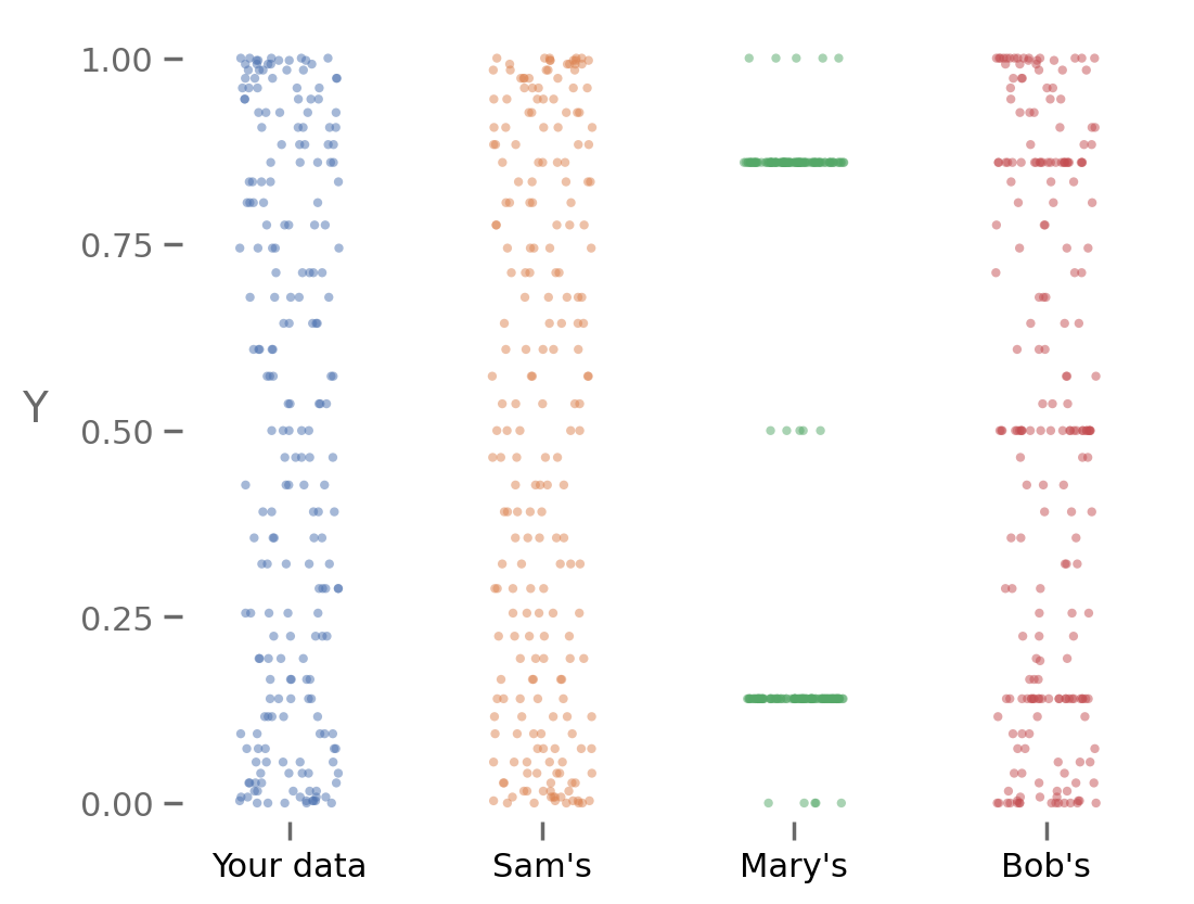
Let us now summarize the data using a boxplot.
A typical box plot summarizes using at most five numbers.
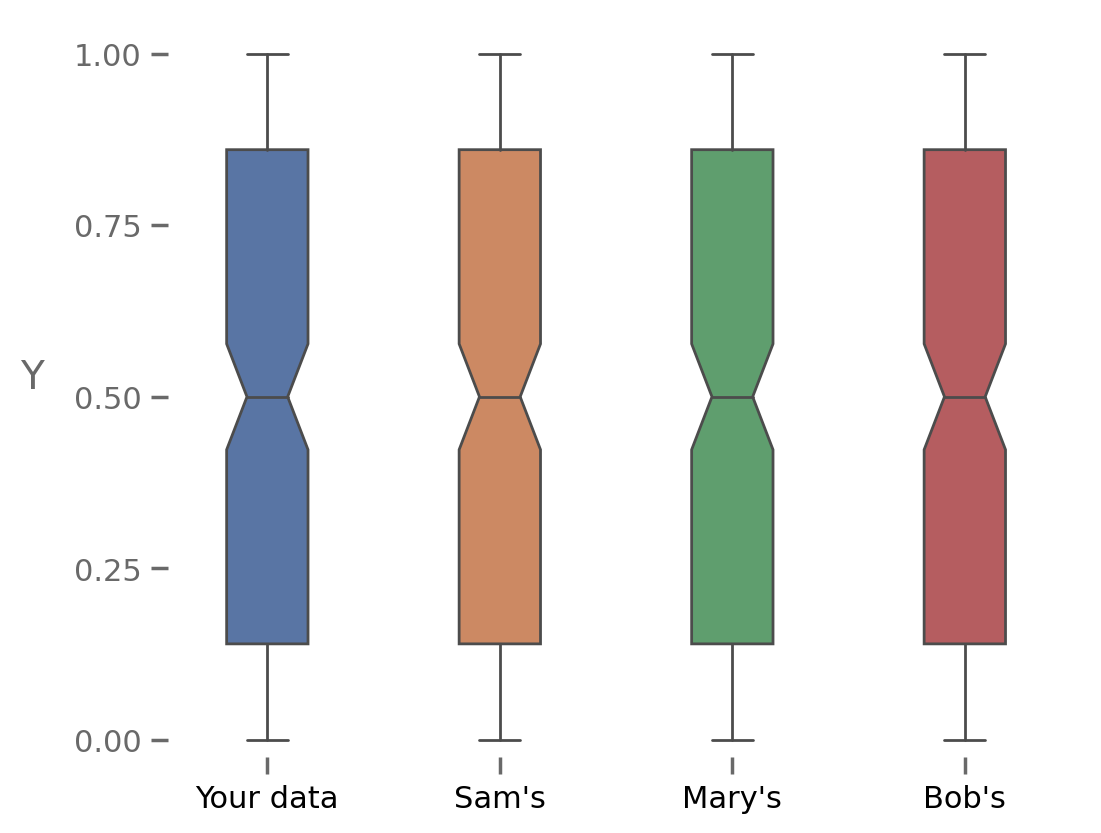
In such a display (the box plot above), the reader will keep wondering how the original data points look like.
Adding a jittered scatter plot beside it provides both macro and micro reading.
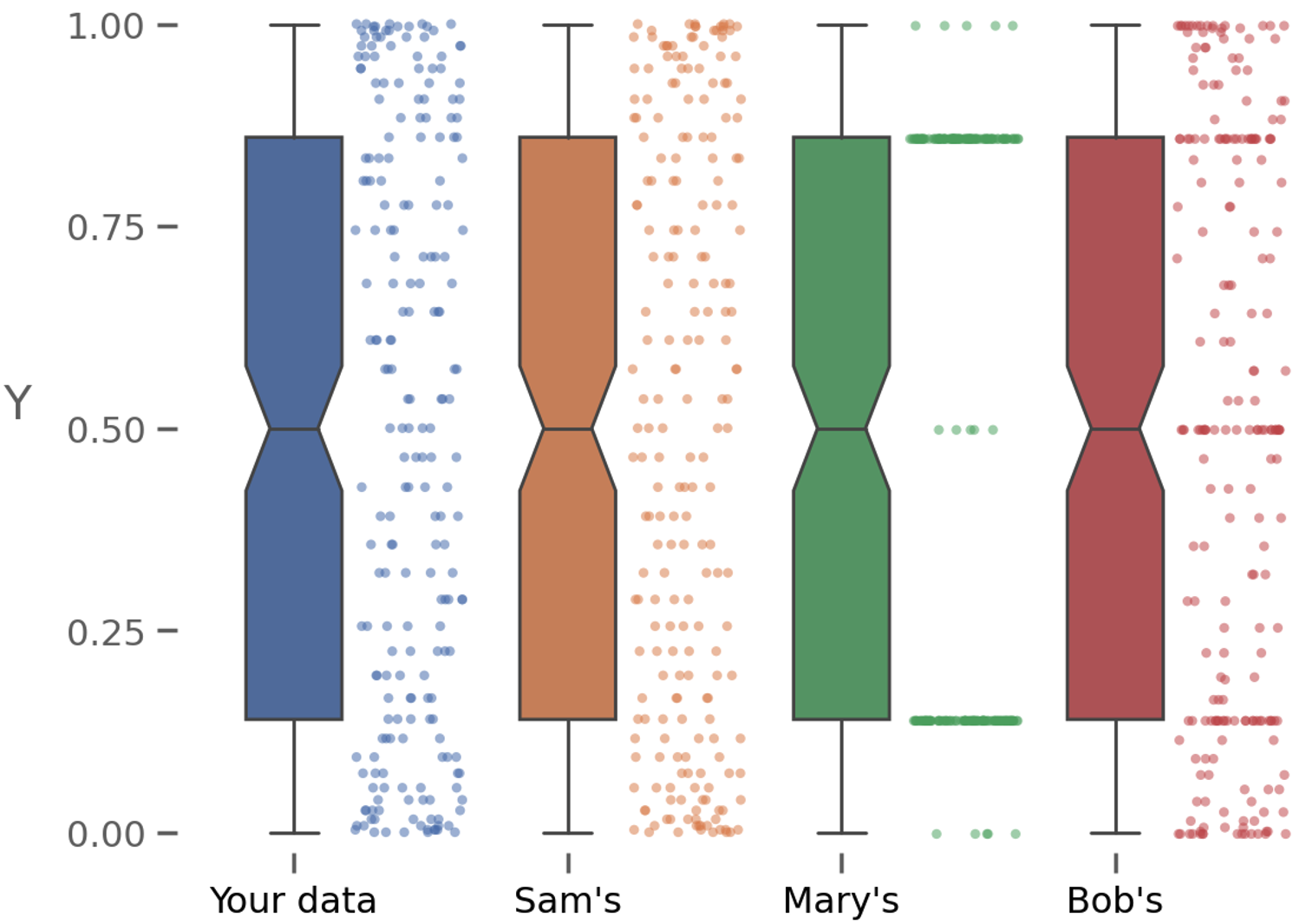
Summary models such as boxplots lack credibility. To clarify, add detail.
3. Content hostile vs. responsive labels
Consider the data graphic below.
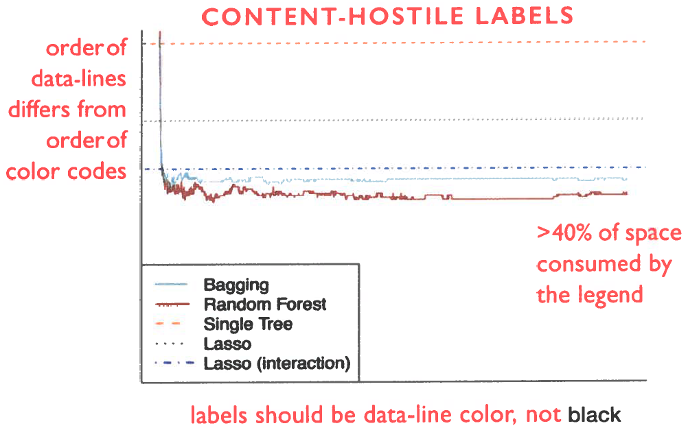
To make sense of this display, readers must briefly memorize a one-time color code stashed in a disordered legend.
Now, here is an alternative—with content-responsive labels.
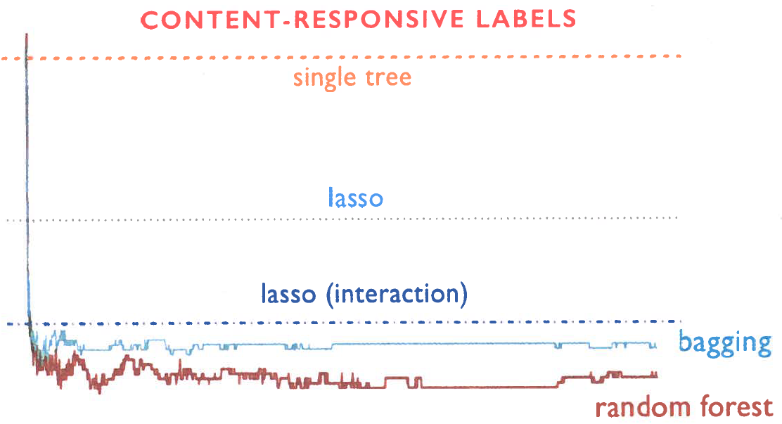
Viewers can read these content responsive labels directly, with no encodings. On this graphic, also note that the more significant labels (bagging & random forest) are enlarged. All available space shows data.
Avoid legends and encodings when you can.
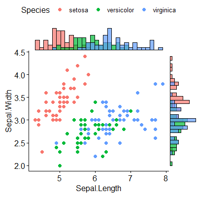
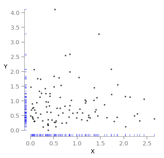
4. Add marginal histograms to scatter plots
Adding marginal histograms in a scatter plot allows a reader to see the marginal distribution of each variable. Here is an example.
If your plotting tool allows you to print the data points in the axis scales. Here is an example.
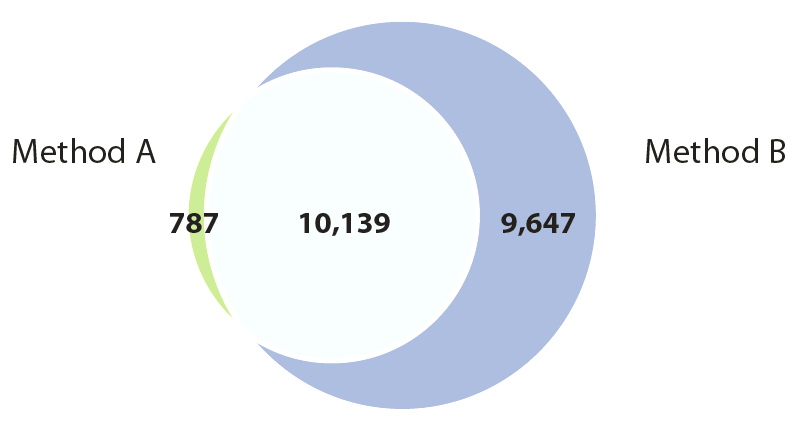
5. Visually quantitative Venn diagrams
The problem with using the traditional Venn diagram to convey quantitative information is that it does not visually represent the magnitude of these quantities.
For example, in the figure below the number of genes detected by “Method A” can be determined by summing the number of group members that are unique to Method A and the number that are shared between Method A and Method B, but this is not communicated visually by this traditional Venn diagram.
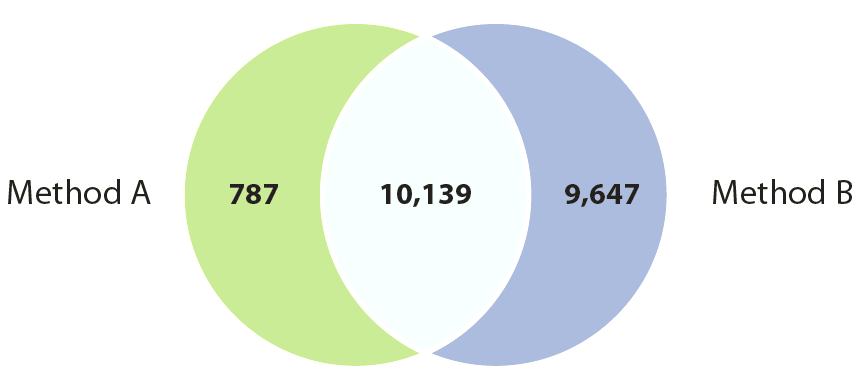
This is a shortcoming that is quite easy to fix: scale the size of the circles in the Venn diagram so that their area is proportional to the relative size of each of the groups, and position the circles relative to each other such that the area of the overlapping region is proportional to the number of group members that are shared between the two groups.
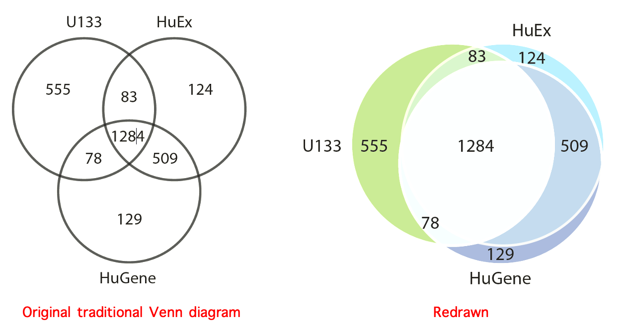
Here is another example. The Venn diagrams below show the “ability of different microarray platforms to detect changes in gene expression.” Overlap of top 2000 genes most differentially expressed between brain tissue and heart tissue as measured by three different types of microarrays.
6. Model multiplicity
In the picture below, we show many different models that attempt to explain a dataset at hand, all of which are probably wrong.
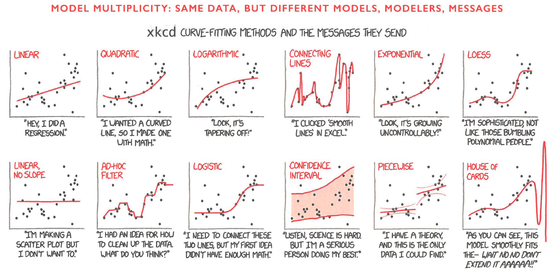
** “A mistake in the operating room can threaten a patient’s life; a mistake in statistical analysis or interpretation can lead to hundreds of early deaths. So it is odd that, while we allow a doctor to conduct surgery only after years of training, we give software packages—SPSS, R, Python, Matlab, AI—for statistical analysis to almost anyone.”** - From somewhere in one of Edward Tufte’s books.
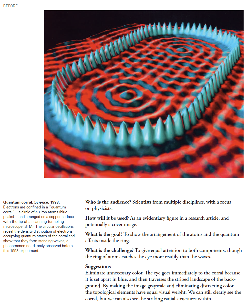
7. Some examples of scientific graphics improvements: Before & After
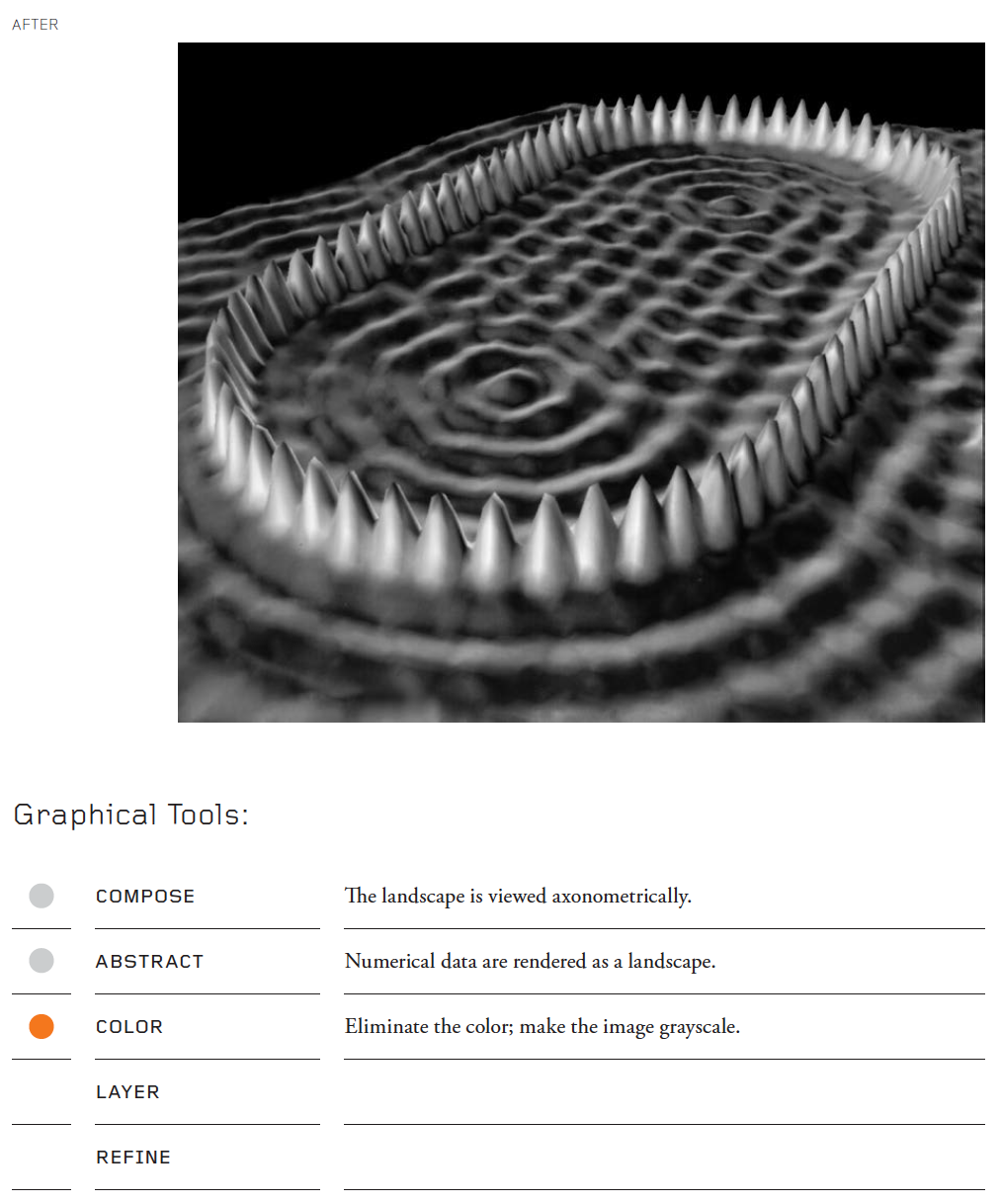
Quantum corral
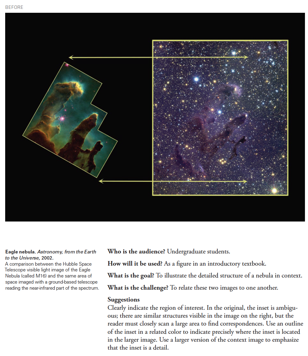
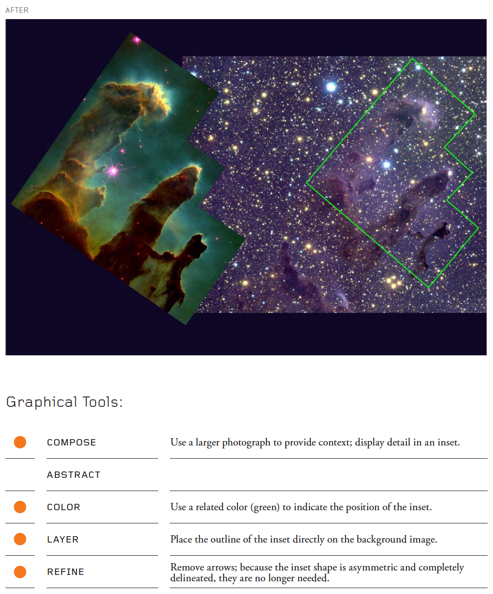
Eagle nebula
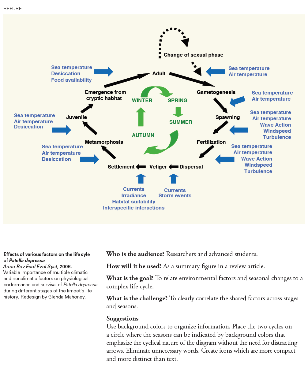
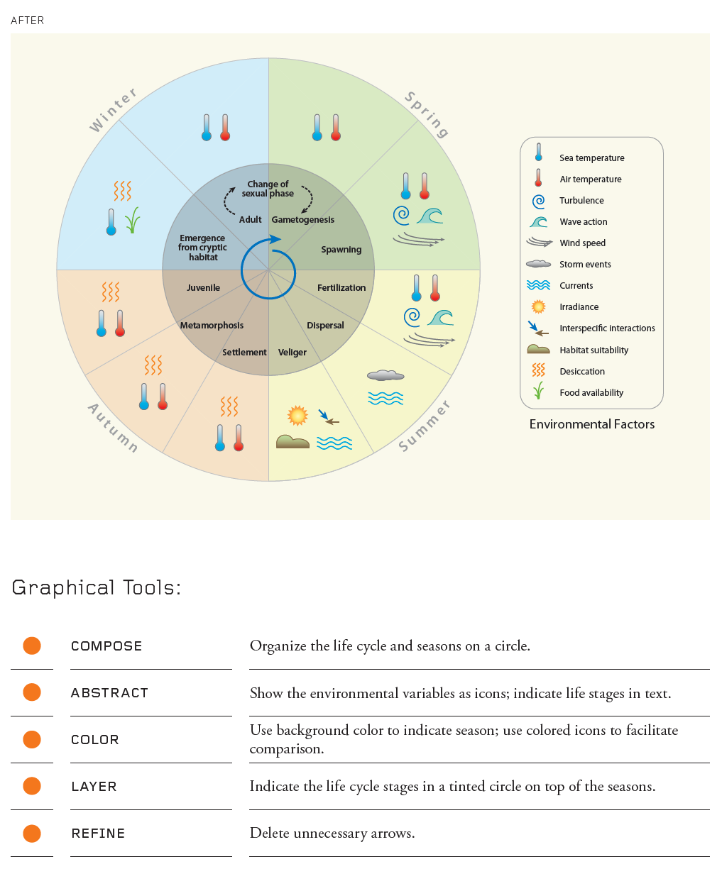
Effects of various factors on a life cycle
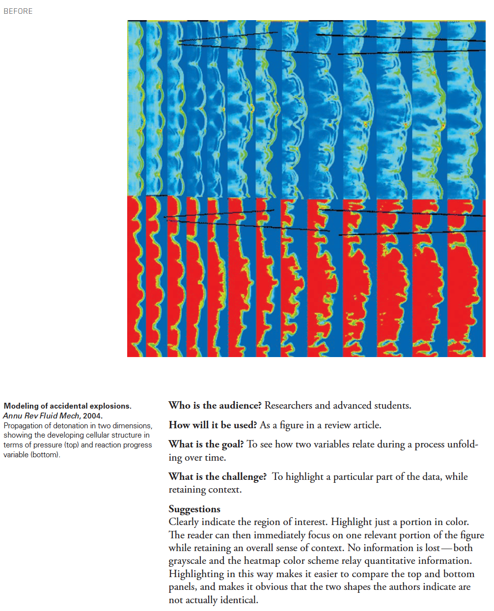
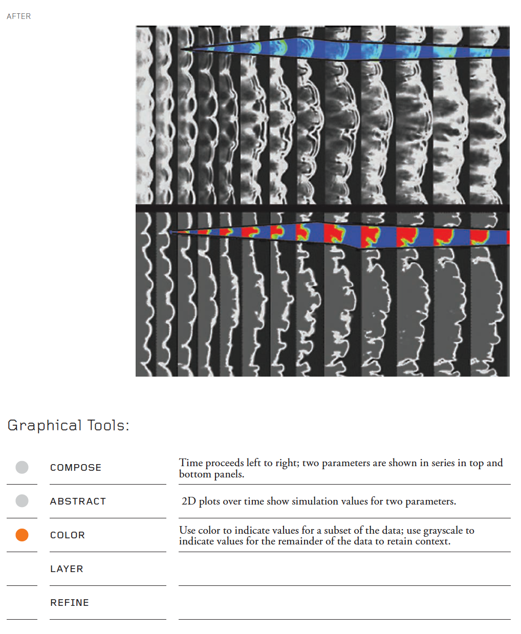
Modeling of accidental explosions
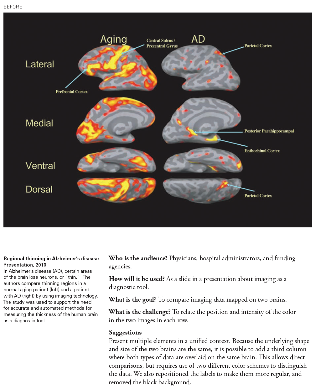
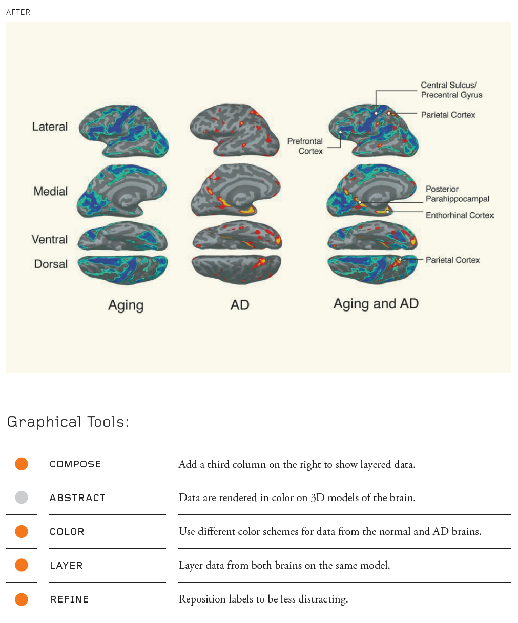
Regional thinning in Alzheimer’s disease