data-viz-workshop-2021
Data graphics: Excellent, good, bad, or weird?
Please classify each of the plot as excellent, good, bad, or ugly.
“The best way to learn how to make effective graphics is by dissecting why some graphics are effective and others are not, and determining how they can be improved.” - by Felice C. Frankel (Author)
1. The asian surge
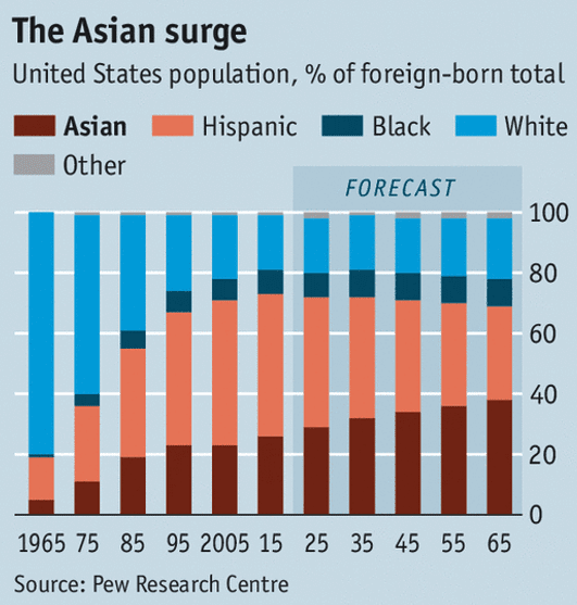
Context (& source): The Economist article titled “The model minority is losing patience” informs that Asian-Americans in the US, a minority considered successful, also face prejudices and discrimination. To study (implicit) the bias and stereotypes against Asians in America, historical mass migration data is analyzed, and probable future projections of the trends are discussed.
Graphic (explanation without interpretation): This plot in the article, with time (years) in x-axis and US foreign-born population distribution (in percentage) in y-axis, presents how the percentage of Asian, Hispanic, Black, and White population has been increasing or decreasing since 1965. Overall, the plot depicts that the percentage of Asians is continuing to increase, compared to the White foreign-born population.
Analysis (our interpretation & critical analysis): The data for this plot has three dimensions (columns): 1) year, 2) % of foreign-born population, and 3) race. Each year, total foreign-born populations is the percentagee sum of all individual foreign-born races. The stacked bar graph here is a fit when one of the dimensions is a fixed-sum type. Intentional de-labeling of the axes is appropriate because they are obvious. Contrasting colors are used for each race for increased clarity. Light (almost unnoticeable) shading of the forecasted data illustrates an extremely confident prediction.
2. Land of the free
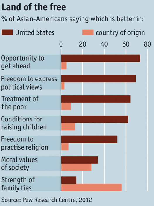
Context: The Economist article titled “The model minority is losing patience” compares the advantage of living in America with living in the country of origin, as reported by Asian-Americans.
Graphic: The graph depicts the comparison between America and other countries across many categories. The x-axis represents the percentage of participants saying that a particular category is better in their home country vs in America. The y-axis represents the various categories in which the comparison is being made. In this case it can be seen that the only category that the participants think that their home country is better in is “strength of family ties”.
Analysis: The graph serves as a salient example of the times when it is appropriate to use clustered bar charts. Here, clustered bars are apt because there are primary variables (opportunity to get ahead, freedom to express political views, etc.) and subcategories (United states and country of origin) and the purpose of this graph is to focus on the comparison between subcategories and to judge their trends. Stacked bar charts are not used because it is useful especially when the purpose of the chart is to focus on the comparison between the primary variables or when the sub-categories have a fixed sum.
3. Household income vs happiness
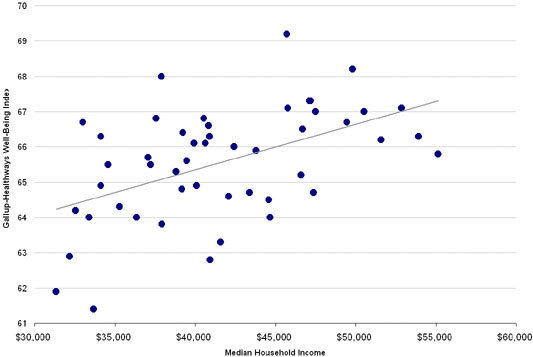
Context: The article “The Happiest States of America” summarizes the survey results and informs that Utah is the happiest state in the US. The Gallup-Healthways well-being index (the metric to access happiness) includes factors like life evaluation, emotional health, physical health, healthy behavior, work environment and basic access — all of which is said to contribute to the happiness of an individual. A reader of the article may be interested to learn what makes a state happy. As an investigation, the authors compared the happiness scores with median state incomes.
Graphic: The scatterplot shows the ‘possible’ positive relationship between a state’s median household income (in x-axis) and its well-being (y-axis). There are 50 dots in the plot.
Analysis: The authors mention as a side note: “The trend line illustrates the positive correlation (although not necessarily causation) between the two measures”. However, the trend line illustrates (makes a reader think) a positive correlation between income and happiness.
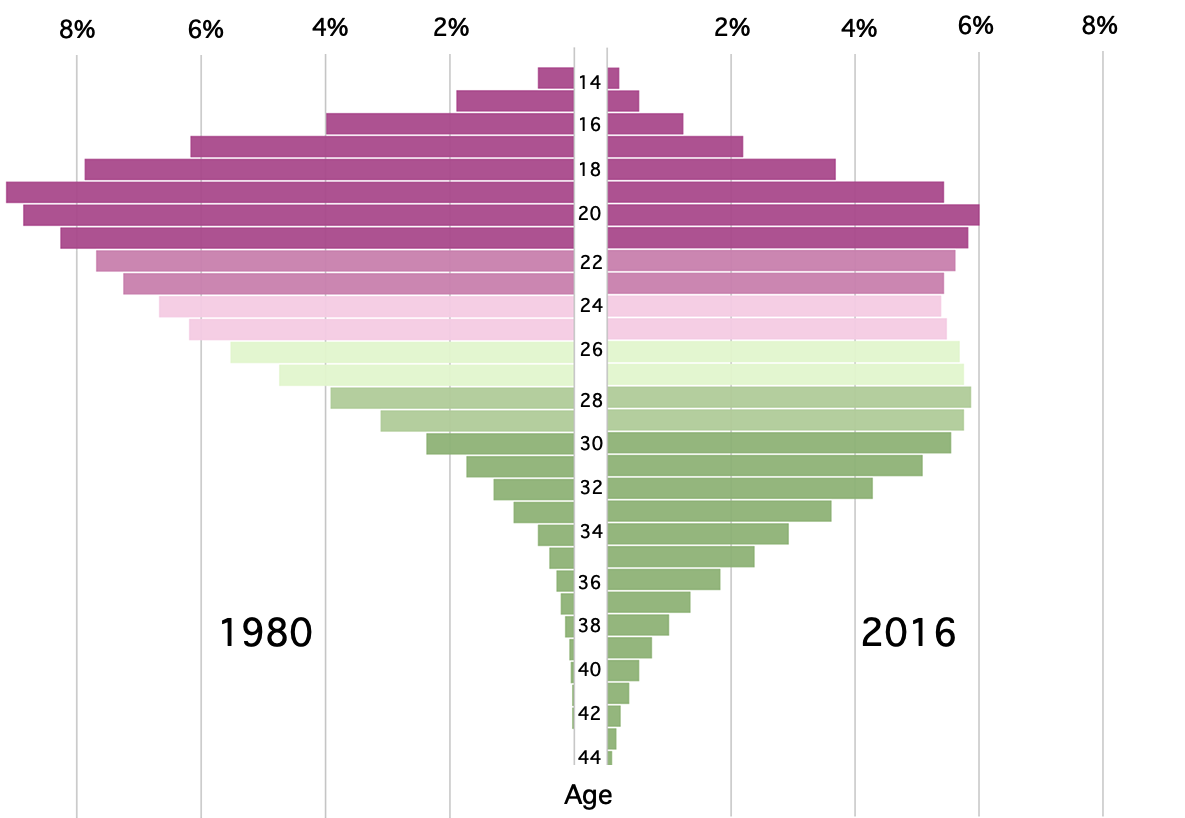
4. The age of a first mother
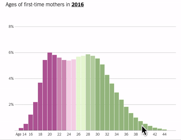
Context: The New York Times article “The Age That Women Have Babies: How a Gap Divides America” analyzes the factors that could influence a woman’s decision regarding the right time for her to beget a baby. It shows how the trend has changed in 2016. The article also talks about the inequality that is rampant in the workforce which forces women to postpone, if not cancel, their plans of giving birth.
Graphic: This is an animated plot. With “age” on the x-axis and the “percentage of women” on the y-axis, the plot shows the change in the distribution of the data in 1980 vs 2016. The moving graphic (video) highlights the contrast (drastic difference) in distribution.
Analysis: The purpose of this plot is to show that the average age of women when they give birth has changed drastically over time. Histogram is a great chart to illustrate this information, because it shows the frequency distribution of the age of women who were first time mothers in 1980. It also shows how the distribution of age differs in 2016 vs 1980. The animation, however, is redundant. Instead, a mirror bar chart would enable the reader to more easily compare and perform detailed analysis.
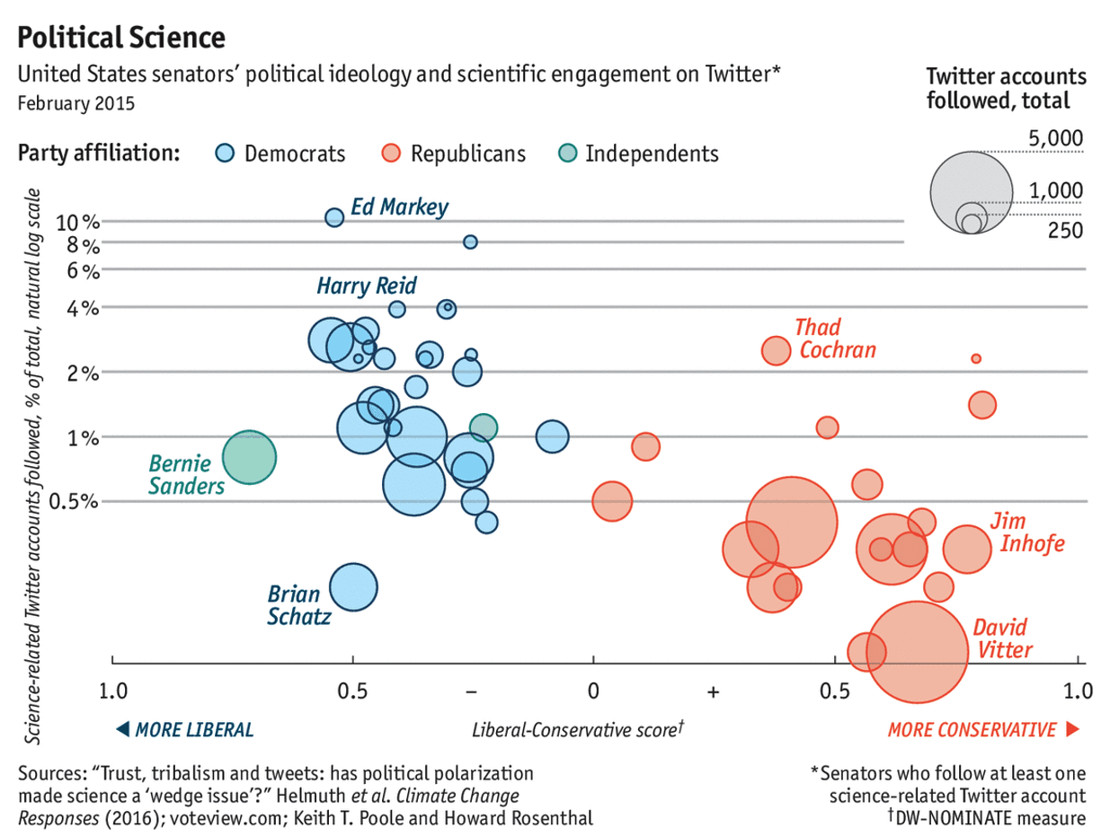
5. The Senate’s scientific divide
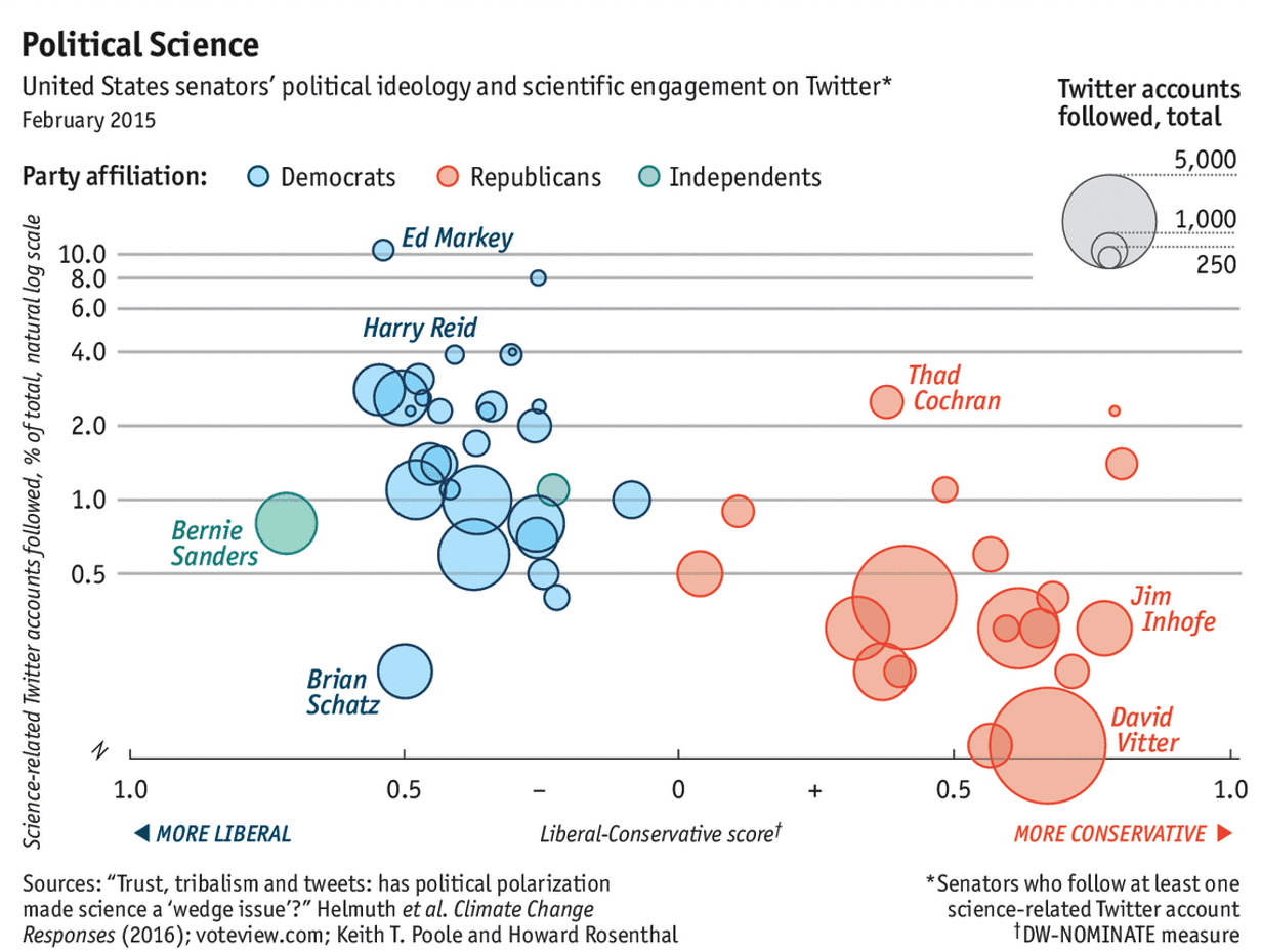
Context: This article in The Economist presents some interesting data about the engagement of senators — regarding science-related news — on their Twitter feed. The article has analyzed the partisan division of the republic and Democratic senators on following the “scientific” twitter accounts such as NASA.
Graphic: The plot, with the “Liberal-conservative score” on the x-axis and the “percentage of science-related accounts followed on Twitter” on the y-axis aims to depict that the Democratic senators are more likely to follow science-related accounts on Twitter than Republican counterparts.
Analysis: This bubble graph visualizes four-dimensional data. A bubble graph is the best choice to illustrate this information because the article tries to show the relationship between three variables: political ideology score, percent of science-related Twitter accounts followed, and ‘total’ followed Twitter accounts (bubble size). The fourth dimension is party affiliation. The author has chosen to use the natural log scale on the y-axis. Had the author used linear scale the plot would look like an exaggeration.
The author’s intention was to convince the readers she/he is actually doing it humbly. The vertically aligned y-axis label is difficult to read. The labels should read left to right (horizontal). Also, it would be easier for a reader if percentage symbols (%) were added next to the y-axis labels.
6. America’s immigration debate
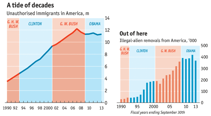
Context: These two graphics are from the article “America’s immigration debate” article in The Economist.
Graphics: They depict the influx of unauthorized immigrants in America from 1990 to 2013 (in the first graph) and the number of deportations done in those years under the administration of respective presidents (in the second graph). Together, these two graphs tell many stories about America’s immigration. When President Clinton and President GW Bush were presidents, the number of illegal immigrants was increasing each year but the illegal alien removal also was increasing steadily. Similarly, when President Obama was the president, the number of illegal immigrants roughly stayed constant but so did the removals.
Analysis: Color bands (blue/red) for years that correspond to the acting president are excellent. The labels are smart. In the first plot, it would be easier for a reader if ‘m’ was replaced with ‘millions’. Data is presented graphically and left for the reader to make interpretations.
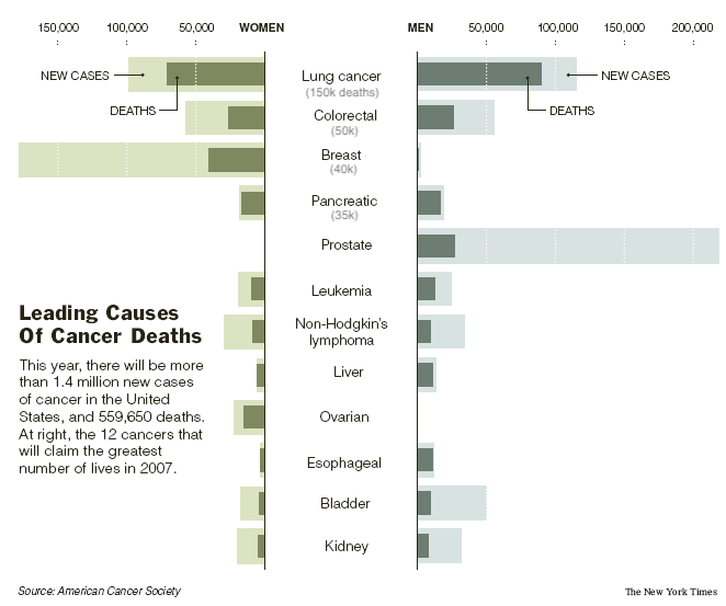
7. Causes of cancer

Context: The article talks about the growing number of men and women who suffered from different types of cancers in the year 2007, while also mentioning the growing number of deaths brought upon by those cancers. NYTimes probably removed the original article containing this graph.
Plot: The mirror bar diagram compares new cases with deaths and men with women.
Analysis: This graphic displays four variables: cancer type, gender, population count, and new case/death. The fourth variable is incorporated in an excellent way. The bars are sorted by the total deaths but it takes a while to figure that out. It would be excellent to include total deaths right below the cancer type in parenthesis and remove the redundant cancer word from all types except the first one as shown here.
8. Career earnings for college graduates
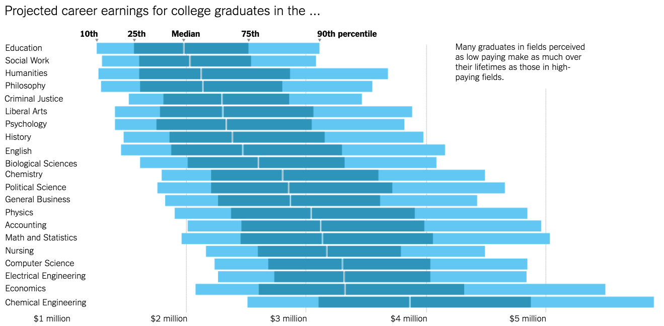
Context: The article “Six Myths About Choosing a College Major” in NYTimes tries to bust the myths about choosing a major in college. It discredits some of the widely-believed myths about choosing majors in colleges such as the saying that choice of major matters more than the choice of college. The author has considered the college students based on their percentiles in any given subject and has projected the lifetime career earnings of students of different percentiles in various majors.
Graphic: The box-plot-like chart shows the central tendency (median) and interquartile ranges across many categories.
Analysis: This graphic is just a different visualization of the standard boxplot. Boxplots when drawn in vertical look clumsy when there are many categories. Reading the category names becomes difficult too. Just the way bar diagrams can be rotated from vertical to horizontal, this plot presents box plots horizontally. This makes it easy for a reader to compare the central tendencies (median). An important takeaway – if you are an economics major, you will earn more even if you are in the bottom 10% – is loud and clear from the visualization. The percentile labels in the first bar is excellent.
9. Advanced learning
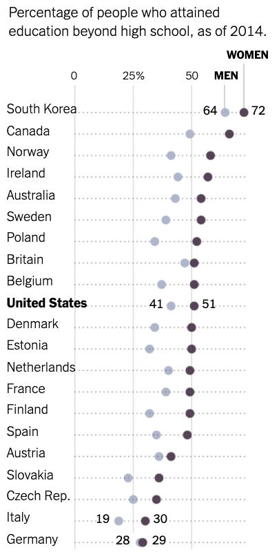
Context: The NYTimes article “Community Colleges Draw From Abroad” highlights that for many American universities and colleges, the world is getting farther away. According to the article, international enrollment in the United States is flat or down after many years when visitors flocked here to learn.
Graphic: Advanced learning (the percentage of people who attain an education beyond high school) is an indicator of the educational success of a country. This dot plot compares the advanced learnings of selected developed countries and shows that South Korea is in the lead. It depicts the comparison, between men and women, of the percentage of people who attained education beyond high school.
Analysis: The author has chosen to use dot plots instead of stacked or grouped bar graphs. When the difference between the two subcategories is very low such as in Germany or Britain, it is easier for a reader to observe the differences if we use a dot plot (as opposed to a stacked bar chart). A dot plot cannot be used when there are more than two subcategories because if they are close/overlapping then the comparison is difficult. But, in this case, a dot plot is appropriate.
10. Airplanes are getting safer than ever before
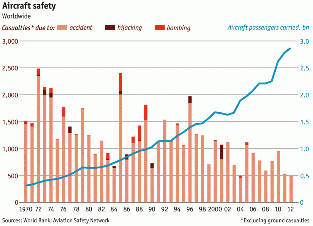
Context: This Economist article “Safe skies” asserts that airplanes are getting safer than ever before despite some rare yet fatal accidents. The purpose of this graph is to show, to a reader, that the number of casualties from airplane-related tragedies such as accidents, hijacking, and bombing has decreased over time, even if the number of passengers has increased.
Graphic: The plot shows the number of airplane casualties (worldwide) over the period of around 40 years.
Analysis: Stacked bar charts to compare the number of different types of airplane-related casualties is a good choice. A line graph (blue line) to observe the number of airline passengers over time is also a good choice. This graphic excellently combines the bar chart and the line graph, making it easier for a reader to make comparisons. Four variables are visualized: time (years), number of casualties, type of casualty, number of passengers carried.
11. Corruption and human development
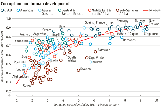
Context: The article “Corrosive corruption” speaks how corruption varies across many countries and groups based on their economy/general standards of living.
Graphic: The graph shows the relationship between the ‘corruption perceptions index’ and ‘human development index’ across groups and several countries.
Analysis: Scatterplot is the default chart choice to illustrate the relationship between two continuous variables. Differentiating countries by colors make it easier to read. Putting the trend line at the back emphasizes the data and not the interpretation. Although the R2 value is low, the trend is quite clear from the data. Mentioning in the x-axis that ‘10=least corrupt’ is smart to avoid any potential confusion.
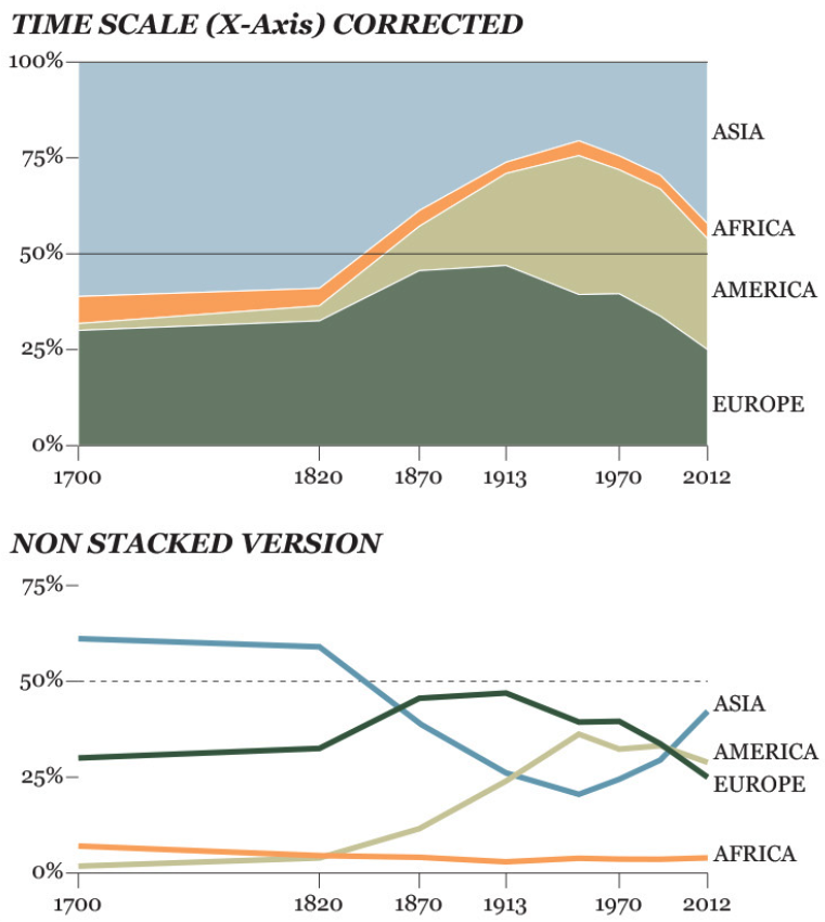
12. Europe’s GDP decrease
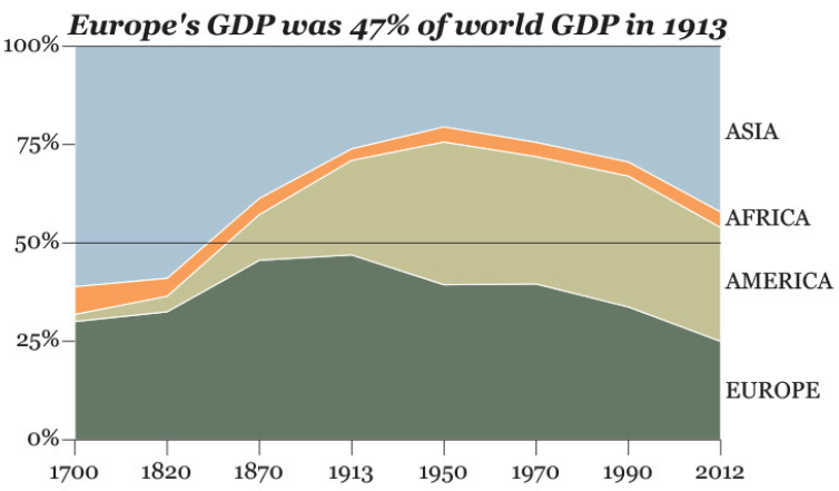
Context: In his book “Capital in the Twenty-First Century”, Thomas Piketty focuses on wealth and income inequality in Europe and the United States since the 18th century. The book’s central thesis is that when the rate of return on capital (r) is greater than the rate of economic growth (g) over the long term, the result is a concentration of wealth, and this unequal distribution of wealth causes social and economic instability.
Graphic: In this graphic, Piketty shows how Europe made 47 percent of world GDP in 1913 and it went down to 25 percent in 2012.
Analysis: The sky blue color used to show the trend of Asia is almost ignored by a reader – it looks like sky. The time range between 1700 and 1820 is squeezed. This is an incorrect practice. A line graph would be more appropriate, with a darker hue for Europe and lighter for others.
13. How the virus transformed the way americans spend their money?
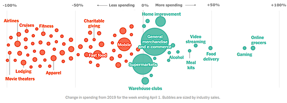
Context: The article “CoronaVirus US Economy Spending” speaks how the virus affected Americans spending in various industries.
Graphic: In this bubble chart, each bubble represents a spending category. The diameter of the bubble represents the industry sales for the corresponding category. The horizontal axis represents the percentage change in credit and debit card purchases. Each consumer category has a total sales value (represented by the bubble’s diameter) and a percentage change in Y purchases.
Analysis: The percentage change in Y purchases having negative percentages (63 categories) indicating a decline in purchases and positive percentages (17 categories) indicating increases in purchases. These percentage changes determine the location of the category bubbles on the number line, with positive changes representing more spending shown as green bubbles and negative changes representing less spending shown as orange bubbles. The chart conveys the graphic designer’s intention to show that ‘small scale industries are most affected due to the virus.
14. The World Cup’s big guns % of team’s runs scored by top scorer
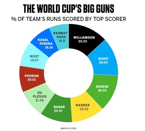
Context: The article “Williamson is so valuable to New Zealand” talks about the outstanding contributions of Kane Williamson’s and why Williamson is so valuable to New Zealand by showing his scores contribution to his team.
Graphic: In this Donut chart, each portion or pie represents the world’s top cricket player’s contribution of their score to their International cricket team’s score. This donut chart shows that Kane Williamson made the highest score contribution to his team, and thus he is the most valuable player to New Zealand.
Analysis: Pie charts or donut charts are generally bad, but you can use them if you’re showing parts of something that add up to 1 (or 100%). I don’t know what the graphics designer was thinking; maybe they recalled that the pie chart best suited for percentages data. Here the data does not add up to 100%. The sectors of the pie don’t represent mutually exclusive and collectively exhaustive parts of anything. Overall, this is an incorrect way of visualizing data.
15. Tesla’s stock trend looks like what Netflix did a decade ago
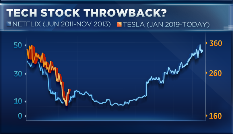
Context: The article “Tesla and Netflix share similarity” talks about how Tesla’s downfall in 2019 looks similar to that of Netflix shares from 2011-2013.
Graphic: The objective of the chart is to show the similarity of Tesla and Netflix stocks. Tesla’s stock in 2019 looks very similar to Netflix’s stock performance in 2011. The x-axis has different timelines June 2011 - Nov 2013 and Jan 2019 - Today. The graph with the orange line is related to teslas stock plotted against the x-axis line Jan 2019 - Today, and the blue line is the Netflix line graph with the x-axis being June 2011 - Nov 2013. The Y-axis has two scales, the left side of the axis starting with 0 and the right y-axis starting scale with 160.
Analysis: This is an excellent example of “data mining,” where you look for some pattern that fits the pattern that you see now so that you can extrapolate to make some random prediction. And if you look at the two lines that have been stretched and overlaid to make it seem like they overlap, they haven’t even done an excellent job of that - it’s hard to see how the two lines are similar. Now leave the bad data aside, and let’s stick to the visualization - What’s with the background? The shadows of the lines? The overall UX? The selective axes labels (0-10-30-50 on the left).
Content contributors:
Badri Adhikari, Sijal Dhakal, Bikash Shrestha, and Amulya Reddy Lakku.