data-viz-workshop-2021
Graphical excellence
Get used to not just seeing or looking at visualizations but to reading them.
Excellence in statistical graphics consists of complex ideas communicated with clarity, precision, and efficiency. Graphical displays should
- show the data
- induce the viewer to think about the substance rather than about methodology, graphic design, the technology of graphic production, or something else
- avoid distorting what the data have to say
- present numbers in a small space
- make large data sets coherent (logical and consistent)
- encourage the eye to compare different pieces of data
- reveal the data at several levels of detail, from a broad overview to the fine structure
- serve a reasonably clear purpose: description, exploration, tabulation, or decoration
- be closely integrated with the statistical and verbal descriptions of a data set.
Graphics reveal data.
Graphics can sometimes be more revealing than conventional statistical computations.
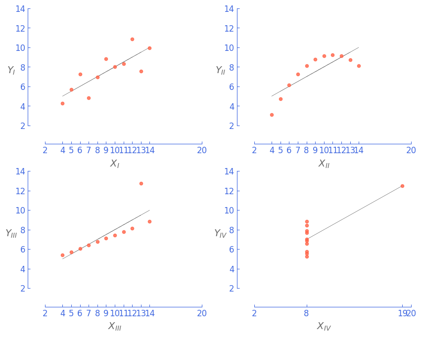
Consider Anscombe’s quartet: all four of these data sets are described by the exact same linear model (at least until residuals are examined).
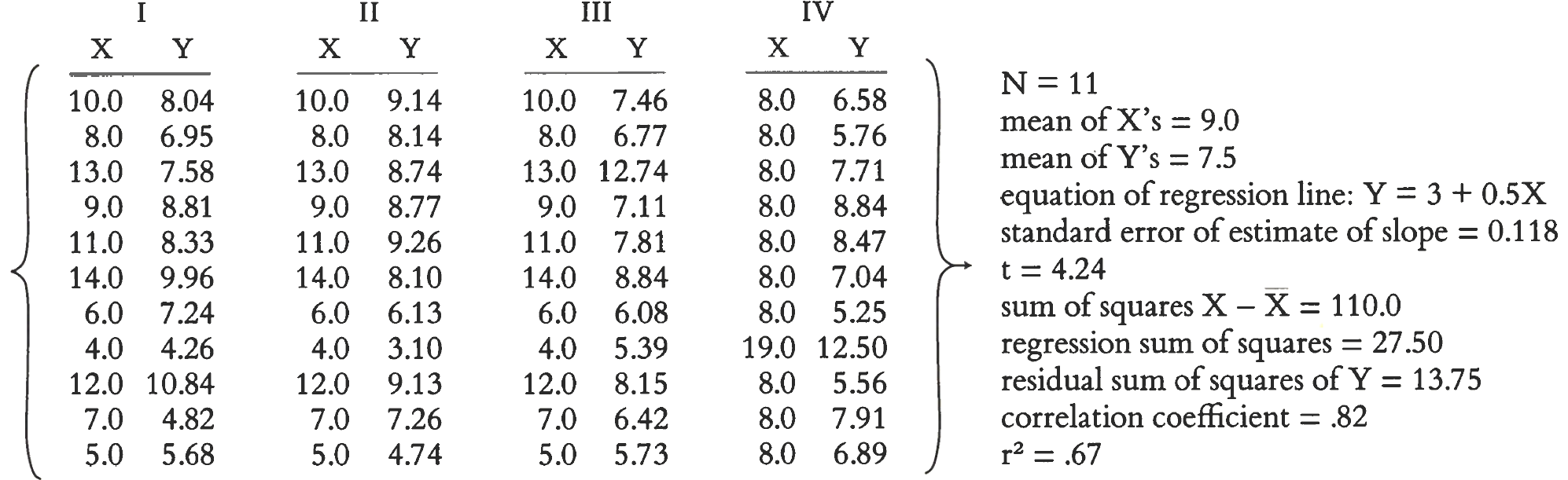
And yet, how they differ, as the graphical display of the data makes vividly clear.
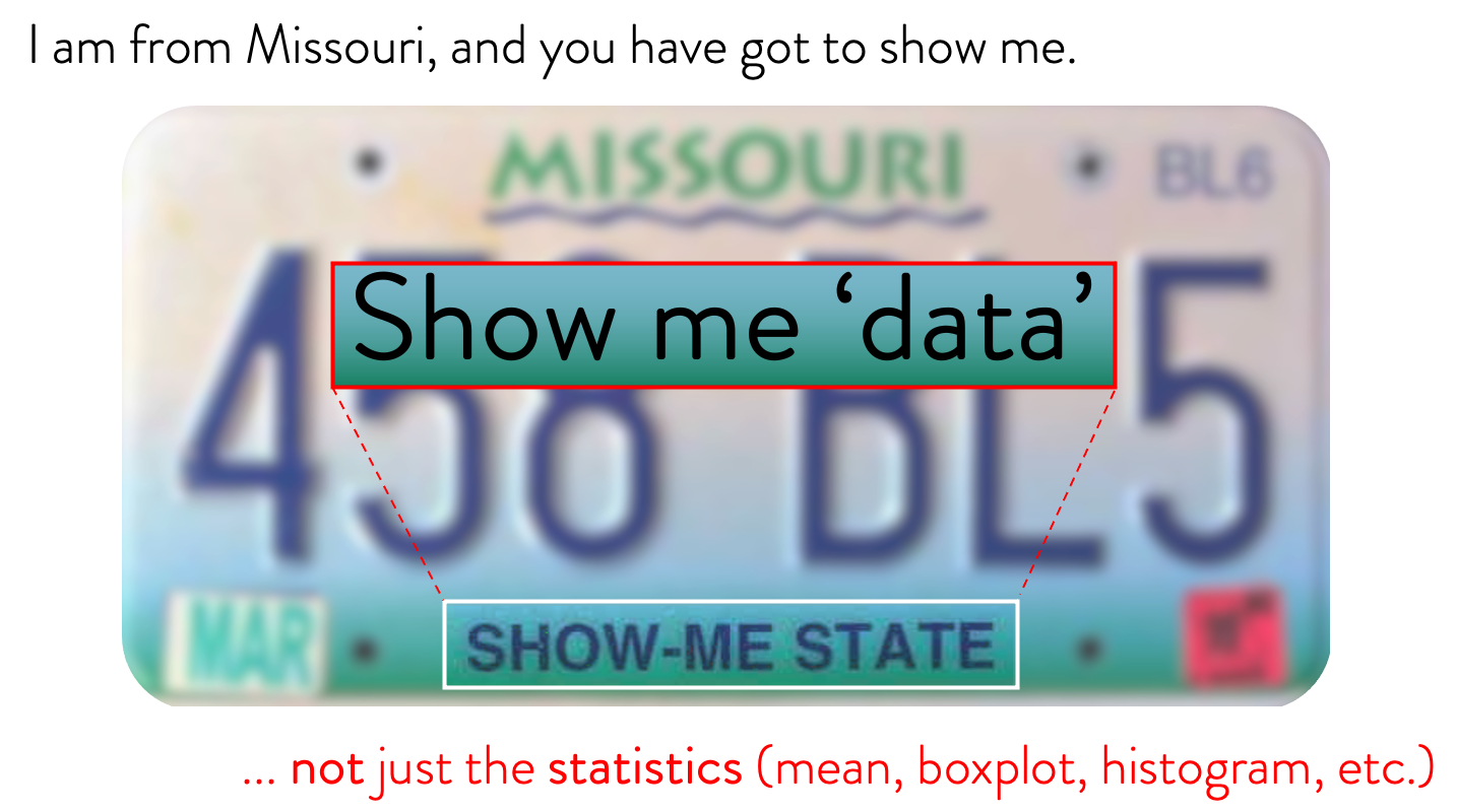
Show the data, not just the statistics. Here is something that will help you remember this.
Of course, just like statistical calculations, statistical graphics are only as good as what goes into them. No matter how clever or fancy, an ill-specified or preposterous model or a puny data set cannot be rescued by a graphic (or by calculation). A silly theory means a silly graphic:
Graphical excellence can almost never be obtained without multivariate data – data maps, time-series, space-time narrative designs, and relational graphics.
Graphical excellence is efficient communication of complex ideas.
Why waste the power of data graphics on simple linear changes,
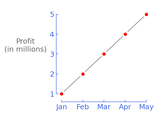
which can usually be better summarized in one or two numbers?
Instead, graphics should be reserved for richer, more complex, more difficult statistical material.
Even in the field of artificial intelligence, the leaders are realizing that the entire field is taking the wrong approach - model-centric. Professor Andrew Ng explains how/why here.
“Focus on the data, not the model.” - Andrew Ng
1. Philip’s curve
A Phillips curve graphic shows the relationship between rates of unemployment and corresponding rates of rises in wages that result within an economy. The original hypothesis was that decreased unemployment (i.e., increased employment levels) in an economy would correlate with higher wage rises – implying an inverse relationship.
We are used to seeing temporal information (months, years, etc.) in the x-axis. In a Philips curve, this is not the case.
The “Philips curve” plots (inflation and unemployment rates plots) for nine countries below clearly ‘collapses’ the idea of an inverse relationship between the two variables.
If you read the curves for all the nine countries you will see that the variables in the x-axis and y-axis are not inversely related.
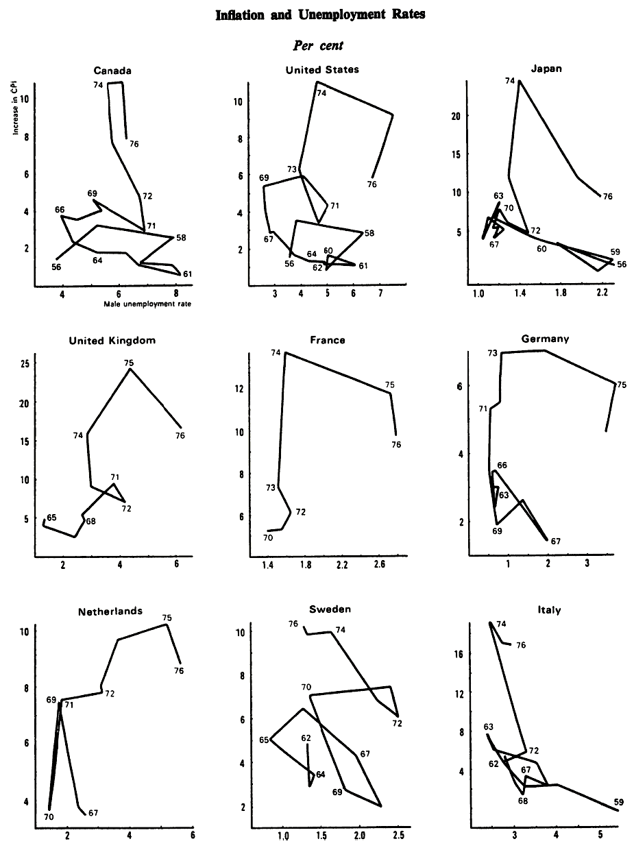
Unconventional graphics can be excellent too.
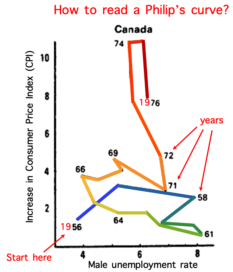
In case you were wonderdring, here is how to interpret/read the Philip’s curves above.
2. Principles of graphical excellence
Graphical excellence is the well-designed presentation of interesting data – a matter of substance (domain/discipline), of statistics, and of design. Source: TVDQI.
Graphical excellence consists of complex ideas communicated with clarity, precision, and efficiency.
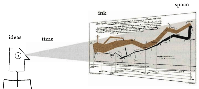
“Graphical excellence is what gives the viewer the greatest number of ideas in the shortest time with the least ink in the smallest space.”
Graphical excellence is nearly always multivariate.
And graphical excellence requires telling the truth about the data.
"Get it right or let it alone. The conclusion you jump to maybe your own." - James Thurber.