data-viz-workshop-2021
Typical methods for visual display of quantitative information
1. Tables
A table makes it easy to look up individual values. If a display is used to look up individual values, a table may be appropriate. A table also makes it easy to compare individual values. However, it does not easily allow us to compare entire series of values to one another. Here is an example:
My colleagues sometimes share with me that their manuscript/report/proposal contains only tables and would like to convert some of the tables to graphics. They feel that their document ‘must’ have some graphics too. I have also shared these thoughts about my documents.
If the readers need to use the table as a ‘lookup reference’ and imagine that they will frequently want to compare individual values, then such data should be kept as tables. Graphs are helpful mainly for comparing entire/overall trends.
Naomi Robbins memorably explains this. Graphs are for the forest, and the tables are for the trees. Graphs give you the big picture and show your trends; tables give you the details. Graphs may be used with most media: paper, projection screen, or computer screen. Large tables, on the other hand, do not work well on projection screens. When you can, show both, or keep the table as supplementary material.
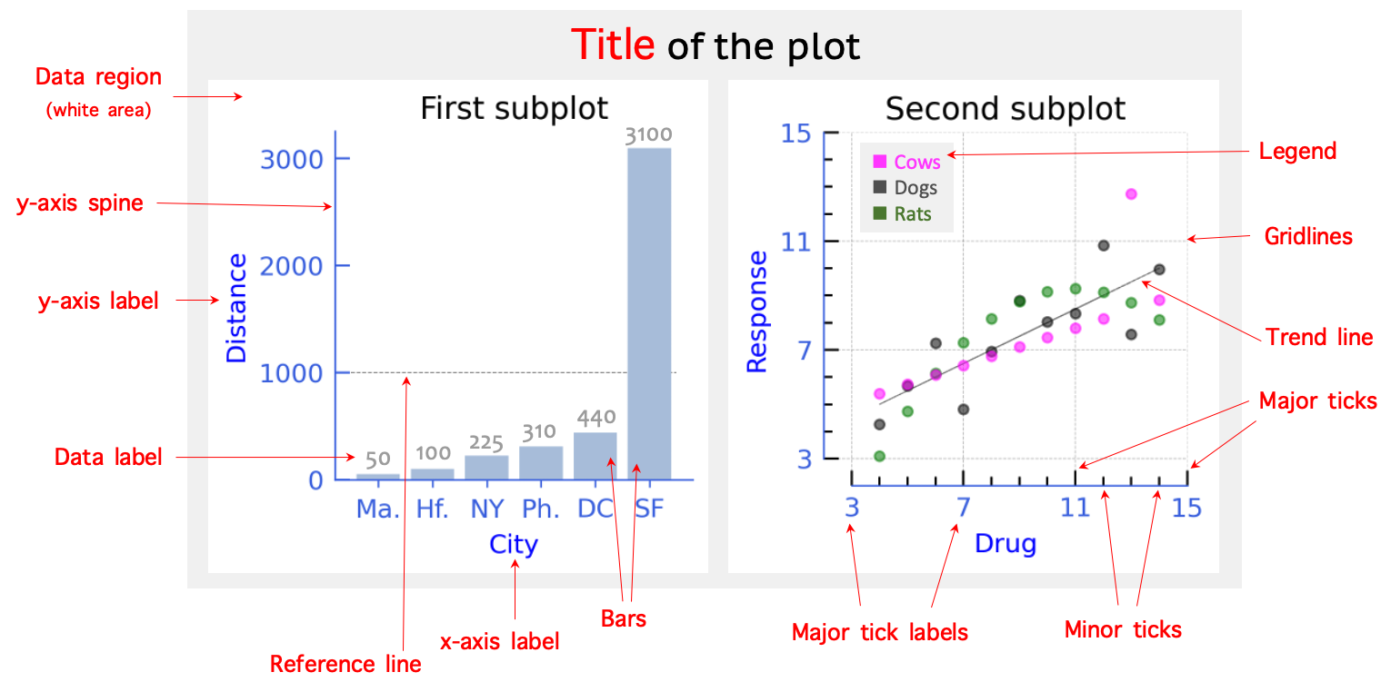
2. Parts/anatomy of a graph
3. Strip plot & jittering
A strip plot shows the distribution of data points along a numerical axis. Other synonymous names for strip plots are one-dimensional scatterplots, one-dimensional data distribution graphs, and point graphs.
Strip plots are sometimes used in the margins of two-dimensional displays to show the distribution of each variable separately.
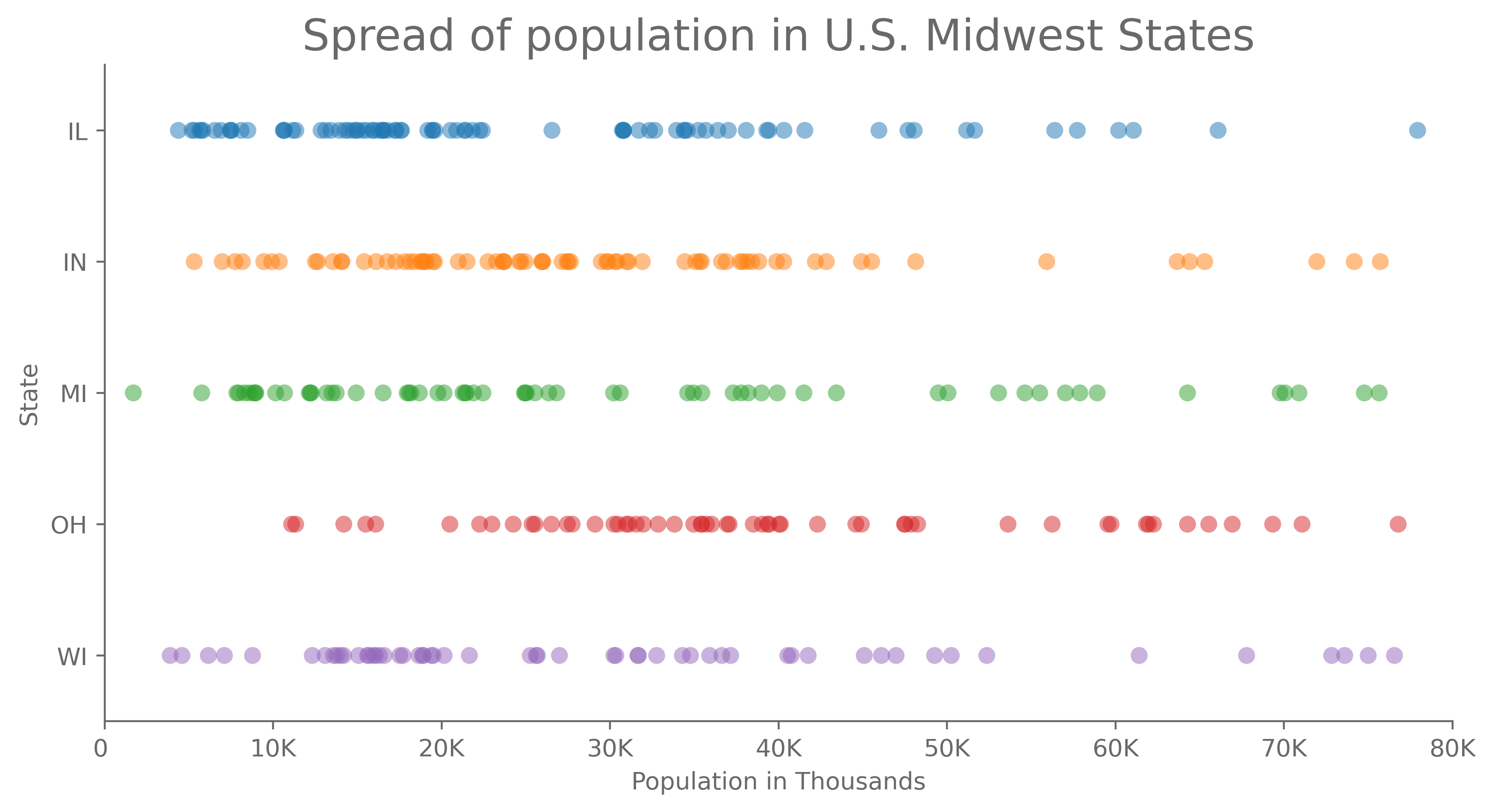
To make the data points distinguishable, we add random noise to the data before plotting. This technique, called jittering, moves the data points a small random amount from their original positions to no longer overlap.
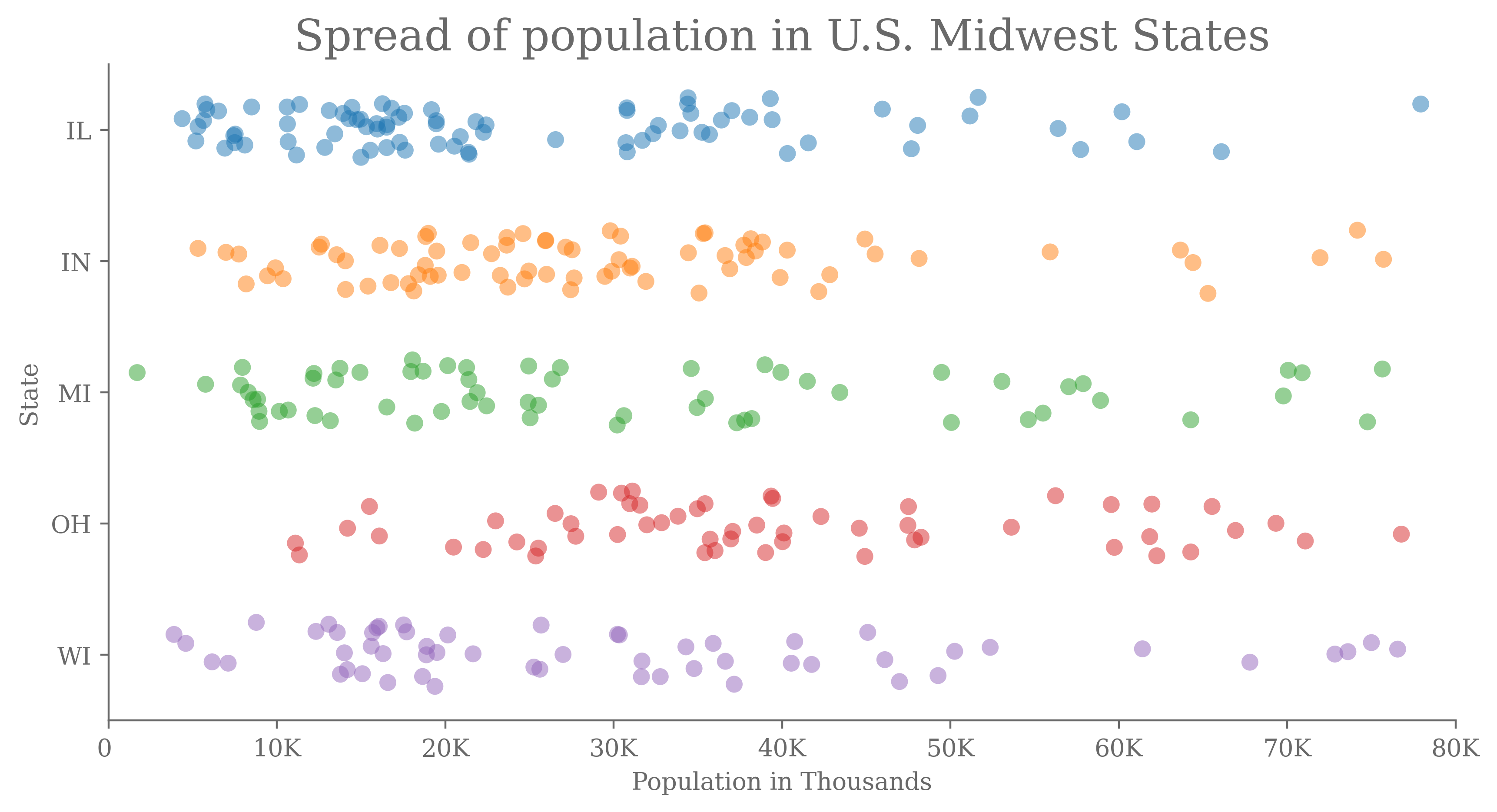
Jittering fixes overlapping points.
4. Dot Plot
Dot plots were introduced by Cleveland (1984) after extensive experimentation on human perception and our ability to decode graphical information. Dot plots use judgments of position along a common scale and are effective.
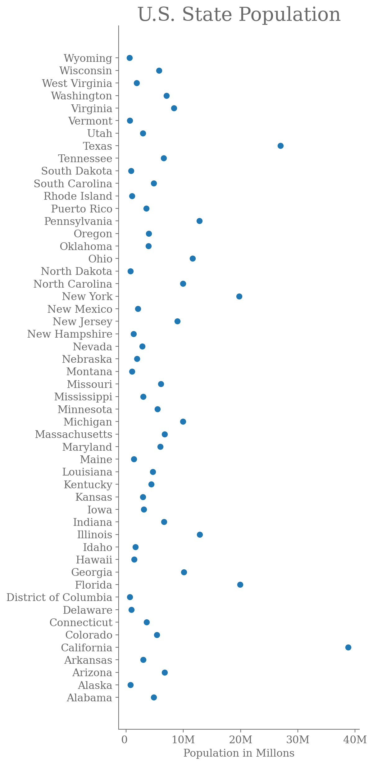
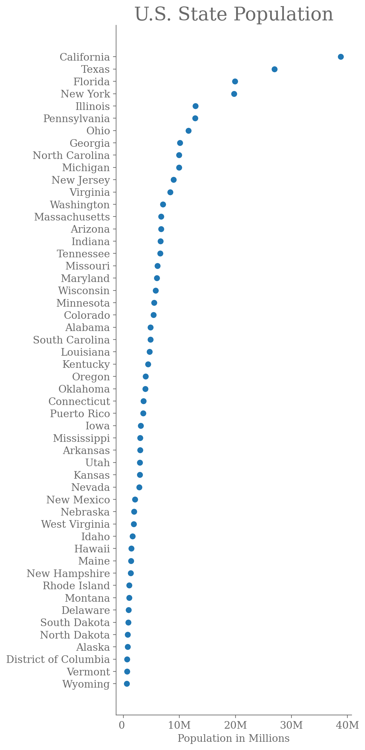
Suppose we use a dot plot instead of a horizontal bar diagram. In that case, it is easier for a reader to see the difference when the difference between the two adjacent subcategories is very low.
Alphabetical order of dots is rarely the most effective way to display data. A better way is ordering by size/values.
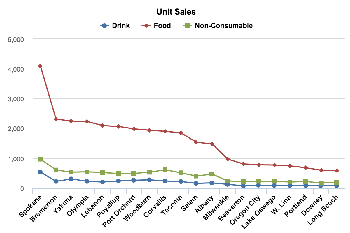
5. Bar/column chart/graph
The classic bar chart uses horizontal or vertical bars (column charts) to show discrete, numerical comparisons across categories. One axis of the chart shows the specific categories being compared, and the other axis represents a discrete value scale. They are best used to show change over time, compare different categories, or compare parts of a whole.
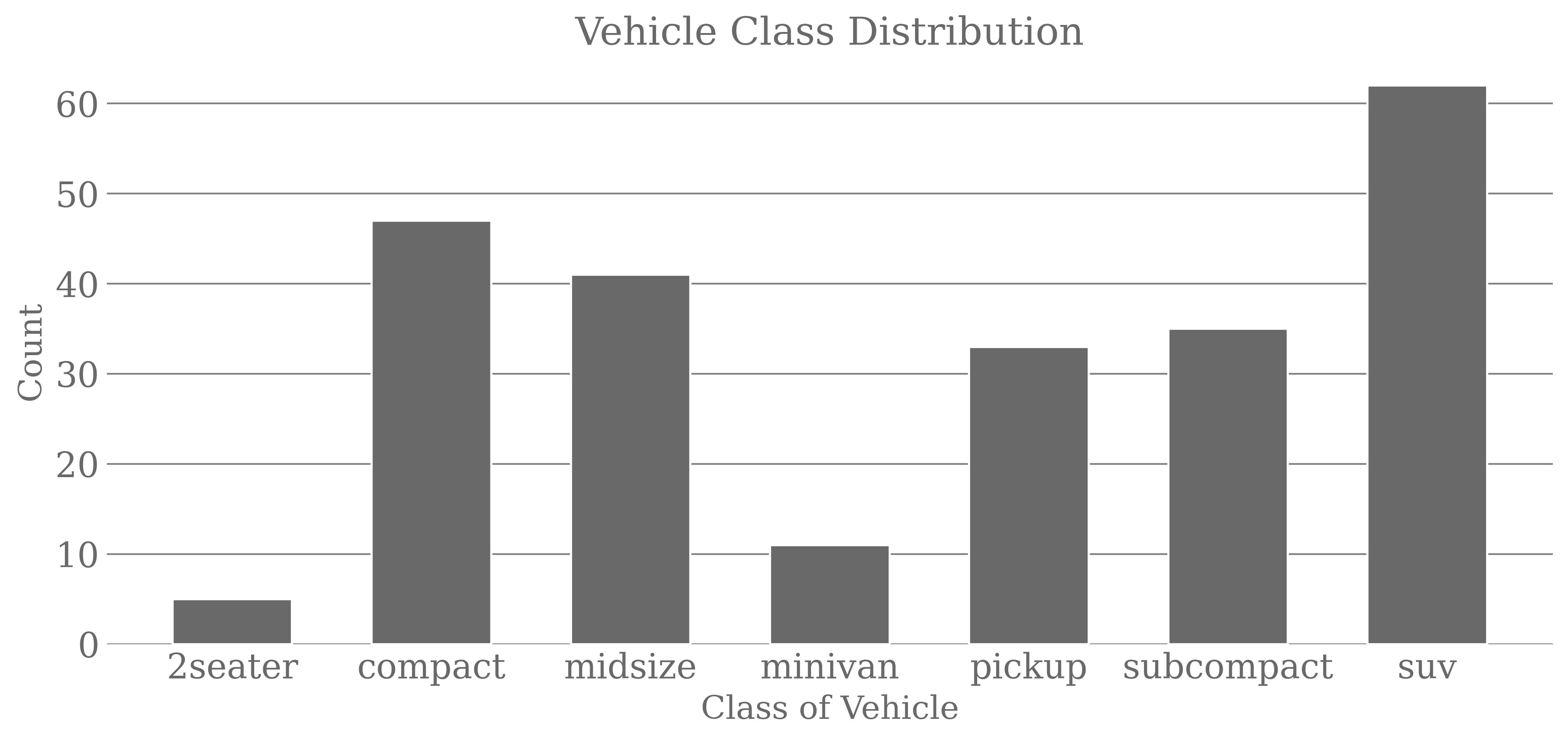
When there are more categories or names of categories are long, switch to a horizontal bar chart.
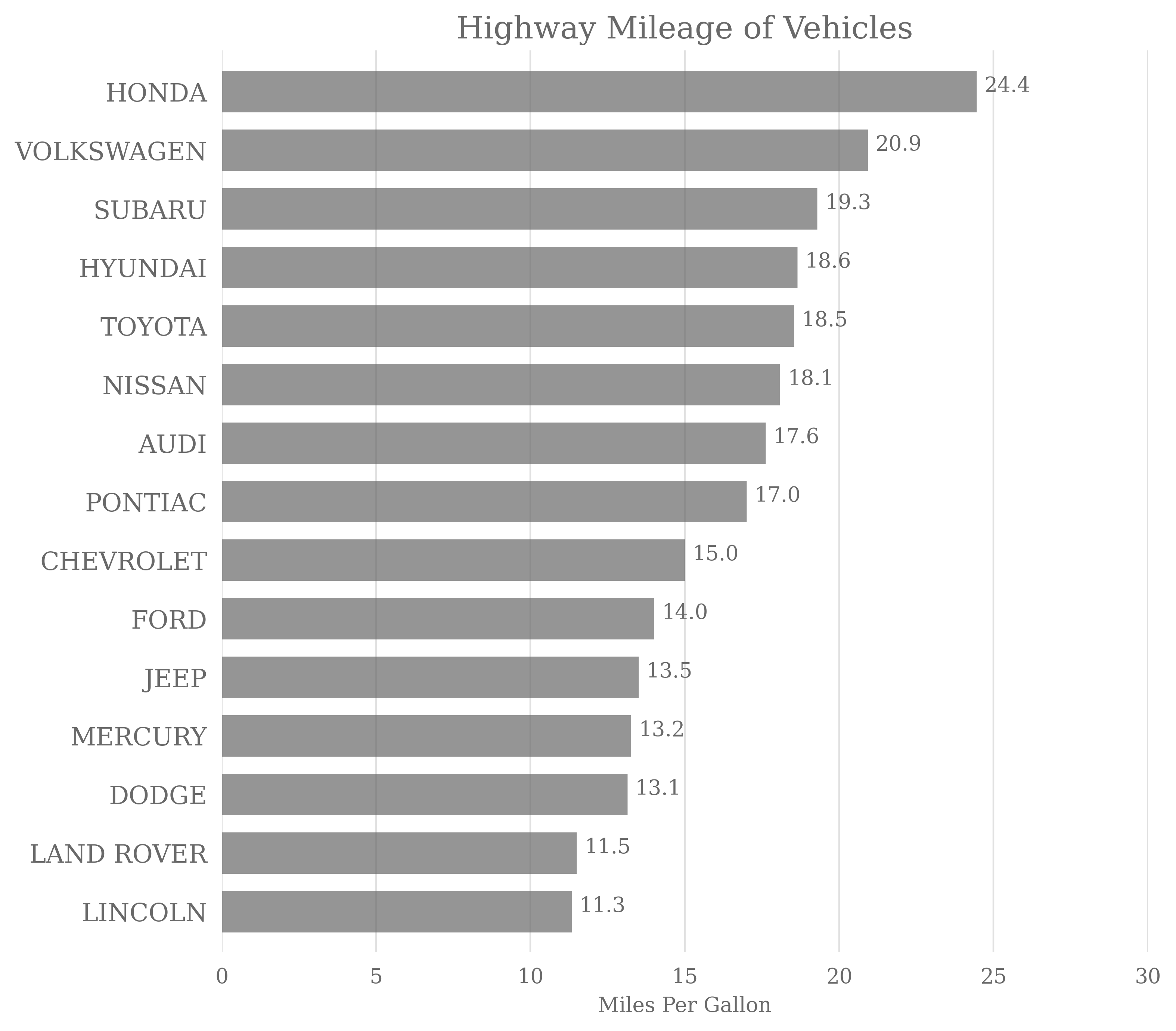
They give you lots of space for showing the name of each category without having to turn the bar labels sideways. In a horizontal bar diagram, the y-axis spine (or the vertical axis) can be dropped because the left alignment of the bars makes it evident that they share the same baseline.
6. Histogram
A (column) histogram visualizes the distribution of data over a continuous interval or specific period. To draw a histogram, the data are grouped into bins or intervals. Each bar in a histogram represents the tabulated frequency at each interval/bin. Histograms help estimate where values are concentrated, what the extremes are, and whether there are any gaps or unusual values. They are also helpful in giving a view of the probability distribution.
Histograms do a reasonable job of showing the shape of one data set but are not very useful for comparing distributions.
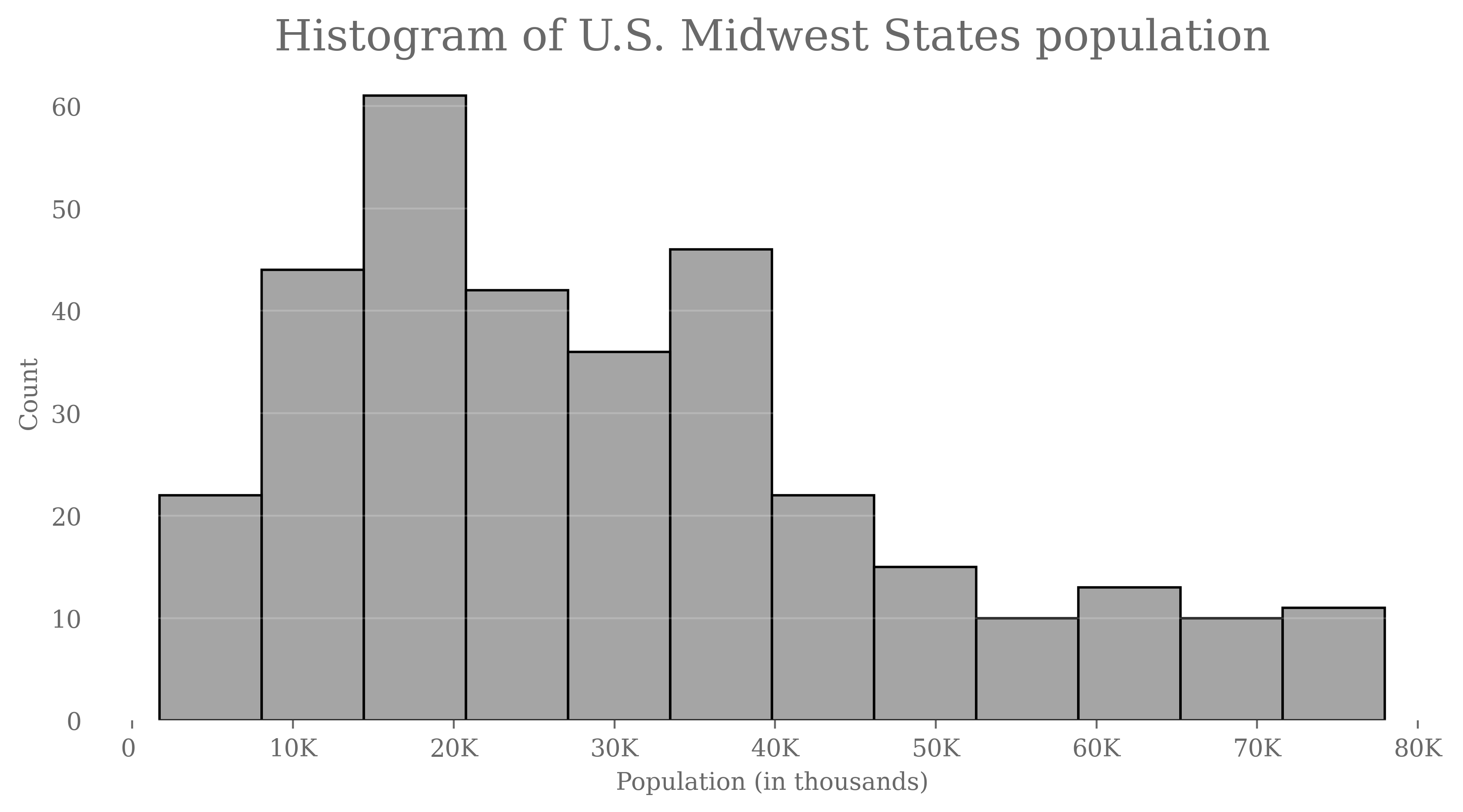
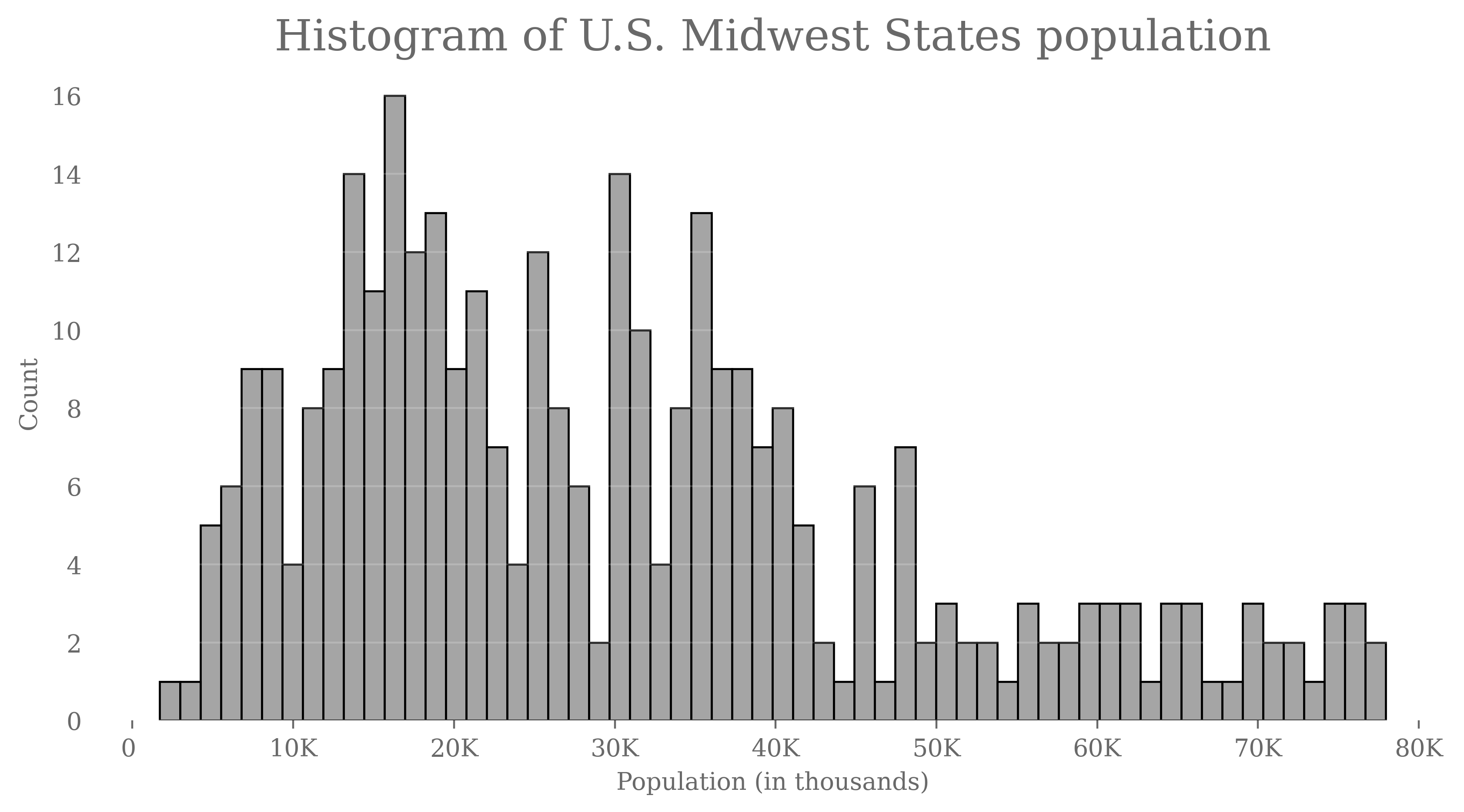
Column histograms are mainly used when there are only a few data points. In the case of many points, use a line histogram.
A stacked line histogram:

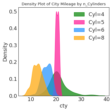
7. Density plot
A density plot visualizes the distribution of data over a continuous interval or period. This chart is a histogram variation that uses kernel smoothing to plot values, allowing for smoother distributions by smoothing out the noise. The peaks of a density plot help display where values are concentrated over the interval.
An advantage density plots have over histograms is that they’re better at determining the distribution shape. They’re not affected by the number of bins used (each bar used in a typical histogram).
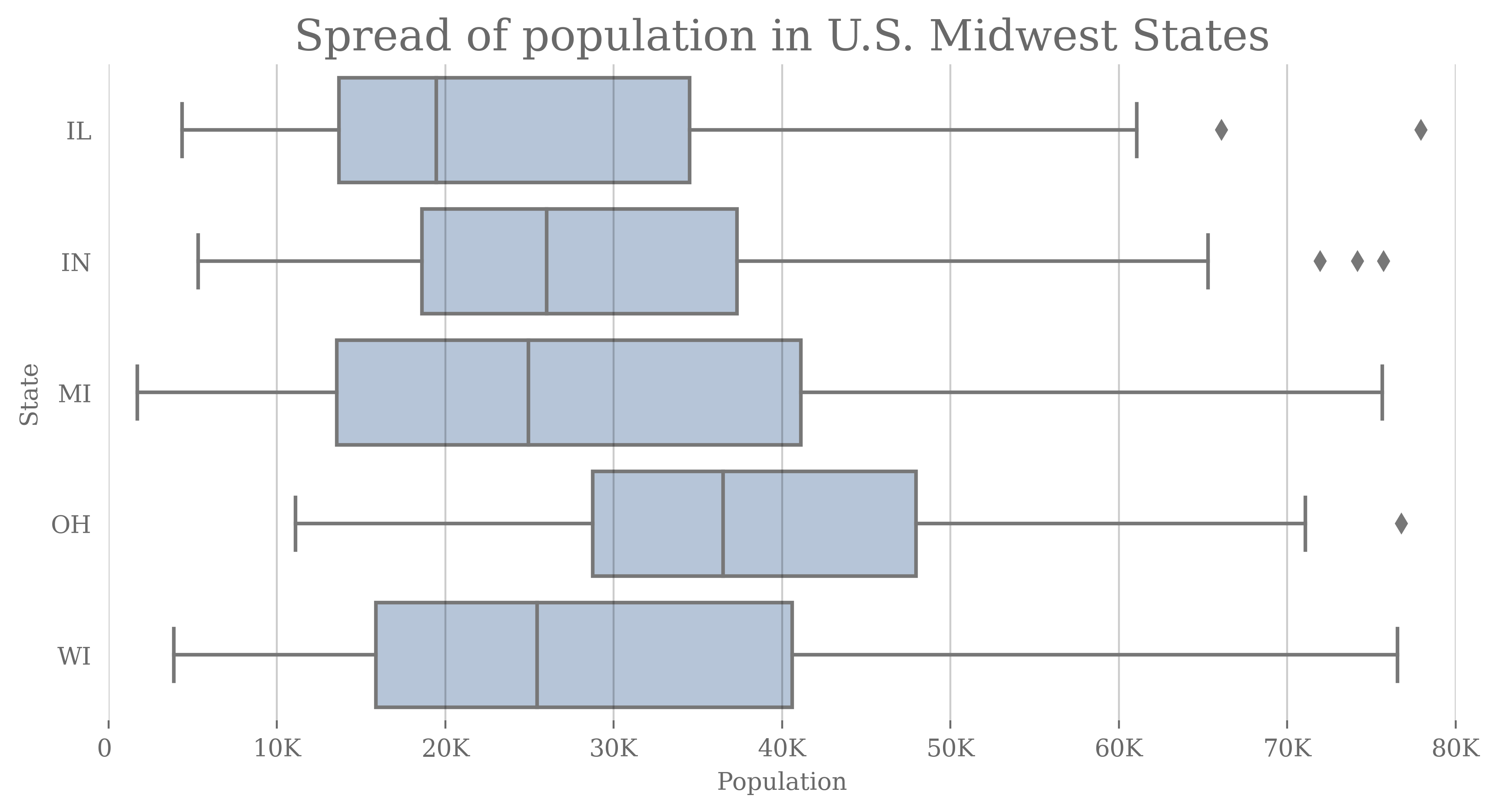
8. Box (whisker) plot
A box plot shows the maximum, minimum, median, first quartile, and third quartile of your data. Any data not included between the whiskers (between maximum and minimum) are be plotted as outliers.
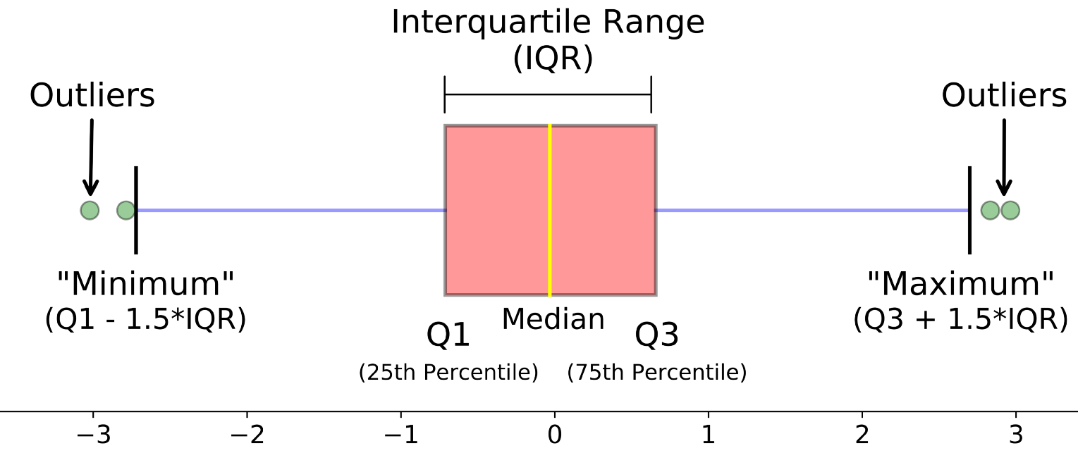
Boxplots don’t have to be vertical. Here is an example.
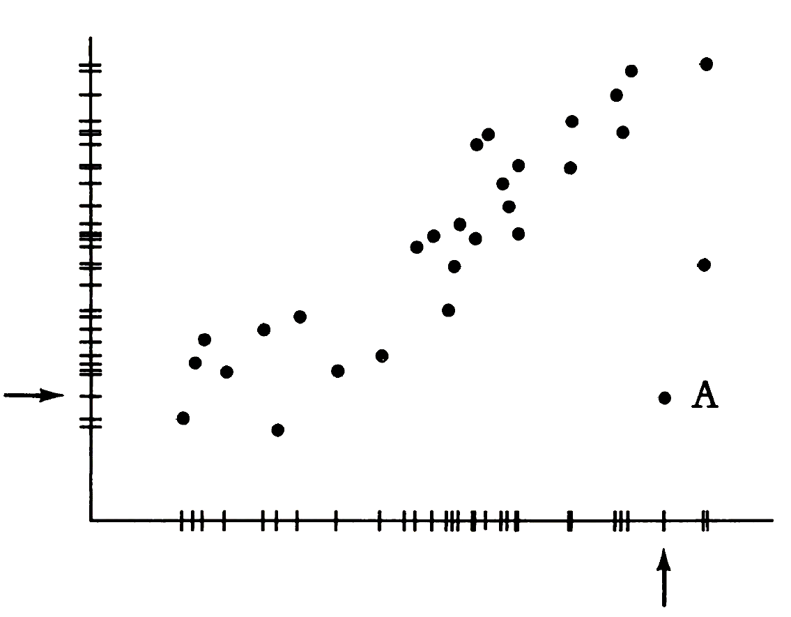
9. Scatter plot/chart
Scatter charts are primarily used for correlation and distribution analysis. They are used for showing the relationship between two different variables where one correlates to another (or doesn’t).
Scatter charts can also show the data distribution or clustering trends and help you spot anomalies or outliers. Here is an example.
Scatter plots can also be plotted with marginal distributions—known as dot-dash-plot or joint-plot.
A dot-dash-plot or joint-plot shows marginal and joint distributions together. The frames/axes of a scatter plot can be turned into data by framing the bivariate scatter with the marginal distribution of each variable. The dot-dash-dot plot combines the two fundamental graphical designs used in statistical analysis: the marginal and bivariate distributions. Source: Tufte’s TVDQI.
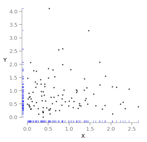
Draw a joint plot instead of a plain scatter plot when you can.
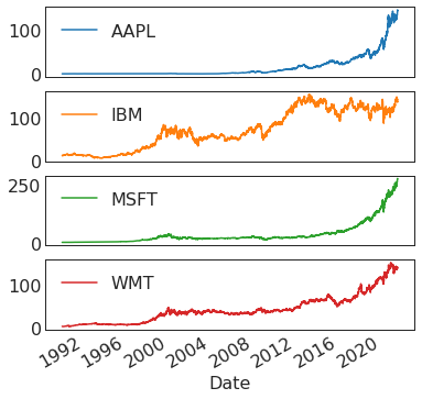
10. Line graph
Line graphs are used to display quantitative values over a continuous interval or time period. A line graph is mostly used to show trends, i.e., how the data has changed over time. Typically, the y-axis has a quantitative value, while the x-axis is a timescale or a sequence of intervals. When grouped with other lines (other data series), individual lines can be compared. The line’s journey across the graph can create patterns that reveal trends in a dataset.
Display negative values below the x-axis.
When grouped with other lines (other data series), individual lines can be compared to one another.
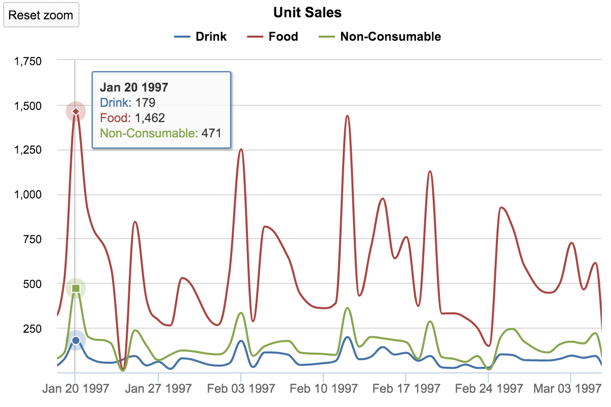
Avoid using more than 3-4 lines per graph. This makes the chart cluttered and harder to read. Instead, divide the chart into smaller multiples (have a small line graph for each data series).
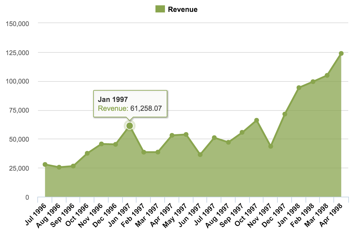
11. Area graph
Area graphs are line graphs but with the area below the line filled in with a specific color or texture. Like line graphs, area graphs are used to display the development of quantitative values over an interval or time period. They are most commonly used to show trends rather than convey specific values.
12. Month/cycle plots
A cycle plot is used to visualize how a trend or a cycle correlates with the day-of-the-week or the month-of-the-year evolved. A cycle plot captures how values have advanced over a period. This chart type is beneficial for identifying certain intervals or periods in which the best results are recorded. For example, we can use a cycle plot to determine which were the most profitable time slots on Fridays, Saturdays, and Sundays when our store had the highest number of visitors. Plotting all the subseries on the same graph lets us see how changes in a subseries compare with the overall data pattern.
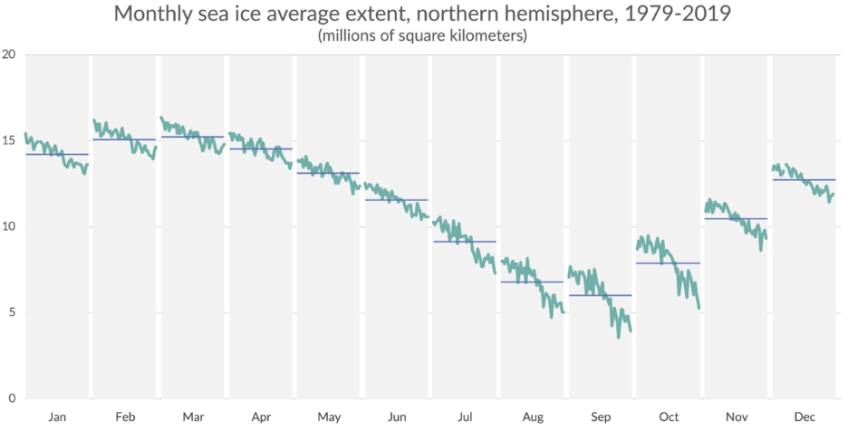
Cycle plots allow us to see the behavior of subseries.
13. Violin chart/plot
Violin chart is often used to compare the distribution of the subcategories of qualitative variables. It can also be used to compare the distribution of charts over time.

The violin plot below shows the relationship of feed type to chick weight.
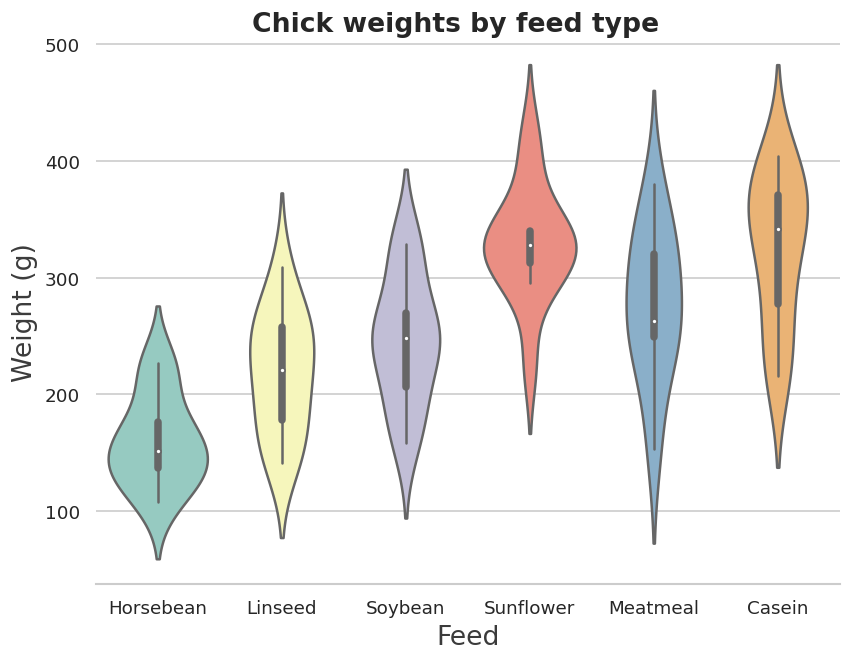
The box plot elements show that the median weight for horsebean-fed chicks is lower than other feed types. The shape of the distribution (extremely skinny on each end and wide in the middle) indicates the weights of sunflower-fed chicks are highly concentrated around the median. The white dot represents the median, the thick gray bar in the center represents the interquartile range, and the thin gray line represents the rest of the distribution.
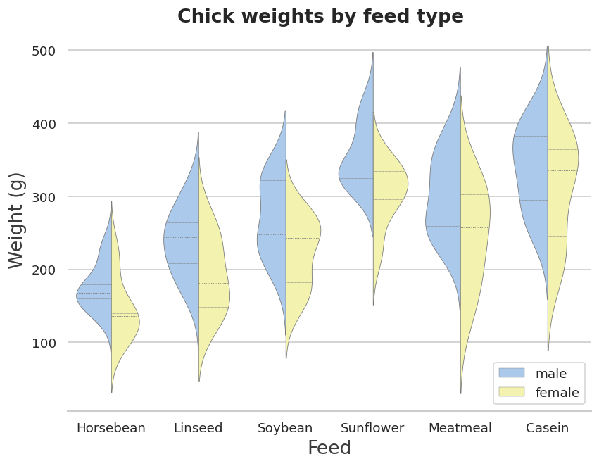
Grouped violin plot with split violins. Instead of drawing separate plots for each group within a category, you can create split violins and replace the box plot with dashed lines representing the quartiles for each group.
14. Stacked bar chart
Stacked bar graphs segment their bars. They are used to show how a larger category is divided into smaller categories and the relationship each part has on the total amount. They are of two types: simple and 100% stack.
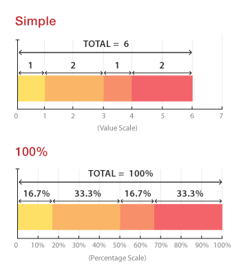
Simple stacked bar graphs place each value for the segment after the previous one. The total value of the bar is all the segment values added together. They are ideal for comparing the total amounts across each group/segmented bar.
100% stack bar graphs show the percentage-of-the-whole of each group and are plotted by the percentage of each value to the total amount in each group. This makes it easier to see the relative differences between quantities in each group.
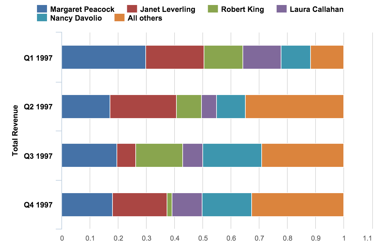
A flaw of stacked bar graphs is that they become harder to read the more segments each bar has. Also, it is difficult to compare each segment to each other, as they’re not aligned on a common baseline.
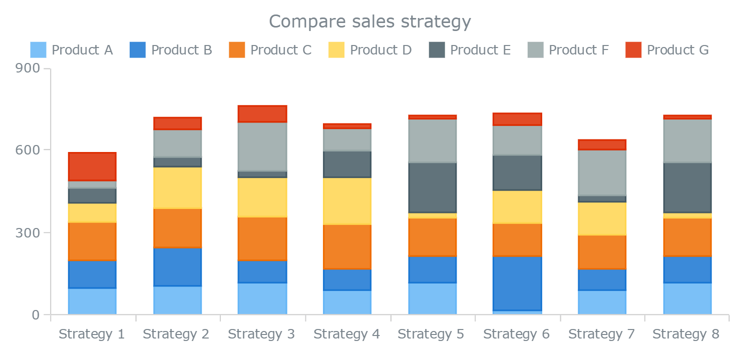
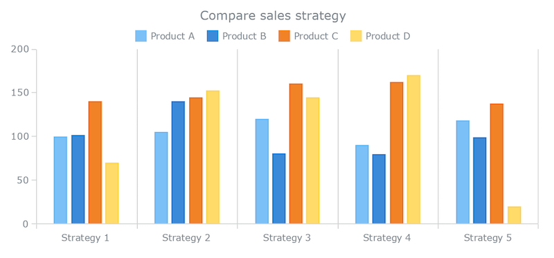
15. Clustered/multi-set/grouped bar chart
This variation of a bar chart is used when two or more data series are plotted side-by-side and grouped under categories, all on the same axis. A clustered bar chart is also used when there is a primary variable and a subcategory. The purpose is to focus on comparing subcategories and judge their trends (in the case of ordinal variables). Choose your primary variables and subcategory based on your priority of comparison. If the comparison of subcategories is the main focus, make that your group/cluster.
Multi-set bar charts become harder to read as the more bars you have in one group. Switch to a line chart (or a parallel coordinate chart) if each group has many items.
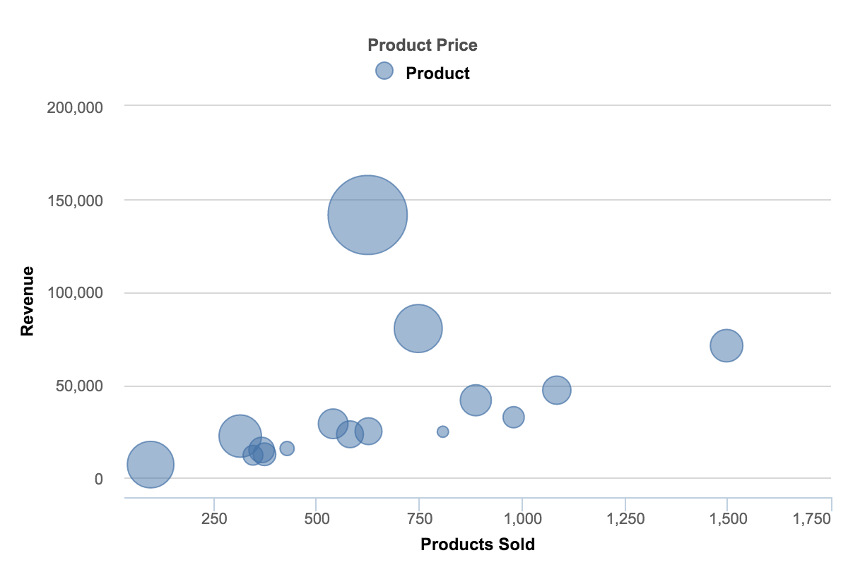
16. Bubble chart
An extension of a scatterplot, a bubble chart is commonly used to visualize relationships between three or more numeric variables. Each bubble in a chart represents a single data point. The values for each bubble are encoded by: its horizontal position on the x-axis, its vertical position on the y-axis, and the size of the bubble. Sometimes, the color of the bubble or its movement in animation can represent more dimensions.
Too many bubbles can make the chart hard to read. This can be remedied to an extent by interactivity: clicking or hovering over bubbles to display hidden information, having an option to reorganize or filter out grouped categories.
17. Labeled scatter plot
A labeled scatter plot is a data visualization that displays the values of two different variables as points. A text label is used to show the meaning of each data point.
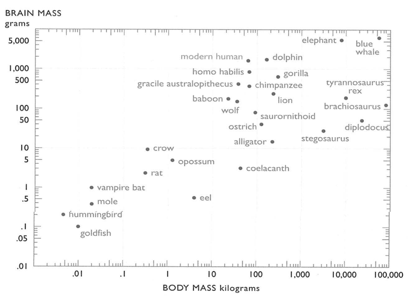
In a labeled scatter plot, the labels should be quiet. They should not be louder than the data points.
18. Mosaic plot
A mosaic plot is a particular type of stacked bar chart that shows percentages of data in groups. The plot is a graphical representation of a contingency table. For two variables, the width of the columns is proportional to the number of observations in each level of the variable plotted on the horizontal axis. The vertical length of the bars is proportional to the number of observations in the second variable within each level of the first variable.
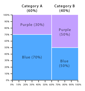
Mosaic plots help show relationships and provide a visual way to compare groups.
19. Scatterplot matrix
A scatter plot matrix is a grid (or matrix) of scatter plots used to visualize bivariate relationships between combinations of variables. Each scatter plot in the matrix visualizes the relationship between variables, allowing many relationships to be explored in one chart.
Scatterplot matrices are suitable for determining rough linear correlations of metadata that contain continuous variables. Scatterplot matrices are not so good for looking at discrete variables.
The scatterplot matrix below shows pairwise relationships between the four variables in the Iris Flower dataset—a dataset popular in the machine learning community.
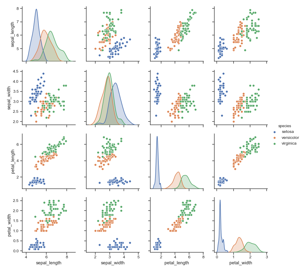
A scatterplot matrix helps pinpoint specific pairs of highly correlated variables in your data.
20. Linked micro maps
Linked micro maps are collections of small maps linked to corresponding plots. They were developed by Dan Carr and are a valuable tool for anyone who plots geographically referenced data.
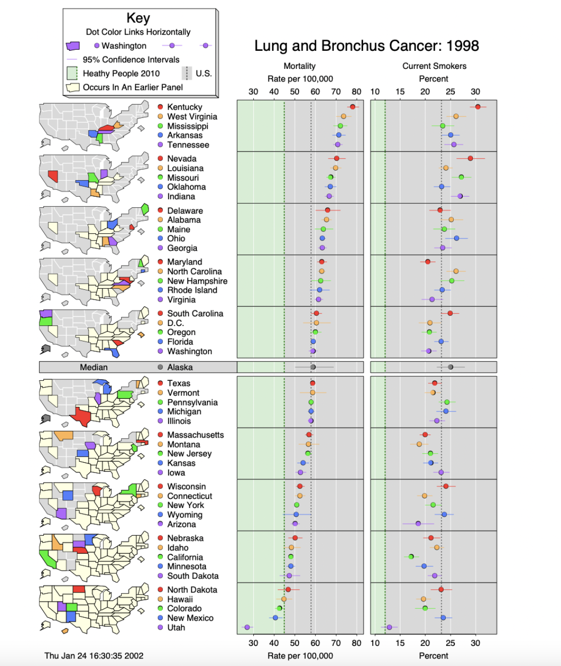
Linked micro maps provide a means to simultaneously summarize and display both statistical and geographic distributions by linking statistical summaries to a series of small maps.
Information relating to a large number of geographic areas can be comprehended clearly when the areas are displayed as a series of micro maps, each of which contains a manageable subset of an entire group.
21. Parallel coordinate plot
This type of visualization is used for plotting multivariate, numerical data. Parallel coordinates plots are ideal for comparing many variables together and seeing the relationships between them. For example, if you have to compare an array of products with the same attributes (comparing computer or cars specs across different models).

In a parallel coordinates plot, each variable is given its axis, and all the axes are placed in parallel to each other. Each axis can have a different scale, as each variable works off a separate unit of measurement, or all the axes can be normalized to keep all the scales uniform. Values are plotted as a series of lines that are connected across all the axes. This means that each line is a collection of points placed on each axis that have all been connected together.
The order the axes are arranged can impact the way how the reader understands the data. One reason for this is that the relationships between adjacent variables are easier to perceive than non-adjacent variables. So re-ordering the axes can help in discovering patterns or correlations across variables.
A parallel coordinate plot can become over-cluttered and, therefore, illegible when they’re very data-dense.
The best way to remedy this problem is through interactivity and a technique known as “brushing.” Brushing highlights a selected line or collection of lines while fading out all the others. This allows you to isolate sections of the plot you’re interested in while filtering out the noise.
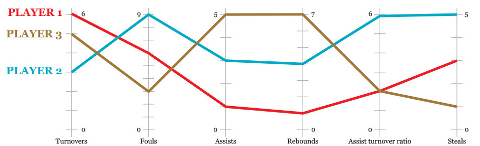
22. Radar/spider/web/polar/start chart/plot
Radar charts are a way of comparing multiple quantitative variables. This makes them useful for seeing which variables have similar values or if there are any outliers amongst each variable. Radar charts are also helpful for seeing which variables are scoring high or low within a dataset, making them ideal for displaying performance.
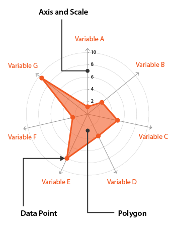
Each variable is provided with an axis that starts from the center. All axes are arranged radially, with equal distances, while maintaining the same scale between all axes. Gridlines that connect from axis to axis are often used as a guide. Each variable value is plotted along its axis, and all the variables in a dataset and joined together to form a polygon
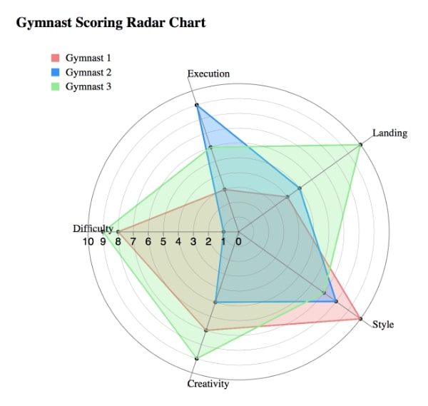
Radar charts help you see the big-picture overlaps more easily. But, some consider radar charts useless and suggest that parallel coordinate charts should always be used instead.
23. Treemap
Treemaps are an alternative way of visualizing the hierarchical structure of a tree diagram while also displaying quantities for each category via area size. Each category is assigned a rectangle area with its subcategory rectangles nested inside of it.
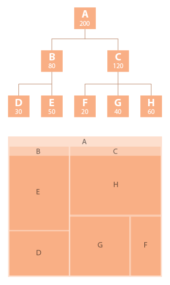
When a quantity is assigned to a category, its area size is displayed in proportion to it and the other quantities within the same parent category in a part-to-whole relationship. Also, the area size of the parent category is the total of its subcategories. If no quantity is assigned to a subcategory, its area is divided equally amongst the other subcategories within its parent category. Treemaps are a more compact and space-efficient option for displaying hierarchies. Treemaps are also great at comparing the proportions between categories via their area size.
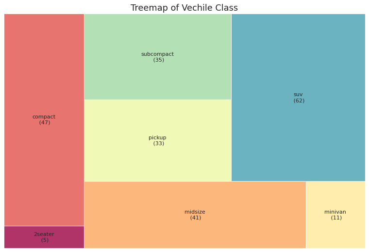
The limitation of a treemap is that it doesn’t show the hierarchal levels as clearly as other charts that visualize hierarchal data (such as a tree diagram or sunburst diagram).
24. Stacked area graph
Stacked area graphs work in the same way as simple area graphs, except for multiple data series that start each point from the point left by the previous data series. The entire graph represents the total of all the data plotted. Stacked area graphs also use the areas to convey whole numbers, so they do not work for negative values. Overall, they help compare multiple variables changing over an interval.
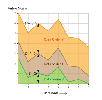
Stacked area charts are best used to show changes in composition over time.
25. Pareto chart
While studying the distribution of wealth in Italy, a social scientist named Vilfredo Pareto discovered that approximately 20% of the population owned 80% of the wealth. He further observed that these proportions describe many other aspects of society as well, which led him to propose the 80-20 rule. A special kind of graph that can be used to show how large amounts of something associated with small proportions of a population, called the Pareto chart, was named in his honor. Pareto charts combine ranking and part-to-whole relationships to tell the story of how the biggest parts of something combine to dominate the whole. In the following example, different channels through which people discover an organization is displayed in a Pareto chart.
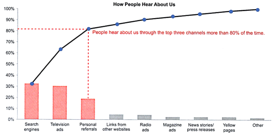
A Pareto chart combines bars and a line in a useful way. The bars display a ranking relationship between parts of the whole from greatest to least, in this case, channels through which people discover the organization. Bars make it possible to compare the contribution of individual channels easily. A line accumulates the same series of values to show the percentage of the whole contributed by subsets of the values from high to low. A line makes sense in this case because there is an intimate connection from one value to the next as they combine to form the whole. This particular example was designed to tell the story that most people discover the organization through the three top channels. the clear message is that the organization could increase its visibility by improving these three channels. Source: Few’s SMN.
Use the Pareto chart to show 80-20 relationship.
The Pareto principle (80:20 rule) contends that roughly 80% of the effects come from 20% of the causes for many events. To amplify this effect, one must always arrange the bar graphs in descending order. And the 80% cutoff should be shown appropriately.
26. Slope chart/graph
A slope graph can be used to show a “before and after” story of different values, based on comparing their values at different points in time. Slopes connect the related values.
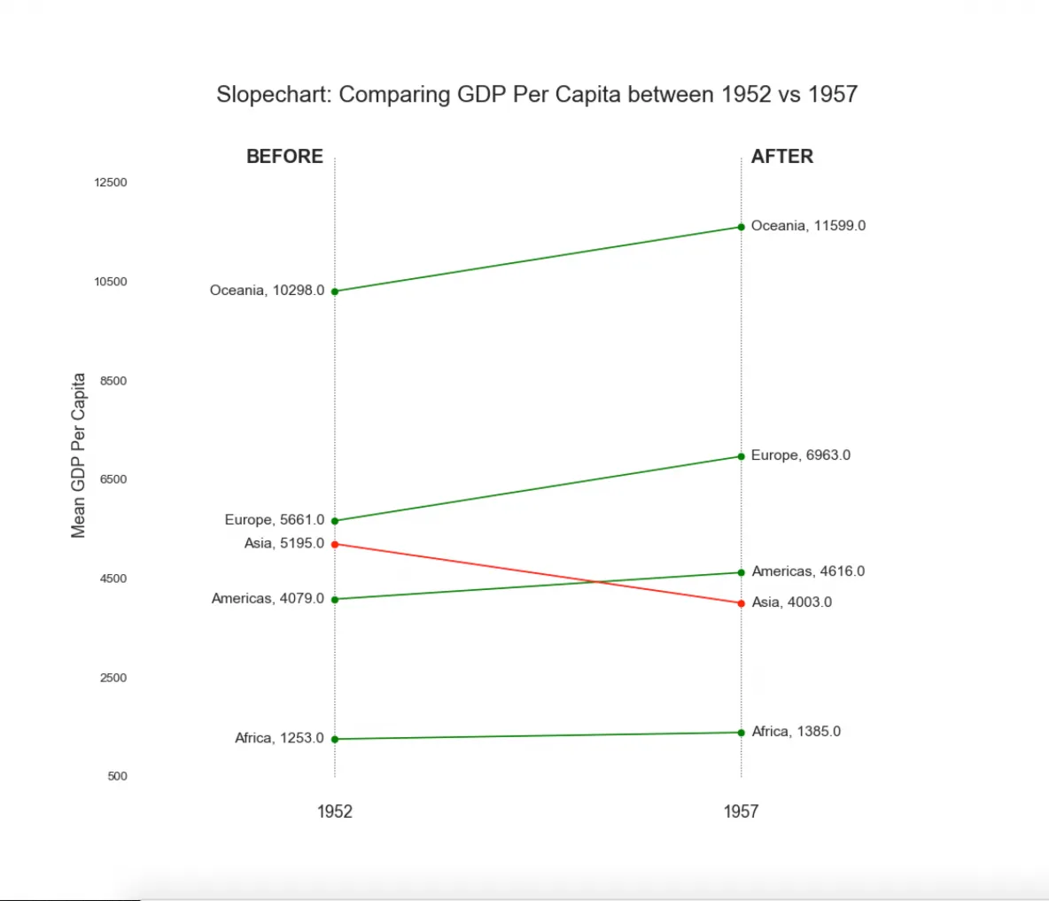
If many category values are presented, slope graphs can become quite busy, especially if there are bunches of similar values and slopes. On these occasions, interactive slope graphs make the chart easier to read, where certain values can be filtered out.
Slope charts are highly effective. Use them whenever possible.
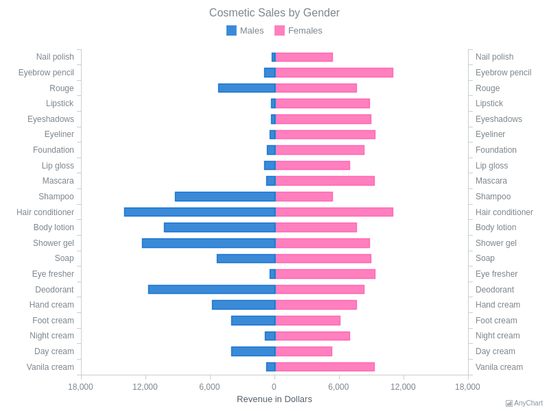
27. Mirror bar chart
A mirror bar chart comparatively displays two sets of data side by side along a vertical axis. The chart resembles the reflection of a mirror, hence the name “mirror bar chart.” The advantage of a mirror bar chart is that it illustrates two data sets side by side and makes it easy to make comparisons and spot any differences between them.
28. Trellis display
Trellis displays provide a framework for multivariate data. They are often instrumental. A major feature of trellis displays is multipanel conditioning. Multipanel plots often avoid the need for color. A great deal of information can fit on a graph without it being cluttered.
Trellised visualizations enable you to quickly recognize similarities or differences between different categories in the data. Each panel in a trellis visualization displays a subset of the original data table, where the subsets are defined by the categories available in a column or hierarchy.
This looks cluttered, particularly around 2020:
Trellised visualization:
Trellise your plots if you have many trends to compare.
29. Ridgeline/joy plot
A ridgeline plot enables us to compare distributions between groups using density curves. A ridgeline plot is comprised of a vertical stack of regular density curves. Usually, the curves are offset with a slight overlap, saving space compared to completely separating the axes. This overlap means that the density curves tend to be plotted without any additional overlays.
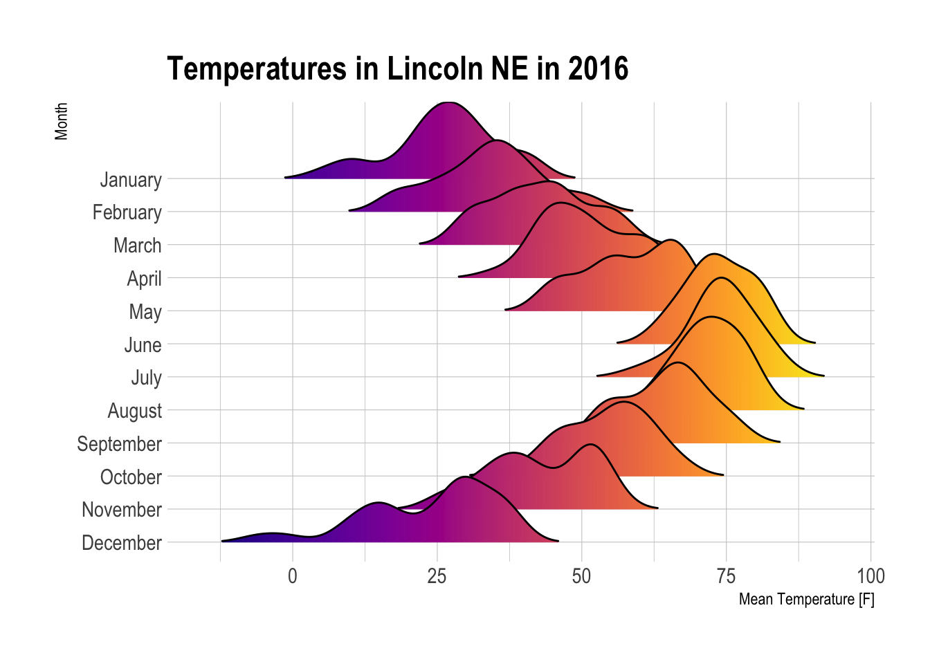
Ridgeline plots are best used when there is a clear pattern in the data across groups.
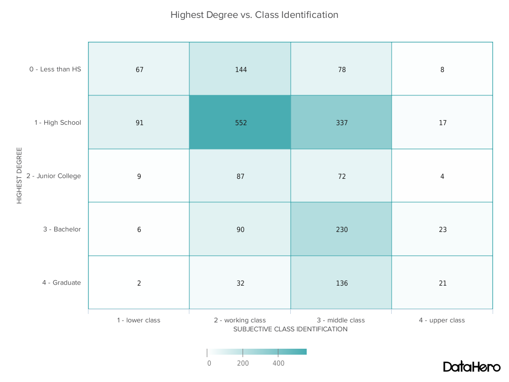
30. Heatmap
Heatmaps visualize data through variations in coloring. When applied to a tabular format, heatmaps are useful for cross-examining multivariate data by placing variables in the rows and columns and coloring the cells within the table. Heatmaps are good for showing variance across multiple variables, revealing any patterns, displaying whether any variables are similar, and detecting if any correlations exist between them.

Typically, all the rows are one category (labels displayed on the left or right side) and all the columns are another category (labels displayed on the top or bottom). The individual rows and columns are divided into subcategories, which all match each other in a matrix. The cells contained within the table either have color-coded categorical data or numerical data that is based on a color scale. The data within a cell is based on the relationship between the two variables in the connecting row and column.
A legend is required alongside a heatmap for it to be successfully read. Categorical data is color-coded, while numerical data requires a color scale that blends from one color to another to represent the difference in high and low values. A selection of solid colors can be used to describe multiple value ranges (0-10, 11-20, 21-30, etc.), or you can use a gradient scale for a single range (for example, 0 - 100) by blending two or more colors.
Because they rely on color to communicate values, heatmaps are a chart better suited to displaying a more generalized view of numerical data. It is usually difficult to accurately tell the differences between color shades and extract specific data points from (unless you include the raw data in the cells).
Heatmaps can also be used to show the changes in data over time if one of the rows or columns is set to time intervals. An example of this would be to use a heatmap to compare the temperature changes across the year in multiple cities to see the hottest or coldest places. So the rows could list the cities to compare, the columns contain each month, and the cells contain the temperature values.
31. Ternary/triangular plot/graphs
Triangular graphs offer an opportunity to display data based on three variables simultaneously. They can only be used for three variables where their total equals one hundred percent of the data. A ternary diagram is a triangular coordinate system; the edges of the triangle are the axes.
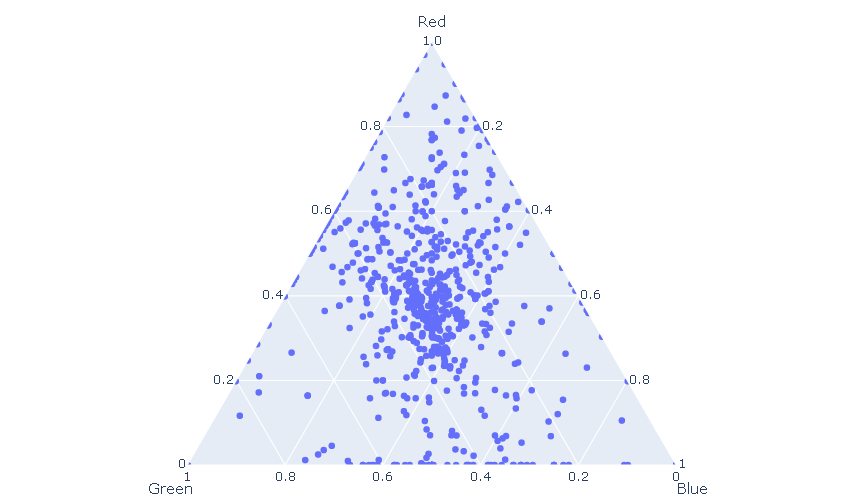
Ternary diagrams are used to plot three dependent variables that always add up to a fixed value, for example, to visualize the compositional variations of rocks or minerals.
Ternary plots are ineffective for the general public but can be effective for scientific readers.
Our group needed around 15 minutes of discussion to fully understand the ternary plot the first time we saw one.
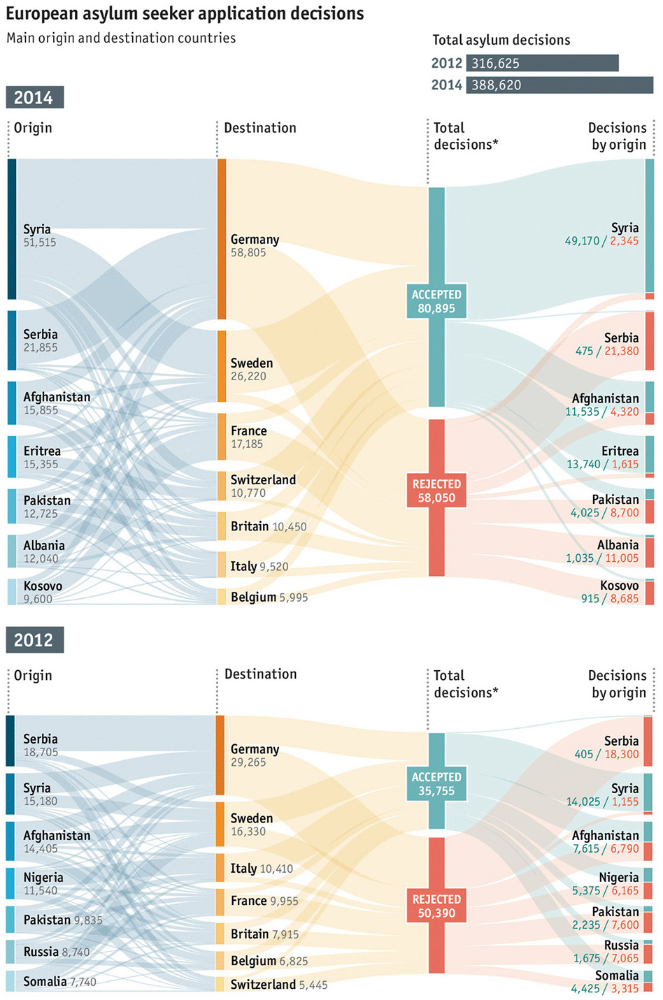
32. Sankey diagram
Sankey diagrams display flows and their quantities in proportion to one another. The width of the arrows or lines are used to show their magnitudes, so the bigger the arrow, the larger the quantity of flow. Flow arrows or lines can combine together or split through their paths on each stage of a process. Colour can be used to divide the diagram into different categories or to show the transition from one state of the process to another.
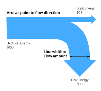
Typically, sankey diagrams are used to visually show the transfer of energy, money or materials, but they can be used to show the flow of any isolated system process.
For some data, the sankey diagram can be the only choice.
The graphic below speaks itself.