data-viz-workshop-2021
Color
The RGB (red, green, blue) color model is the most popular way to mix, and create colors. Red, green, and blue can be added together in various ways to reproduce a broad array of colors. The model’s name comes from the initials of the three additive primary colors: red, green, and blue. Often printers use CMYK (cyan, magenta, yellow, key) instead. Similarly, you might have noticed HSV or HSL (hue, saturation, value/lightness) in the color picker of some graphics software. These are all schemes that describe the way colors combine to create the spectrum we see.

1. Hue, saturation, and lightness
The primary system used to describe a color is known as HSL (hue, saturation, and value/lightness). A color is made up of three different attributes: hue, saturation, and lightness. Saturation and lightness are together referred to as intensity. Unlike RGB and CMYK, which use primary colors, HSL is closer to how humans perceive color.
Hue is a precise term for what we usually think of as a color (red, green, blue, pink, etc.). Hue is described numerically in degrees from 0 to 360 along the circumference of a circle, illustrated by the following color wheel. Numbering starts at the top with red at 0° and continues around the wheel.

Saturation measures the degree to which a particular hue fully exhibits its essence. In the example below, red ranges from completely pale on the left, lacking the essence of red entirely, to fully red on the right, exhibiting its whole essence. Saturation is expressed as a percentage, starting with 0% on the top, representing no saturation, to 100% at the bottom, representing full saturation.
Lightness (or brightness or value) measures the degree to which a color appears dark or bright. Lightness is also expressed as a percentage, with 0% representing fully dark and 100% representing fully light. When lightness is highest, there is no darkness in color.
Any color can be described numerically based on these three measures: hue (0-360°), saturation (0-100%), and lightness (0-100%).
2. Transparency/opacity
The alpha value of a colored graphical object (or a graphic layer) controls the transparency or opacity. It can be represented as a real value, a percentage, or an integer: full transparency is 0.0, 0%, or 0, whereas full opacity is 1.0, 100%, or 255, respectively.
When a color (source) is blended with another color (background), e.g., when an image is overlaid onto another image, the alpha value of the source color is used to determine the resulting color. If the alpha value is opaque, the source color overwrites the destination color; if transparent, the source color is invisible, allowing the background color to show through. If the value is between, the resulting color has a varying degree of transparency/opacity, creating a translucent effect.

3. Layering and separation
Among the most powerful devices for reducing noise and enriching the content of displays is the technique of layering and separation, visually stratifying various aspects of the data.
Effective layering of information is often difficult.
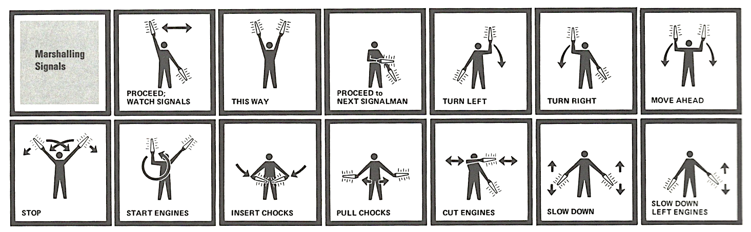
In the following industrial diagram, 300 small parts and their identifying numbers are separated just using two colors.

Color can effortlessly differentiate between annotation and the annotated.
Here is another example.
Consider the marshaling signals array below. Here, the grid (bold black lines), the silhouette (the black image of the person), and the type (lamp in the hand directions) are competing with each other. Thick bars of grid boxes generate little paths around both silhouette and type by exciting negative white space. Remember, the essential information is the lamp directions, not the silhouette or the borders.
To direct attention toward the information at hand, the revision below extends the light to a dark range of color (i.e., remove darkness), separating and layering the data in rough proportion to their relevance. Gray calms a contrasty silhouette, bringing about, in turn, more emphasis on the lamps and their position and motion. Coloring the lights helps to separate the signals from all the rest. The lamp whiskers (small lines around the lamp) are redundant and can be removed. The whiskers confuse if it is referring to a glowing light or trembling motion.
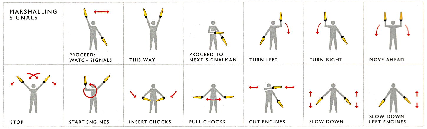
Effectiveness and elegance come from small spots of intense, saturated color for carrying information — a design secret.
4. Color and information
In representing and communicating information, how are we to benefit from color’s great dominion?
“To paint well is simply this: to put the right color in the right place.”
The uses of color in information design are: to label (color as a noun), to measure (color as quantity), to represent or imitate reality (color as representation), and to enliven or decorate (color as beauty).
For example, in the Mount Everest mountain map below, color:
- labels by distinguishing water from the shrub, forest, and glaciers,
- measures by indicating altitude with contour,
- imitates reality with glacier whites/blues and shrub browns,
- and visually enlivens the typography quite beyond what could be done in black and white alone.

For your reference, a black and white version is below. Please note that this version also measures (with contour lines) but fails to do the others. Here is the same image with ‘hue’ removed.

Here is another example of the use of colors.
The sentence below describes the Pythagoras theorem.

So, what are the design practices and strategies for how color can be used to serve information? Edward Tufte proposes two principles:
First rule: Pure, bright, or very strong colors have loud, unbearable effects when they stand unrelieved over large areas adjacent to each other, but extraordinary effects can be achieved when used sparingly on or between dull background tones.
The organization of the earth’s surface facilitates graphic solutions of this type in maps. Extremes of any type — such as highest land zones and deepest sea troughs, temperature maxima, and minima — generally enclose small areas only.
If one limits the strong, heavy, rich, and solid colors to the small areas of extremes, then expressive and beautiful patterns occur. If one gives all, especially large areas, glaring, rich colors, the pictures have brilliant (bright/radiant), disordered, confusing, and unpleasant effects.
Note the after-images and vibration resulting from the strong colors used in the image below.

Second rule: The placing of light/bright colors mixed with white next to each other usually produces unpleasant results, especially if the colors are used for large areas.
The violation of these principles yields bad examples, like the one below. All the strong colors, especially surrounding blue, generate a strange puffy white band, making it the map’s dominant visual statement. These colors are dark in value and at a visual war with the heavily encoded information.

A concept map provides a visual summary of a chapter in the form of blocks, links, and connections—highlighting the relationships between concepts covered in the chapter. In my courses, I ask students to make ‘concept maps’ of almost every chapter that they read, and I get to see dozens of concept maps (block diagrams) drawn by various students summarizing the same content. Some of the maps look excellent, and some look weird. Until I myself read about these principles of using colors, I did not know why some look excellent and others weird.
As Edward Tufte suggests in the graphic below, the omnipresent boxes of organization charts are rarely needed. If every name is highlighted, no name is. Maps don’t put boxes around city names. The location of typography alone indicates the two-dimensional location of each bureaucrat; the space gained by the absence of all those little boxes can then provide additional information, such as the salary of equivalents of the now-unboxed bureaucrats. Omitting the boxes increases explanatory resolution.

If you highlight everything in your graphic with bright colors, you are essentially highlighting nothing.
Color vision deficiencies
Color blindness (color vision deficiency, or CVD) affects approximately 1 in 12 men (8%) and 1 in 200 women worldwide.
While I was doing my undergraduate degree in Nepal in 2009, my friend was desperate to join the army in Nepal. He had done all the preparations, and he was both physically and mentally fit. But, he could not participate because he was color blind, and he did not know this until then.
In just a few minutes, you can check if you are color blind here.
The most common form of color vision deficiency involves differentiating between red and green. Thus, avoiding colormaps with both red and green will prevent many problems in general.
Also, often, you will need to choose a colormap in your graphics. For example, in heatmaps. It is always safe not to choose ‘rainbow’ style colors. For instance, in Matplotlib, perceptually uniform colormaps are viridis, plasma, inferno, magma, and cividis (see named colormaps below).

The Color Brewer tool often comes in handy to decide what color to use when.
