data-viz-workshop-2021
How to choose a correct chart for your data?
How do you know that you have chosen the right graphic form to represent your data? When is it appropriate to use a bar chart, a line chart, a data map, or a flow diagram? Geez, if I had the answer to that, I’d be rich by now. I invariably reply, “I have no idea, but I can give you some clues to make your own choices based on what we know about why and how visualization works.” Source: TTA.
Unfortunately, there is no single flowchart that can guide you in this process. But many find the following resources helpful.
“The best way to learn how to make effective graphics is by dissecting why some graphics are effective, and others are not, and determining how we can improve them.” - by Felice C. Frankel
You cannot apply anyone’s method of choosing graphic forms uncritically. A bit of critical judgment is paramount.
Below are some resources.
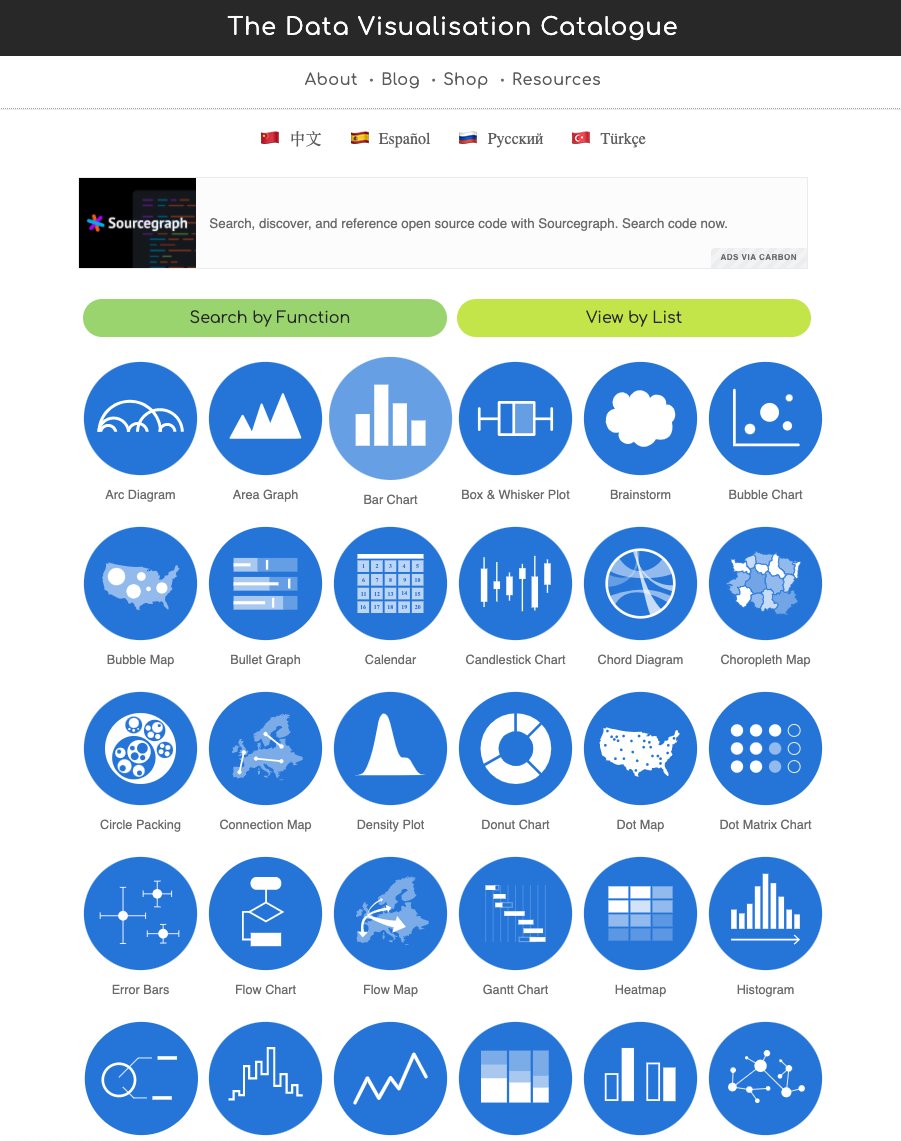
Severino Ribecca’s data visualisation catalogue
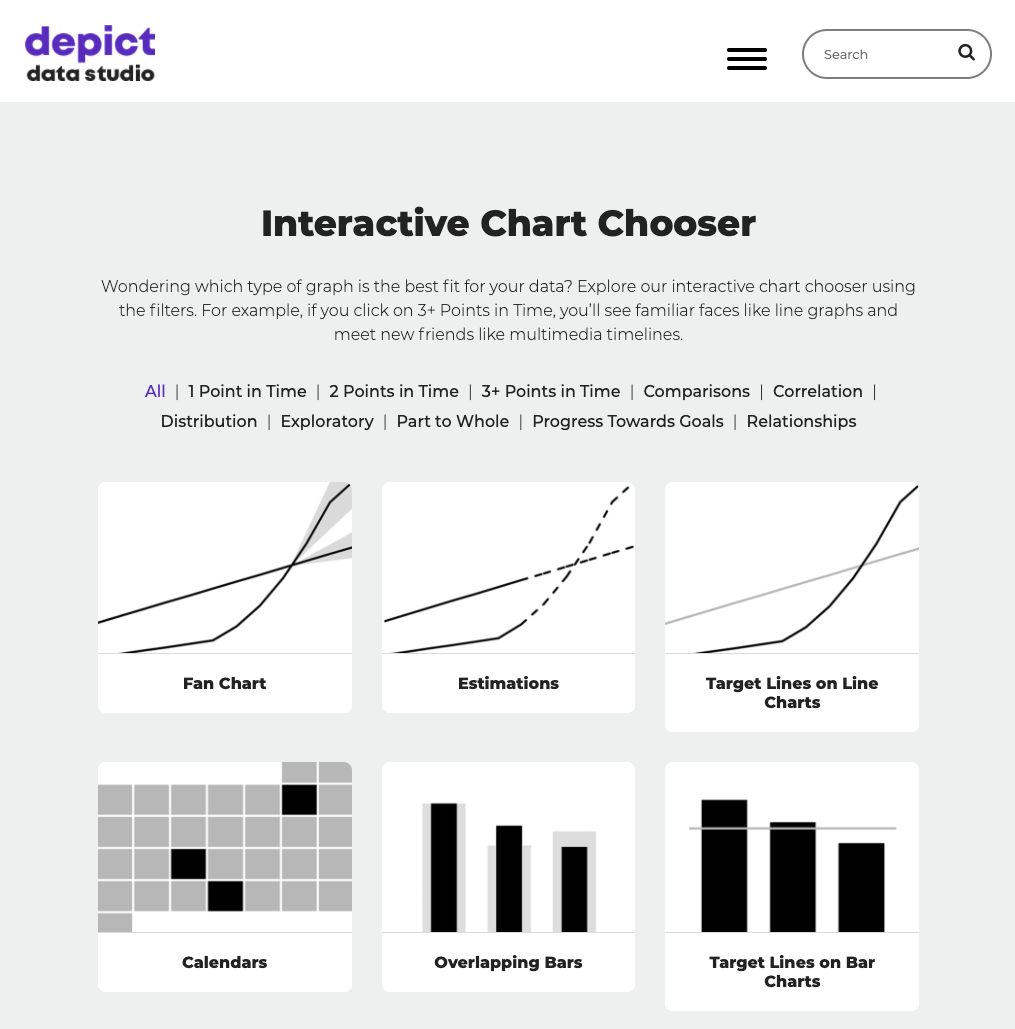
Ann K. Emery’s Essentials website
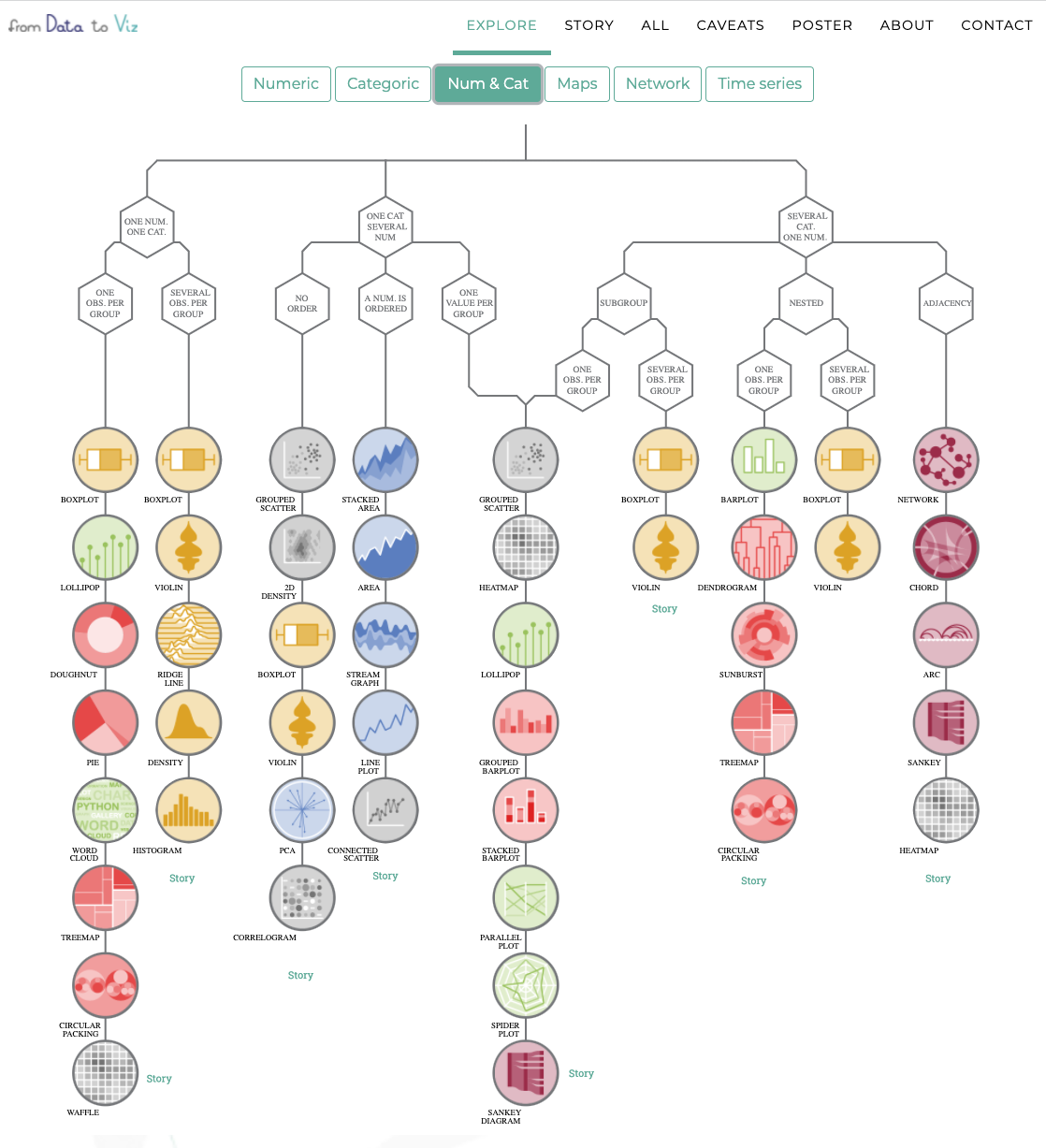
Yan Holtz & Conor Healy’s decision tree