data-viz-workshop-2021
Chartjunks: Vibrations, grids, and ducks
The unnecessary interior decoration of graphics that does not tell the viewer any new information, and generates a lot of non-data-ink or redundant data-ink is called a chartjunk. For example, overbusy grid lines, excess ticks, and redundant representation. j
Chartjunks are unnecessary visual elements in charts that distract you from the information.
Three types of chartjunk:
- unintentional optical art (vibrations)
- dreaded grid
- self-promoting graphical duck
1. Unintentional optical art (vibrating chartjunk)
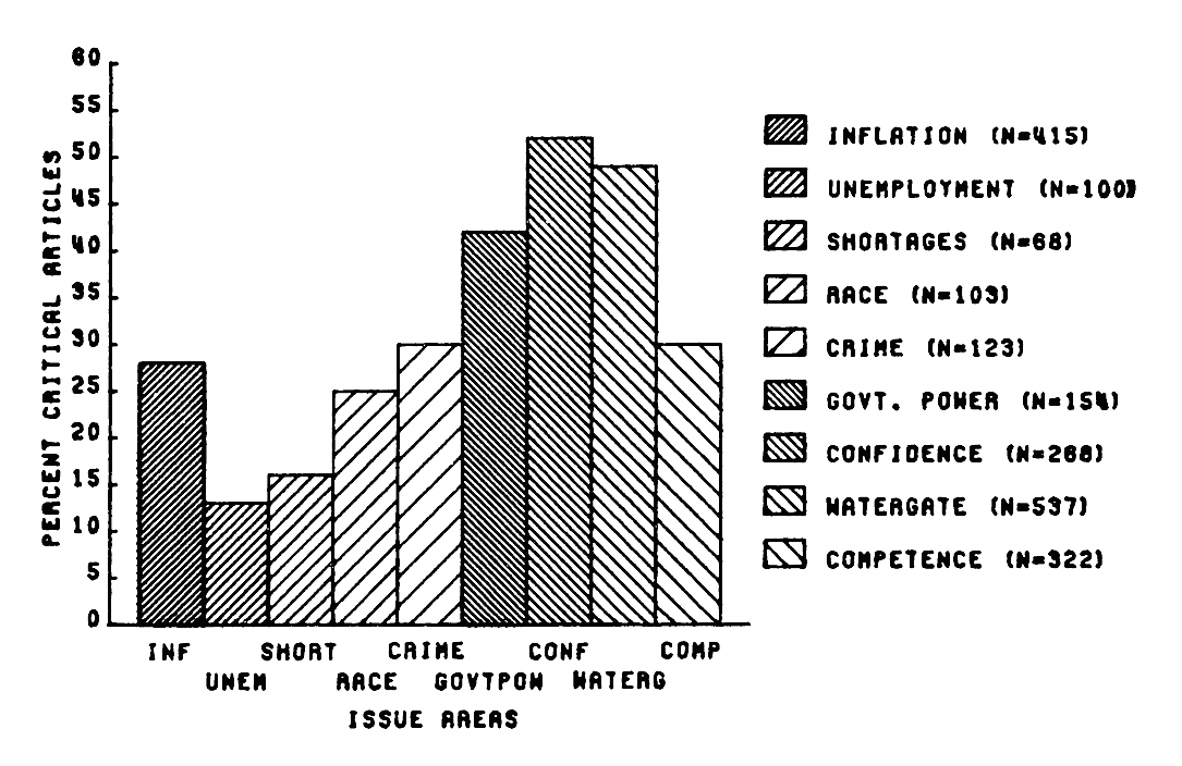
Contemporary optical art relies on Moire Effect in which the design produces the distracting appearance of vibration and movement. For e.g., in the bar chart below, there are 131 line strokes and 15 digits to communicate its simple information.
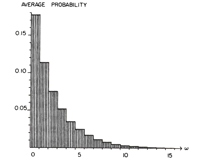
These unnecessary vibrating lines cloud the flow of information that make the graphics bad and ineffective. Moreover, the vibrating lines are poorly drawn, unevenly spaced, and misaligned with the vertical axis.
Moire Effects have proliferated with computer graphics. Some vibrating Moire Effect are shown in the figure below.
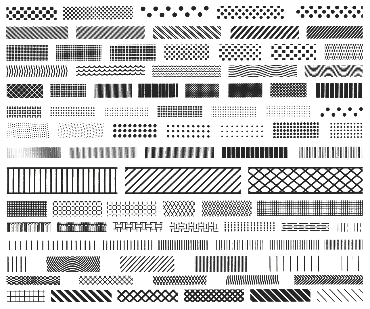
This form of chartjunk has been increased because of innovation in computer graphics. Now the software produces such chartjunk with just one click. Therefore, handbooks and textbooks are filled with vibrating graphics.
2. The Grid
Grids should be muted or wholly suppressed so that their presence is only implicit. Grids are primarily for the initial plotting of data rather than putting it into print.
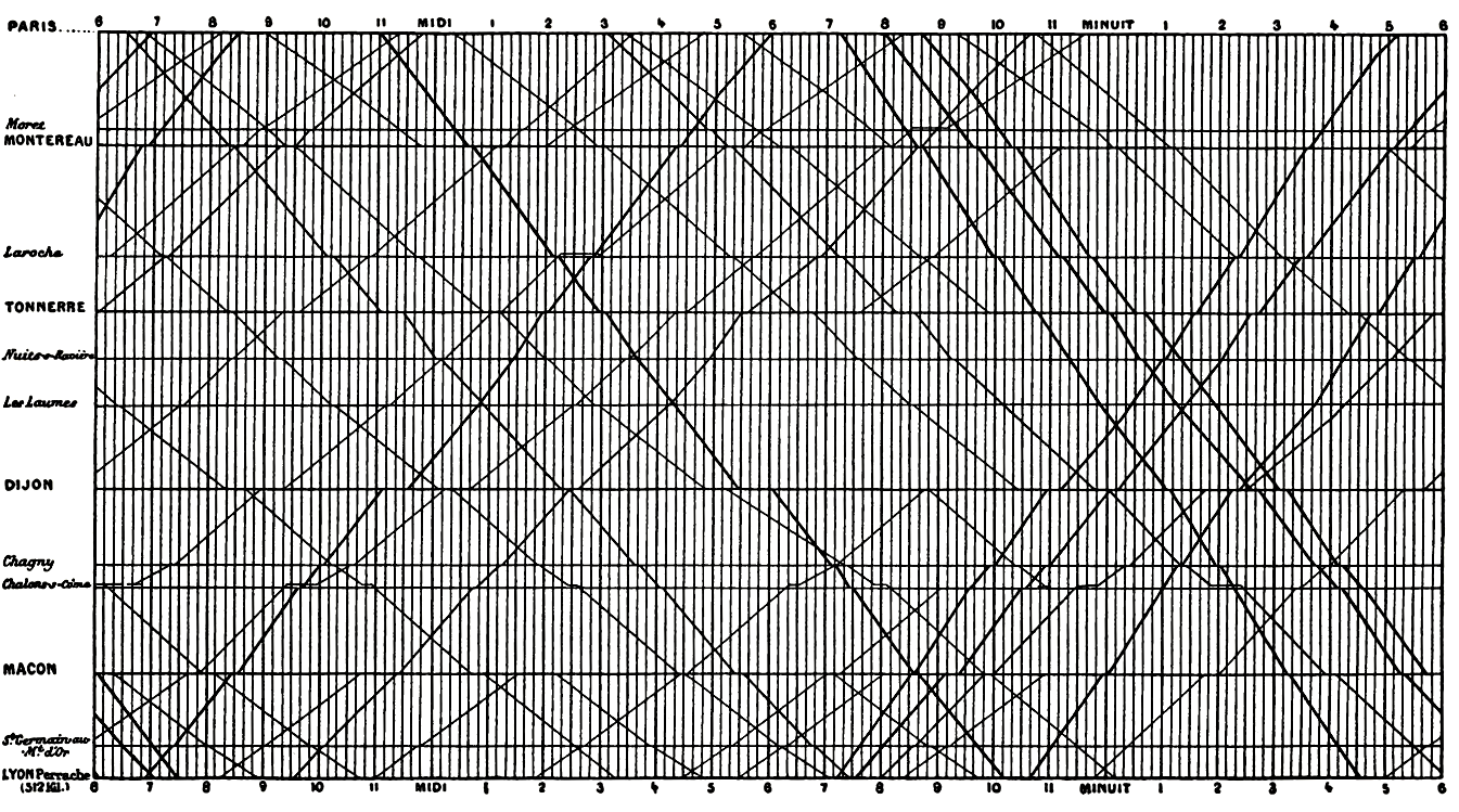
For example, the dark grid lines in the graphic below are chartjunk because they cloud the information that the graphic is trying to show.
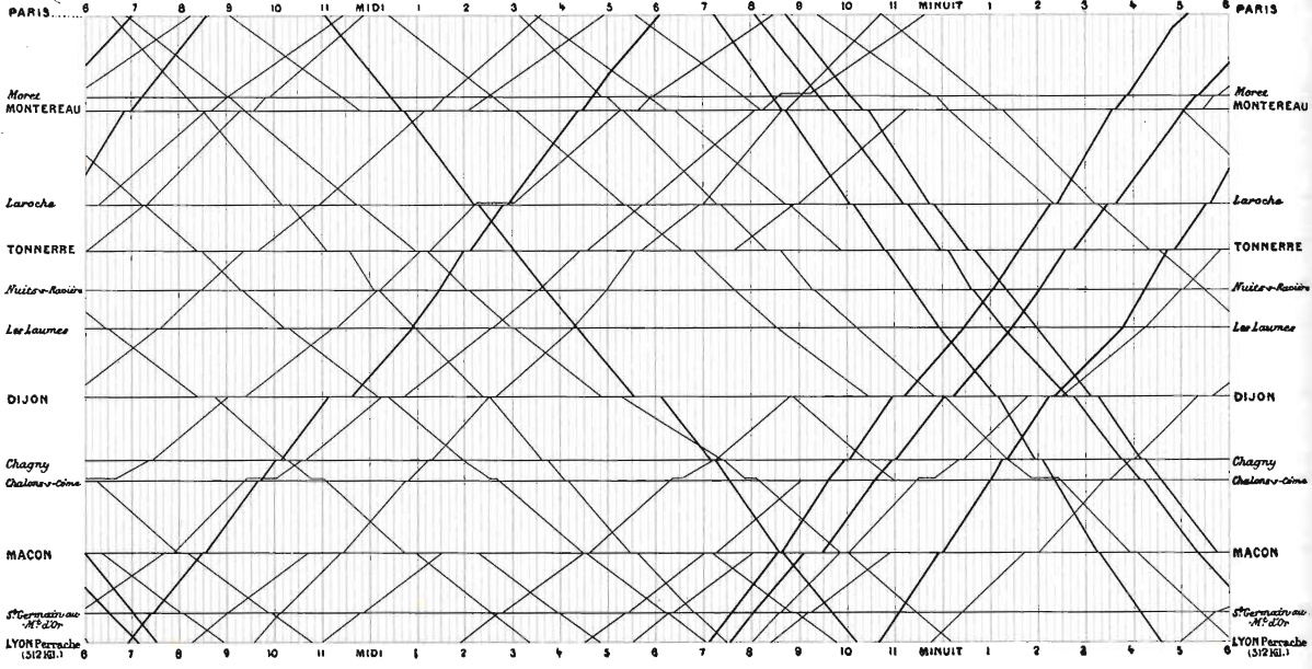
In the improved version below, the gray, muted grid lines work well and complement the graphs with more accurate data reconstruction.
Dark grid lines are chartjunk, and they carry no information, clutter up the graphics, and generate graphical activity unrelated to data information.
3. Self-promoting graphics: The duck
When a graphic is taken over by decorative forms or computer debris, when the data measures and structures become Design Elements, when the overall design provides Graphical Style rather than quantitative information, that graphic can be called the “Duck”.
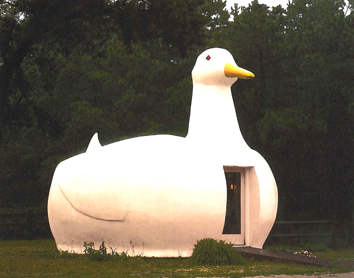
For the build below, the whole structure is a decoration rather than a decoration on the building. There is a warning from Pugin, which says that: It is alright to decorate construction but never construct decoration.
Do not use a computer and graphic software to build a duck. This is “we-used-a-computer-to-build-a-duck” syndrome.
Computer and their software can do mighty things graphically, but they should be used to make better design rather than implementing every feature given by the software.
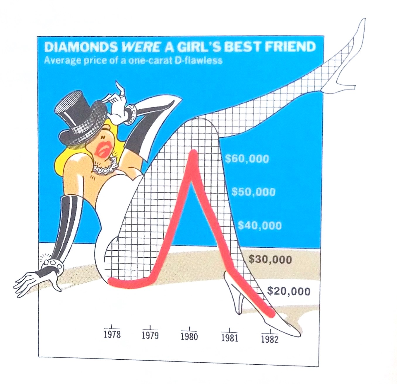
Here this graphics is an example of “we-used-a-computer-to-build-a-duck” syndrome.
There are unnecessary decorations everywhere in this graphic.
The thin substance, the clotted, crinkly lettering all in uppercase sans-serif, the pointlessly ordered cross-hatching, the label written in abbreviations, the optical vibrations in every bar. The over decorations made this graph full of chartjunk.
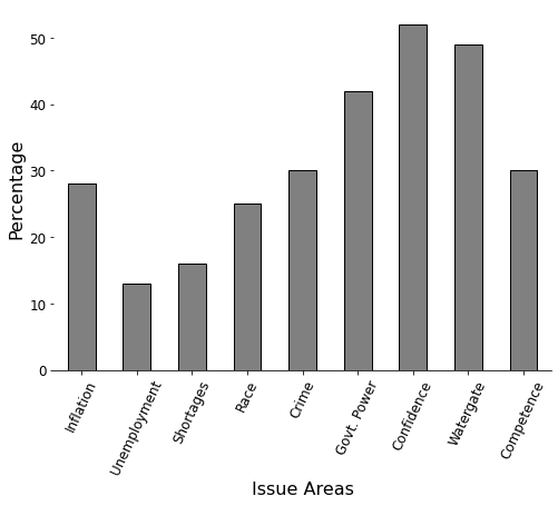
The same data can be shown in a simple table or a bar diagram to show the necessary information.
For e.g., in the form of a bar diagram shown below.
Graphics do not become attractive and exciting through the addition of ornamental hatching and false perspective.
If you are looking for more ducks, here is another one.
“Lurking behind chartjunk is contempt both for information and for the audience. Chartjunk promoters imagine that numbers and details are boring, dull, and tedious, requiring ornament to enliven. Cosmetic decoration, which frequently distorts the data, will never salvage an underlying lack of content. If the numbers are boring, then you have got the wrong numbers. Credibility vanishes in clouds of chartjunk; who would trust a chart that looks like a video game?” - Edward Tufte. Source: EI.