data-viz-workshop-2021
Solution
Bar charts tend to look a bit clunky when you have more than 10 bars or so.
An intriguing alternative would be an unorthodox line chart, which doesn’t put time on the X-axis, but a categorical variable, age groups.
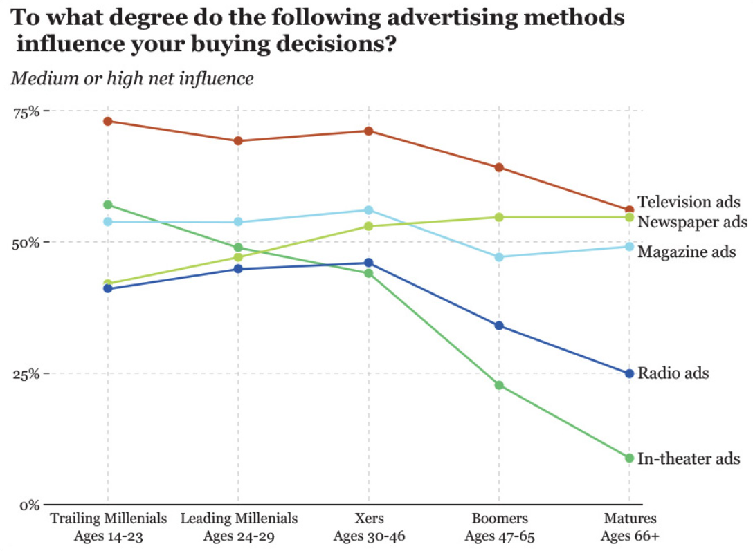
The beauty of this chart is that it gives us the best of both worlds: it doesn’t just let us see trends across age groups, but it also allows us to compare each medium within each group, as the dots are stacked on top of each other.