data-viz-workshop-2021
Task: Too many bars in a bar diagram
Data source: Deloitte’s Digital Democracy Survey.
Imagine that you’re doing some advertisement market analysis and you wish to know which kind of media influences teenagers and adults the most. You may conduct a survey and display the results below. This bar chart lets you compare the different methods of delivering ads within each age group.
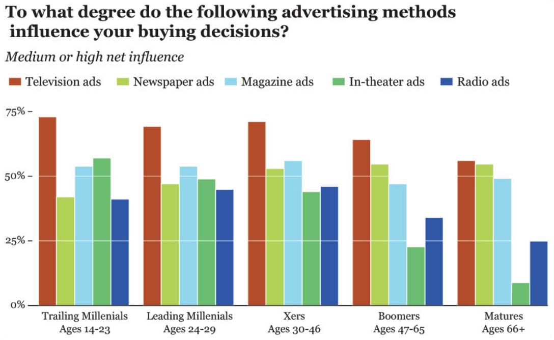
But what if what you wish to do is not compare media within age groups but across age groups? In other words, what if you want to see which media becomes more or less trustworthy as people age?
In that case, the current chart isn’t that adequate. You can spot TV’s downward pattern, but that’s just because the bar corresponding to TV ads is the first one of each cluster, and its color stands out over the others. If you want to see if magazine ads become more or less trusted later in life, your brain will be forced to isolate the blue bars in the middle of each group and then compare them to each other. That’s way too much work. If seeing trends across age groups is the task we want to enable, let’s group the bars not by age but by media.
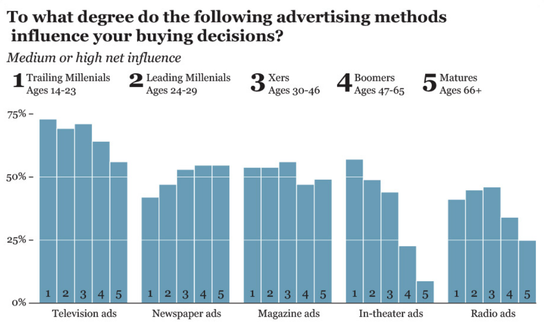
Both of the charts above have too many bars, and it reminds us of a fence.
We could further improve this chart, using other alternatives (i.e., not bar charts). How?
Please sketch your solution on graph paper. You do not have to be precise.