data-viz-workshop-2021
Task: Social Media Update 2016
The table below is from a survey by the Pew Research Center.
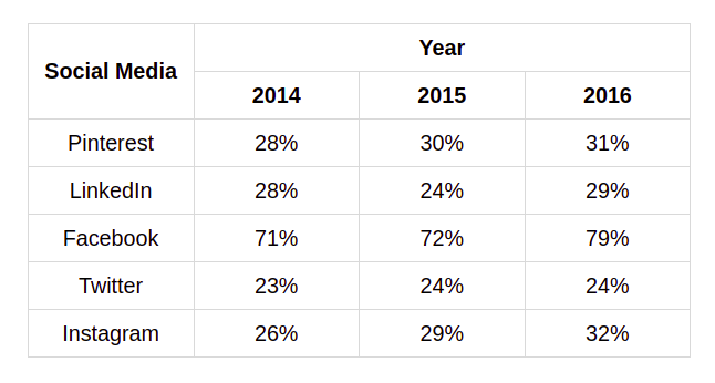
It shows the percentage of people using Pinterest, LinkedIn, Facebook, Twitter, and Instagram for 2014, 2015, and 2016.
Note that the columns do not sum to 100% because each person may use multiple social media platforms.
We now need to display this visually. From the table, it is clear that Facebook is the most popular media. Your chart should effectively display this.
- What type of chart will you use?
- How will you plot the data?
Would you please sketch your draft on graph paper? You do not have to be precise.