data-viz-workshop-2021
Task: Maximize the box plot data ink ratio
The box plot below is built using the ‘mtcars’ dataset in the R. It displays two variables: ‘cyl’ (number of cylinders) in the x-axis and ‘mpg’ (miles per US gallon) in the y-axis. The y-axis shows the distribution of ‘mpg’ values in the form of a box plot.
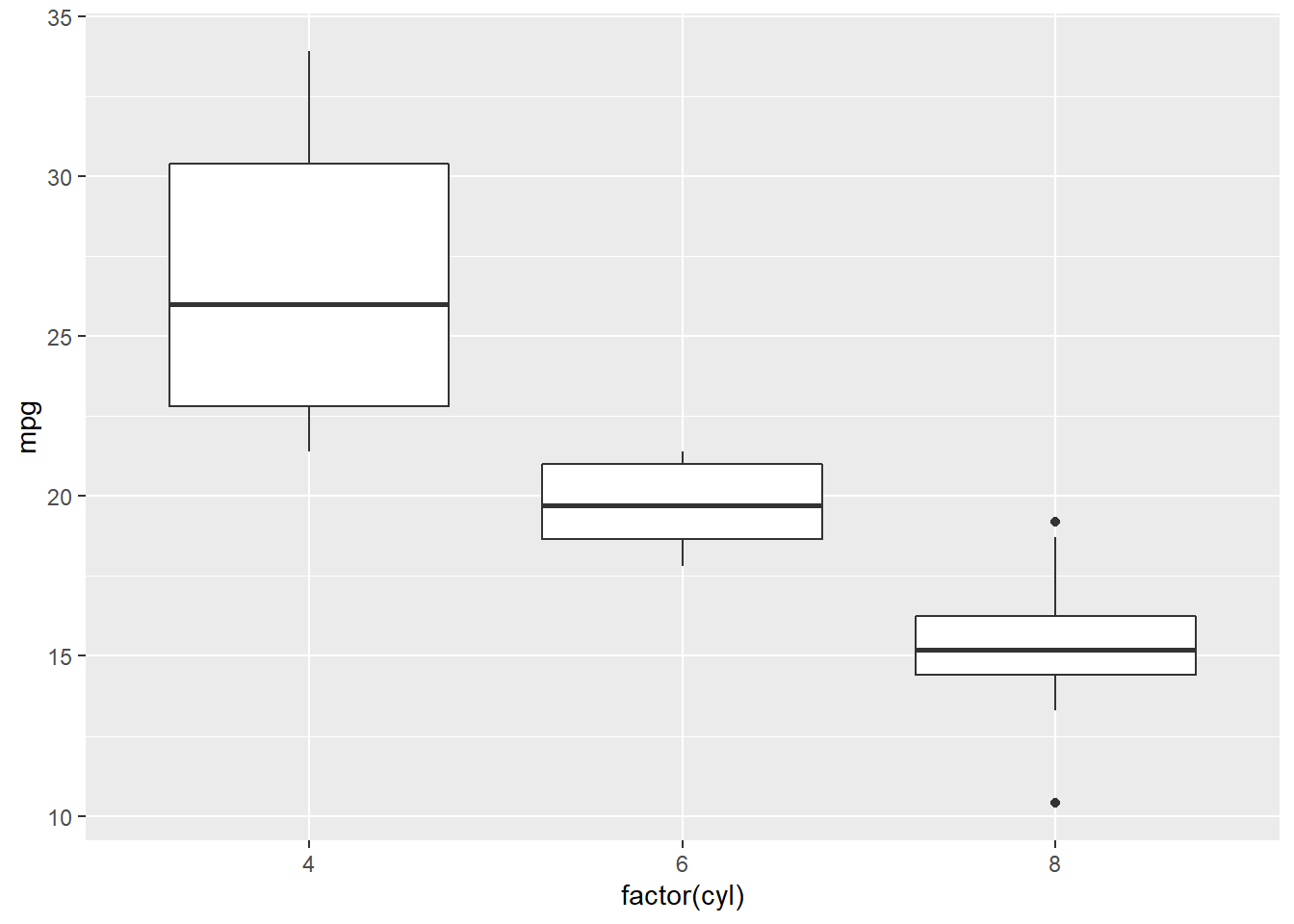
This box plot has a low data-ink ratio.
How could we erase non-data-ink (within reason) and redundant data-ink (within reason)?
On graph paper, please sketch an improved box plot eliminating non-data-ink. You do not have to be precise.