data-viz-workshop-2021
Data density
1. Don’t use graphs to display small amounts of data
Good graphics is proponent of high data density.
Data density is defined as the ratio of the number of entries in a data matrix to the area of the data graphic.
Such a ratio is often hard to quantify, but his point was clear: Don’t waste a large graphic on a small amount of information.
If there are only a few data entries, a table within the text makes more sense than creating a histogram with only a handful of bars. It does not make sense to use graphs to display very small amounts of data.
Our eyes have a great resolution power, and we can thus maximize the data density and still keep our plot informative. High density is good: the human eye/brain can select, filter, edit, group, structure, highlight, focus, blend, outline, cluster, itemize, winnow, sort, abstract, smooth, isolate, idealize, summarize, etc.
Give people the data so they can exercise their full powers – don’t limit them. Give the control of the information to the viewer instead of the editor.
Data-thin displays move viewers towards ignorance and passivity.
2. What does it mean to have a low data density?
It’s when you don’t have a lot to say, but you take a long time (or use a lot of space, in the case of visualizations) to say it.
For example, the bar chart below would only comprise four entries in a data matrix (2 product names and two numbers of respondents) but is about 6 x 4 inches (given a 100 DPI resolution). This gives us 0.17 data points per square inch.
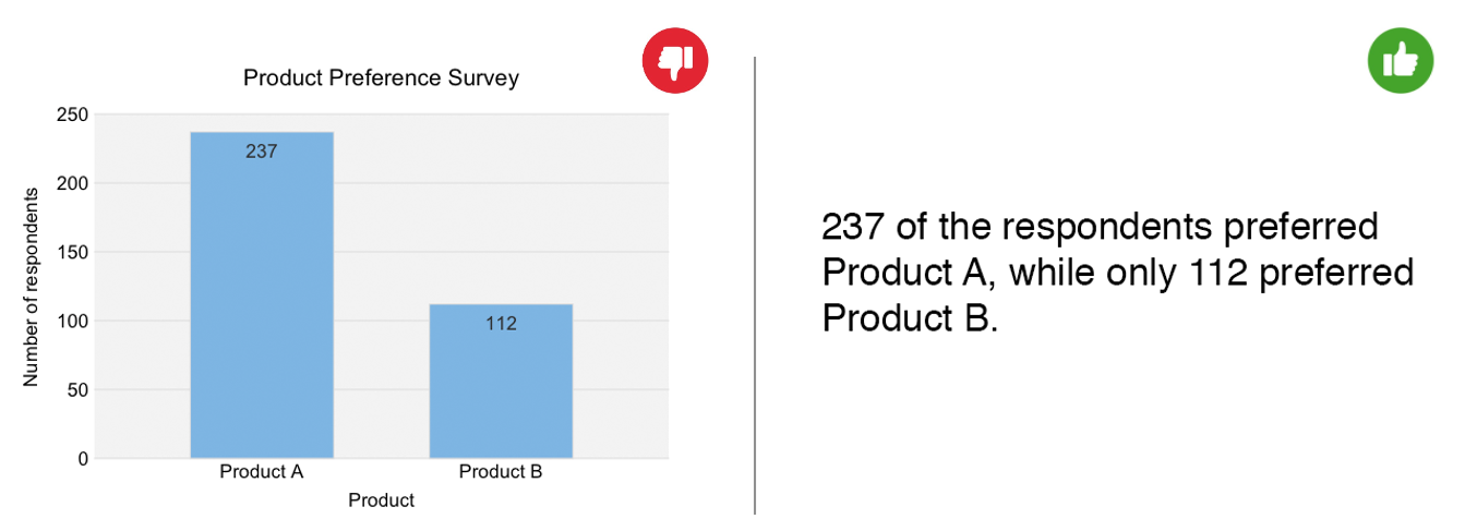
The bar chart above can be omitted in favor of a simple sentence like “237 of the respondents preferred Product A, while only 112 preferred Product B” without any reduction in understanding to the reader.
Here is another example.
The following graphic was played on The National during a story about Maple Leaf foods and its newly revamped factory.


The entire sequence took about 23 seconds, during which the narrator introduced the survey and read out the results.
All of this information can be represented with this small table:
| Category | Percent of people surveyed |
|---|---|
| No longer eat | 39% |
| No longer order | 56% |
| No longer buy | 30% |
| n = 2000 |
For most of us, understanding this information would probably take under 5 seconds, especially considering it’s not that interesting.
The purpose of visualizing data is not necessarily to break the monotony of text (although they do help) but to add understanding and value. Graphs with high data density let us tease out insights about our data that we otherwise could not.
3. Present many numbers in a small space
Data-rich graphs give context and credibility to statistical evidence. Low information graphics are suspect: What is left out? What is hidden? Why are we shown so little?
High-density graphics help us compare parts of the data by displaying much information within the parts of the eye.
Here are two principles for increasing data density:
- Maximize data density and the size of the data matrix within reason.
- Graphics can be shrunk way down.
The way to increase data density other than by enlarging the data matrix is to reduce the graphic area. One way of achieving this is through the Shrink Principle. Most graphs can be shrunk way down without losing legibility or information.
As the data size increases, data measures must shrink (smaller dots for scatters, thinner lines for busy time-series).
4. Use small multiples
At the heart of quantitative thinking is a single important question: “Compared to what?”
Small multiples are an excellent tool for visualizing large quantities of data with a high number of dimensions.
The idea behind small multiples is similar to a movie frame: a series of graphics showing the same combination of variables, indexed by changes in another variable. Small multiples are sets of thumbnail-sized graphics on a single page that represent aspects of a single phenomenon.
The advantage of using small multiples is that a large amount of data rich information can be explained, and the variations in the data are easy to understand in light of the variables being compared.
As an example, consider a slope graph below, showing population change from 1960 to 2013.
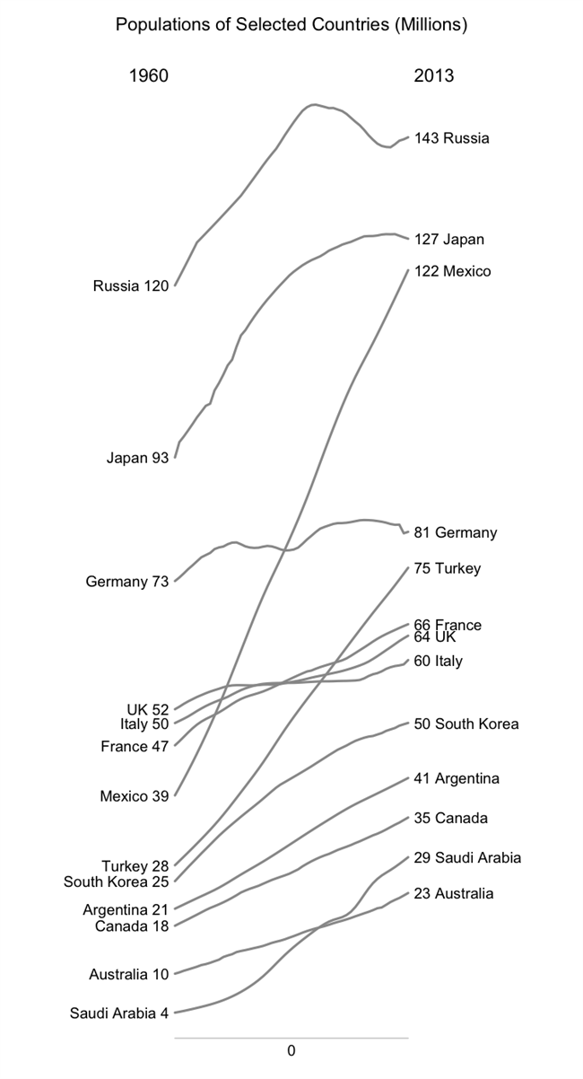
In a slope graph, countries that are not spatially adjacent to each other are difficult to compare. Also, slope graphs frequently suffer from issues involving overlapping labels.
Using the same data, I created a small multiples graph.
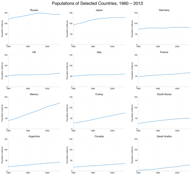
In the graphic above, comparing spatially far apart counties is easier than in the slope graph.
This example isn’t entirely convincing. But, it sets the stage to show the value of small multiples.
What if we are interested in comparing the entire population but two groups: male and female people. In the slope graph, what do we do? Use two colors? Or do we create two slope graphs?
If we use small multiples, we just have to add a curve to all the small plots.
Here is a more concrete example.
The graphic below shows the crude birth and death rates estimates for a (somewhat arbitrary) selection of nine G-20 nations using small multiples.
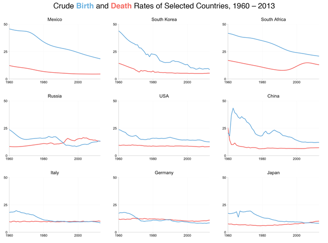
From this graphic, we can see a whole range of interesting (and, unfortunately, frequently somber and depressing) data stories concerning individual countries, compared to a general single graph:
- The increase in birth rate and drop in death rate in 1960’s China following the end of the Great Leap Forward period;
- The increase, from the mid-1990s onwards, in the death rate in South Africa due to the AIDS epidemic and the decline in recent years as antiretroviral drugs became more widely available;
- The hinoeuma year (1966) in Japan.
At the same time, the figure permits us to contrast and compare.
For instance, a pattern of low death rates and even lower birth rates leads to an aging population (at least in the absence of any significant migration).
Consequently, a quick perusal of the figure and you’d probably not be surprised to learn that recent years have seen concerns over pensions and the retirement age in Italy, Germany, and Japan.
What to watch out for when using small multiples?
- Placement of the small multiples charts should reflect some logical order, e.g., dimensional matrix, geography, or time. This helps the user quickly find the charts that are interesting to them.
- Small multiples should share the same measures, scales, size, and shape, and changing one of these factors undermines the ability for people to re-use their understanding of the chart. The chart’s simplicity is critical, and users should be able to process information across many of these charts. The following small chart from the New York Times works as an individual graphic; when shown in “postage stamp” size across 20 cities, this chart is too data-dense.
5. Sparklines: Intense, simple, word-sized graphics
A sparkline is a small intense, simple, word-sized graphic with typographic resolution. Sparklines mean that graphics are no longer cartoonish special occasions with captions and boxes.
They can be everywhere a word or number can be: embedded in a sentence, table, headline, map, spreadsheet, graphic.
The difference between the typical line charts and sparklines is that sparklines are small and single, small enough to be embedded in the text. Usually, several sparklines may be grouped. So it is essential scale them.
Sparklines provide a context for better decision-making based on previous data.
Let us look at some sparklines.
The most common data display is a noun accompanied by a number. For example, a medical patient’s current level of glucose is reported in a clinical record as a word and number:

Placed in the relevant context, a single number gains meaning. Thus the most recent measurement of glucose should be compared with earlier measurements for the patient. This data line shows the path of the last 80 readings of glucose:

Lacking a scale of measurement, this free-floating line is dequantified. At least we know the value of the line’s right-most data point, which corresponds to the most recent glucose value, the number recorded at the far right. Both representations of the most recent reading are tied together with a color accent:

Some useful context is provided by showing the normal range of glucose, here as a gray band. Compared to normal limits, readings above the band horizon are elevated, those below reduced:

For clinical analysis, the task is to detect quickly and assess wayward deviations from normal limits, shown here by visual deviations outside the gray band. Multiplying this format brings in additional data from the medical record; a stack, which can show hundreds of variables and thousands of measurements, allows fast, effective parallel comparisons:

Because of their active quality over time, these little data lines are called sparklines—small, high-resolution graphics usually embedded in a full context of words, numbers, images.
Sparklines are data words: data-intense, design simple, word-sized graphics.
Sparklines have obvious applications for financial and economic data by tracking and comparing changes over time, showing an overall trend and local detail.
Embedded in a data table, the sparkline below depicts an exchange rate (dollar cost of one euro) for every day for one year:

Colors help link the sparkline with the numbers: red = the oldest and newest rates in the series; blue = yearly low and high for daily exchange rates. Extending this graphic table is straightforward; here, the price of the euro versus three other currencies for 65 months and 12 months:

Here is another example.
Daily sparkline data can be standardized and scaled in various ways depending on the content: by the range of the price, inflation-adjusted price, percent change, percent change off of a market baseline. Thus multiple sparklines can describe the same noun, just as multiple columns of numbers report various performance measures.
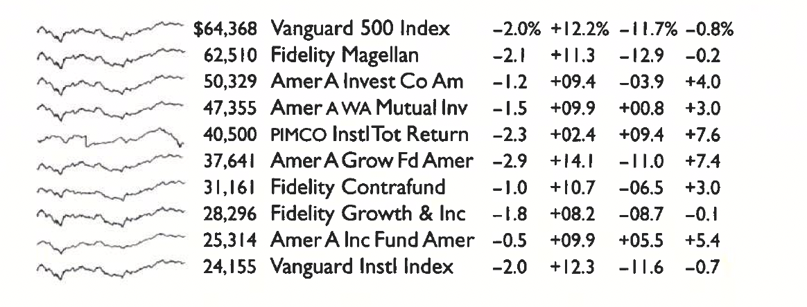
Here is a conventional financial table comparing various return rates of 10 popular mutual funds:
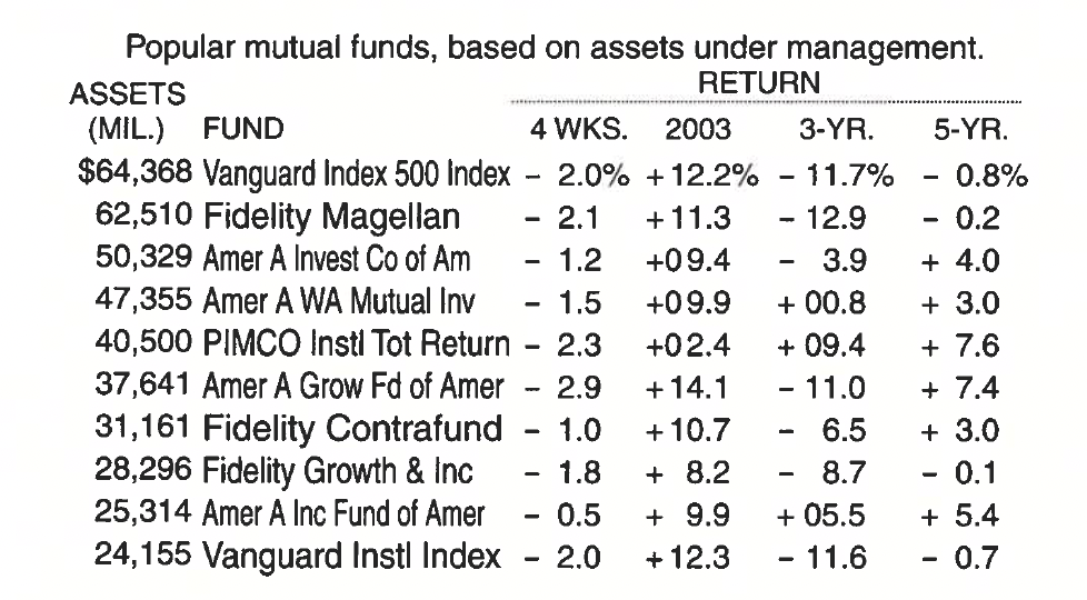
This is a typical display in data analysis: a list of nouns (mutual funds, for example) along with some numbers (assets, changes) that accompany the nouns. The analyst’s job is to look over the data matrix and then decide whether or not to go crazy or at least to decide (buy, sell, hold) about the noun based on the data. Here comes the sparkline graph for rescue to find such trends, and let us also look at the day-to-day path of prices and their changes for the entire last year.
Here is the sparkline table comparing various return rates of 10 popular mutual funds: