data-viz-workshop-2021
Effectiveness, limitations, and human perception
1. Effective and ineffective graphs
The main reason we draw data graphics (or plots or visualizations) is to communicate information.
But this is not the only reason. We also draw graphs to:
- keep the audience attentive during the presentations,
- make the documents more attractive and inviting by adding variety which helps in increasing the readership, and
- help to check and identify incorrect data.
“Drawing a graph is not enough; it should be effective.”
What do we mean by an effective graph?
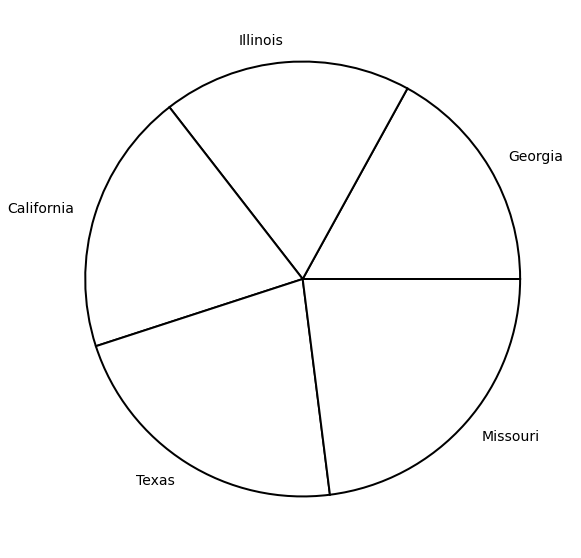
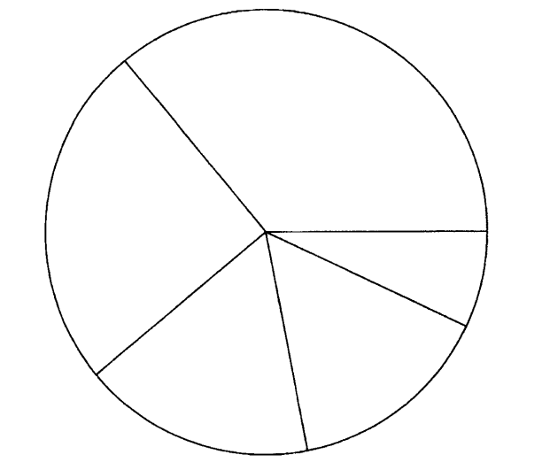
The pie chart below has five wedges, each labeled with a state name. Looking at the pie chart wedge sizes, can you order the states from the largest to the smallest?
Now, look at the dot plot below displaying the same data.
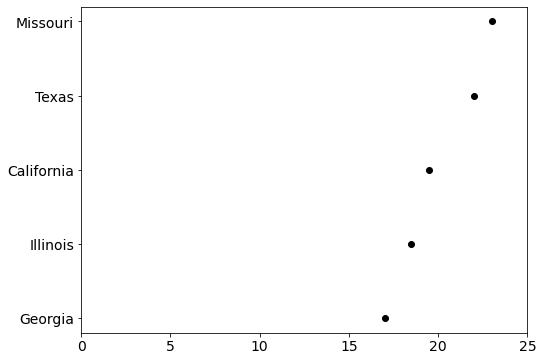
In this dot plot, it is much easier to order the states. Isn’t it? We can do it in a couple of seconds. Missouri is the largest, and Texas is the second-largest, and so on.
Therefore, we can say that this dot plot is more effective than the pie chart shown above.
“One graph is more effective than another if its quantitative information can be decoded more quickly or more easily by most observers.”
But, sometimes tables are preferable.
The table shown below has the same data, and it not only shows the exact values of the state but also shows the total value. Therefore, sometimes tables are preferred if the datasets are small.
| State | Value |
|---|---|
| Texas | 22 |
| Missouri | 23 |
| California | 19.5 |
| Illinois | 18.5 |
| Georgia | 17 |
2. Limitations of pie charts
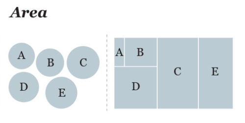
The two graphs below display various items and their corresponding sizes.
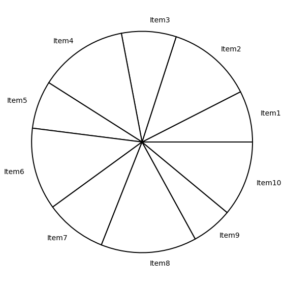
Do you observe any patterns between the sizes of the items?
Are the patterns visible in both plots?
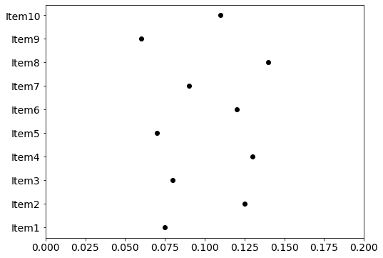
The value of the items with even-numbered labels is an exact offset of those with odd-numbered labels. Each item with an even-numbered label is exactly 0.05 bigger than the preceding odd-numbered label. It can be seen very clearly in the dot plot, but it isn’t easy to notice it in the pie chart.
Pie charts have perceptual problems. They convey information far less reliably as compared to a dot plot.
3. Limitations of 3D plots
Only design worse than a pie chart is a 3D pie chart.
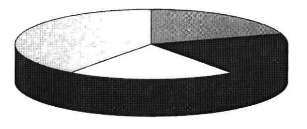
Can you guess the percentage covered by each wedge in the given 3D pie chart?
It’s pretty tricky, isn’t it?
Here’s the same data in a 2D bar chart. This bar chart shows the information far more clearly than the 3D pie chart.
3D bar charts also do not show the information effectively. E.g., the bar charts shown below drawn using different software/tools have different formations for displaying the data. If you want to read the height of the bars, you will have to read the bars from the back in the first one (left fig) whereas from the front in the second one (right figure).
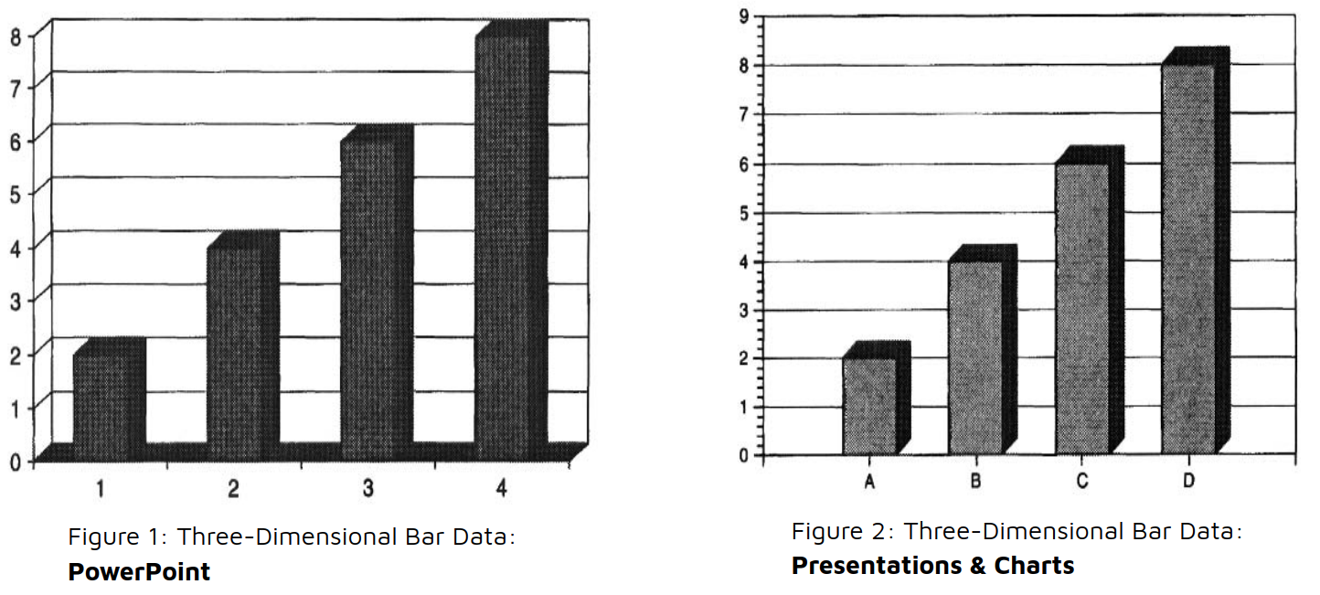
There is no consistency in the graphs because it depends on the software used to create them and the reader rarely knows about the software used to create them.
If we plot the same data using just 2D bars, we will get clear information, as shown in the figure below.
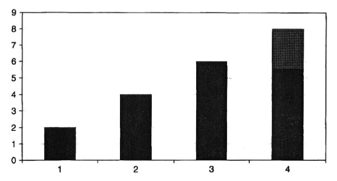
Therefore, it is not recommended to use three-dimensional bar charts for two variables dataset.
4. Limitations of Stacked and Grouped Bar Chart
What are the things that you can discover by studying the given stacked bar chart?
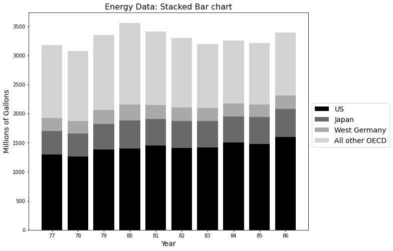
You can probably read the values for the United States and the total height of the bars quite accurately. But did you notice that the values for All Other OECD generally tend to decrease over time? You probably didn’t.
“It is very difficult to judge lengths that do not have common baseline”
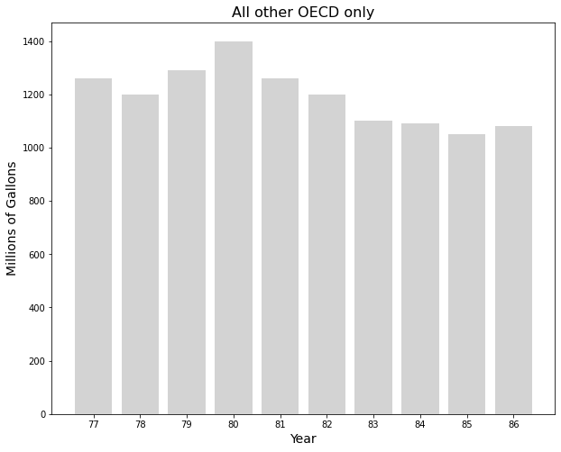
For example, if we plot the All other OECD separately with a common baseline, we can notice the trend, as shown in the figure below.
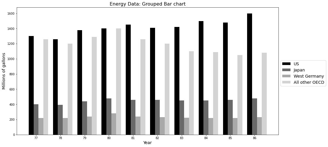
Here’s the same data in a grouped bar chart. The bars in this chart have a common baseline, and the patterns of all the groups are more noticeable than the stacked bar chart.
But grouped bar chart will become challenging to read if the number of groups increases. As shown in the figure above, a straightforward solution is reordering the shadings that will help make the groups more distinguishable.
5. Limitations of Curves
Differences between curves
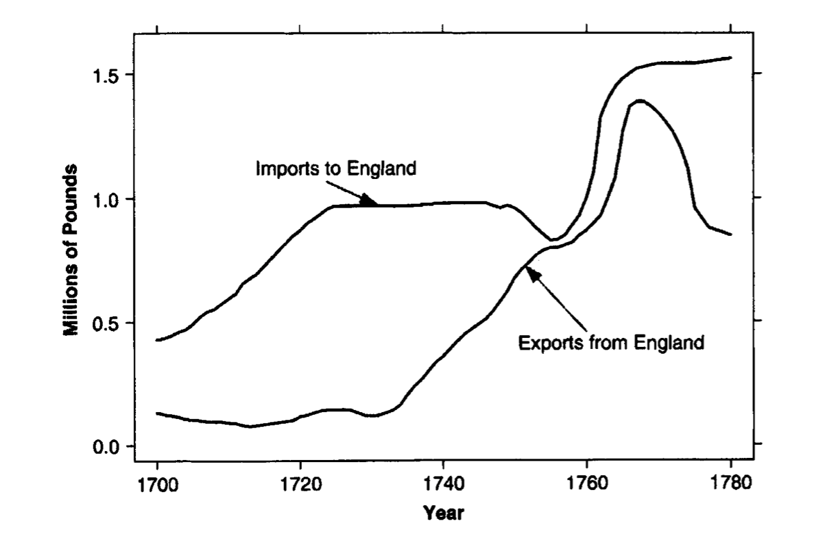
In this graph, we are interested in the trade balance (i.e., the difference between exports and imports). The curves in the chart show the exports from England and imports to England. Instead of showing only exports and imports, adding the difference curve will make the graph more informative.
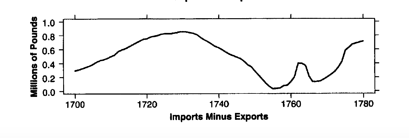
The curve in this graph shows the difference between exports and imports. If we combine this graph with the chart above, we will display a complete picture.
Therefore, it is essential to remember the variable of interest while plotting. For example: if we have before and after data, and we are interested in the improvement, it is better to show the improvement too, not just the before and after data.
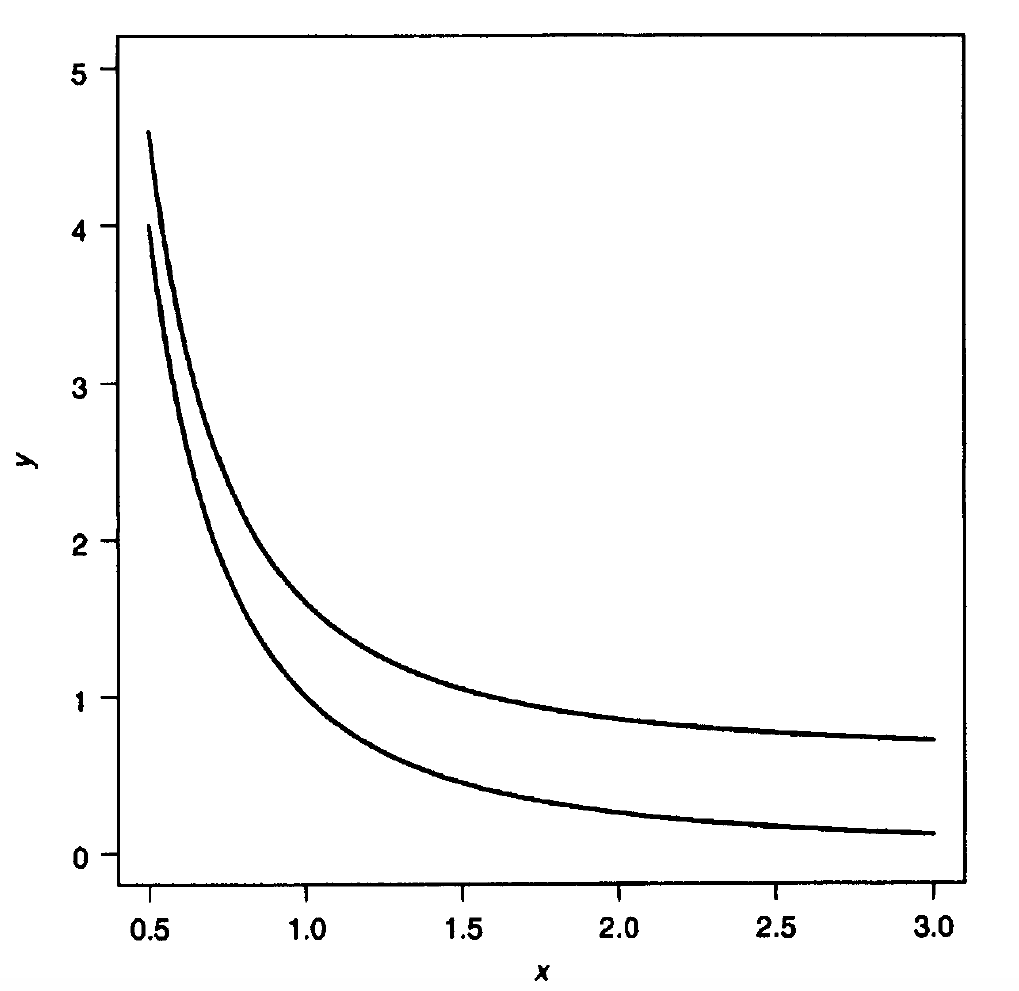
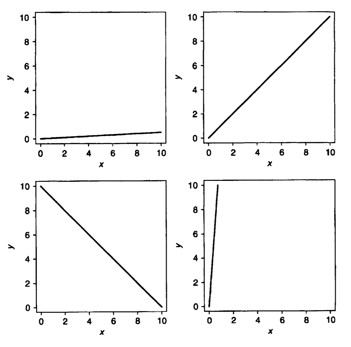
Here’s another interesting example. Looking at the two curves in the graph above, what will be the value of x where these two curves are closest and farthest with each other? If we naively see this, we will say that it is closest when x = 0.5 and farthest when x = 3.
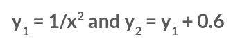
But here’s the interesting fact, the curves differ by a constant amount. Here are the equations for these two curves.
The curve y2 is always higher by 0.6 than the curve y1. Sometimes charts can be visually deceiving.
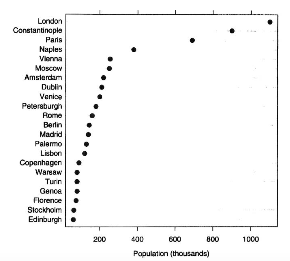
6. Limitations of Bubble Plot
The bubble plot below shows the population of cities at the end of the eighteenth century, where the size of the bubbles represents the population size. Suppose we try to order the cities according to the population. In that case, we will have a hard time placing the cities in their respective order because it is difficult to distinguish the slight difference in the bubble area.
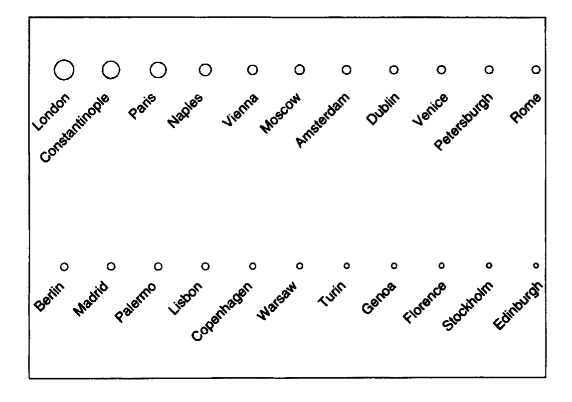
But if we plot the same data using a dot plot, we can easily order the cities, and it is also easier to determine the population.
Some forms of graphs are difficult to read accurately. Pie charts, bubble charts, and stacked bar charts are examples. They also hide the structure of the data. Avoid 3D dimensional charts.
7. Human Perception and Our Ability to Decode Graphs
We need to analyze the graph to get the correct information properly. Sometimes because of perception, we decode the wrong information from a chart.
Some of the properties that are used for making judgments when we analyze the graphs to decode the information are as follow:
- Angle
- Area
- Color Hue
- Saturation
- Density
- Length
- Position along a common scale
- Position along an identical, nonaligned scale
- Slope
- Volume
Cleveland and McGill, in 1984, ran experiments to determine which of these properties we could judge most accurately. The knowledge obtained from these experiments will help us understand why some graphs work and others don’t.
8. Position Judgement
According to Cleveland and McGill, the judgment of positions along a common horizontal scale is the most accurate elementary graphical task.
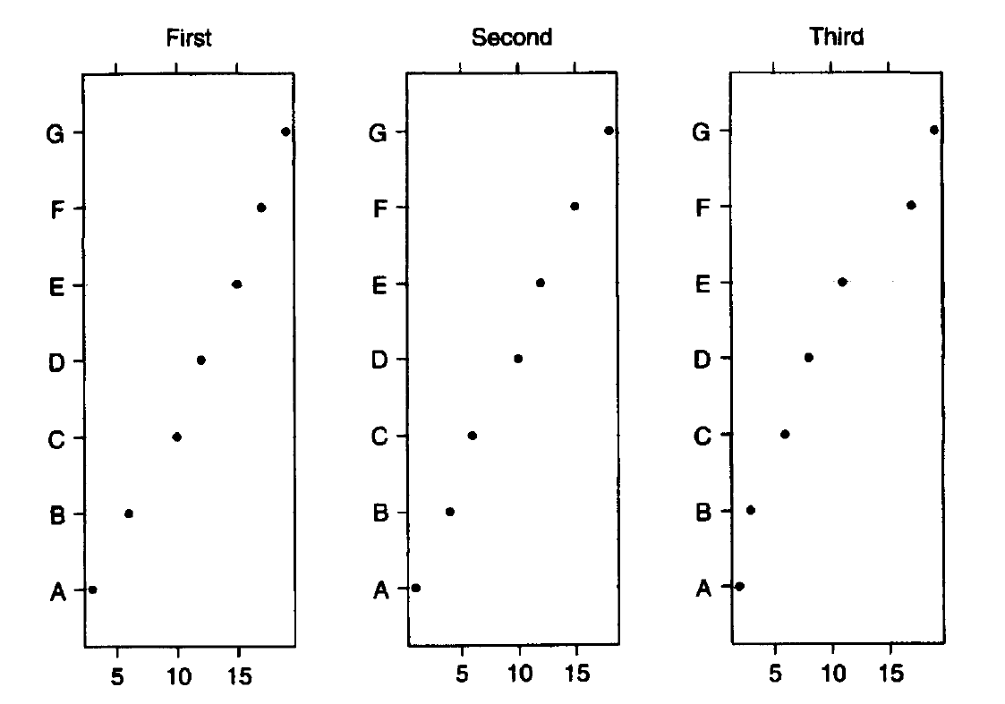
E.g., here in the left figure, the dot plot allows decoding the data by making judgments of positions.
Multipanel displays are handy when we have more than two variables. Each panel shows two variables for one value of the third variable. For example, if the third variable is country and we have data for England, France, and Italy, there would be one panel for each country.
9. Length, area, and volume judgment
Steven’s law:
The perceived scale is proportional to xβ, where x is the magnitude of an attribute of an object, such as its length or area, and β is an experimental value generally ranges from 0.9 to 1.1 for length, 0.6 to 0.9 for area, and 0.5 to 0.8 for volume.
When β = 1, xβ = x, and when β < 1, xβ < x.
Since the β for the area is less than 1, we perceive areas to be smaller than they are.
This bias is more pronounced with volumes.
The beta range for lengths includes 1, so we perceive lengths more accurately than areas or volumes.
The conclusion is that we judge length more accurately than areas or volumes, but judging length is still not easy. To detect a difference in length between two line segments, we need a fixed percentage increase in the length.
For example, if one line is 99 inches and the other is 100 inches, it will be more difficult to distinguish this 1-inch difference than if one line is 1 inch and the other is 2 inches, even though the absolute differences are the same.
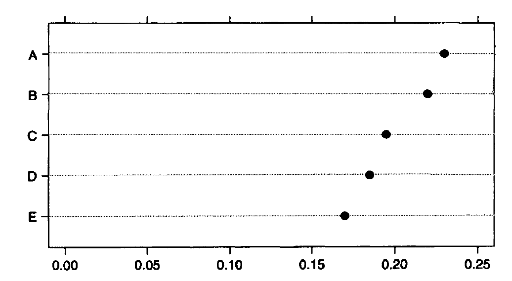
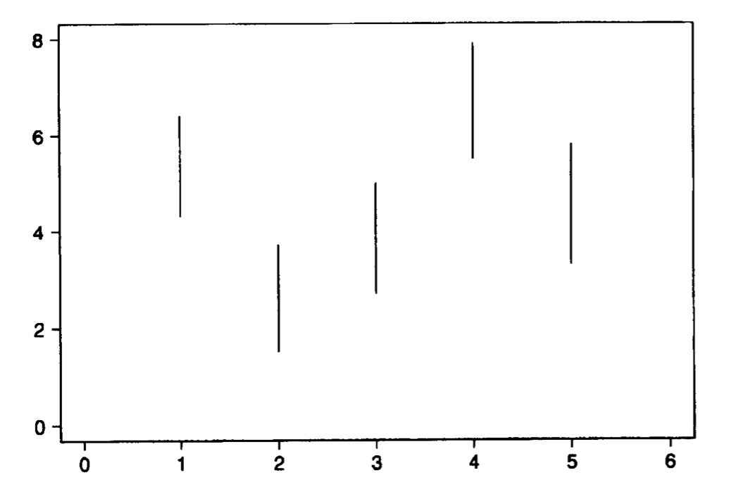
Here in the plot below, the difference between these lines is tiny; we cannot distinguish the length of these lines.
Area judgments are less accurate than length and position judgments. Volume judgments are even more biased.
10. Angle Judgement
We also don’t judge angles very well, and we tend to have biased judgments while perceiving angles. For e.g., we underestimate acute angles and overestimate obtuse angles, and angles with horizontal bisectors appear larger than those with vertical bisectors.
We also don’t judge angles very well. This is why pie charts provide a big picture don’t enable a precise comparison.
11. Color/hue, saturation, and density
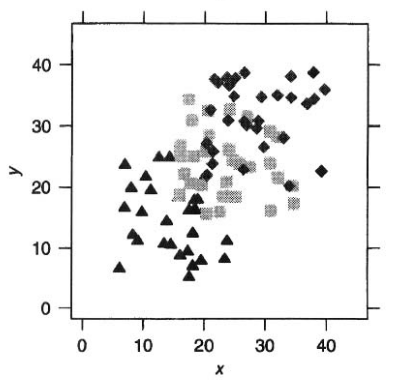
Color plays a vital role in human perception, and color-coding effectively distinguishes data from various groups.
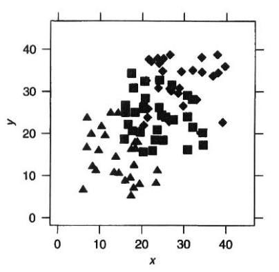
Here in the given left plot, it is difficult to visually separate the three groups with triangle, square, and diamond shape categories because they are of the same color with the same density and saturation. The differences are distinguishable if we vary the density or saturation, as shown in the right plot.
12. Slope judgement
Slope is directly related to angle.
A reader makes angle judgments to determine the slope, but as we already know, we don’t judge angles very accurately.
The accuracy of judgments of slopes of line segments depends on the angle with the horizontal.
We judge angles near 45° most accurately.
13. Role of distance and detection
Distance and detection also play a role in our ability to decode information from the graphs.
The closer together objects are, the easier it is to judge attributes that compare them. As the distance between objects increases, the accuracy of judgment decreases.
It is certainly easier to judge the difference in lengths of two bars if they are next to one another, then if they are pages apart.