data-viz-workshop-2021
Task: Revenue of gross incomes
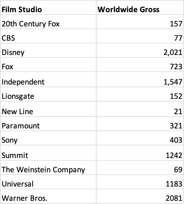
The table below lists the worldwide gross income of the top 13 film studios, including 20th Century Fox and Disney.
To facilitate easy comparison, we created a pie chart below, along with the film studio legend on the right.
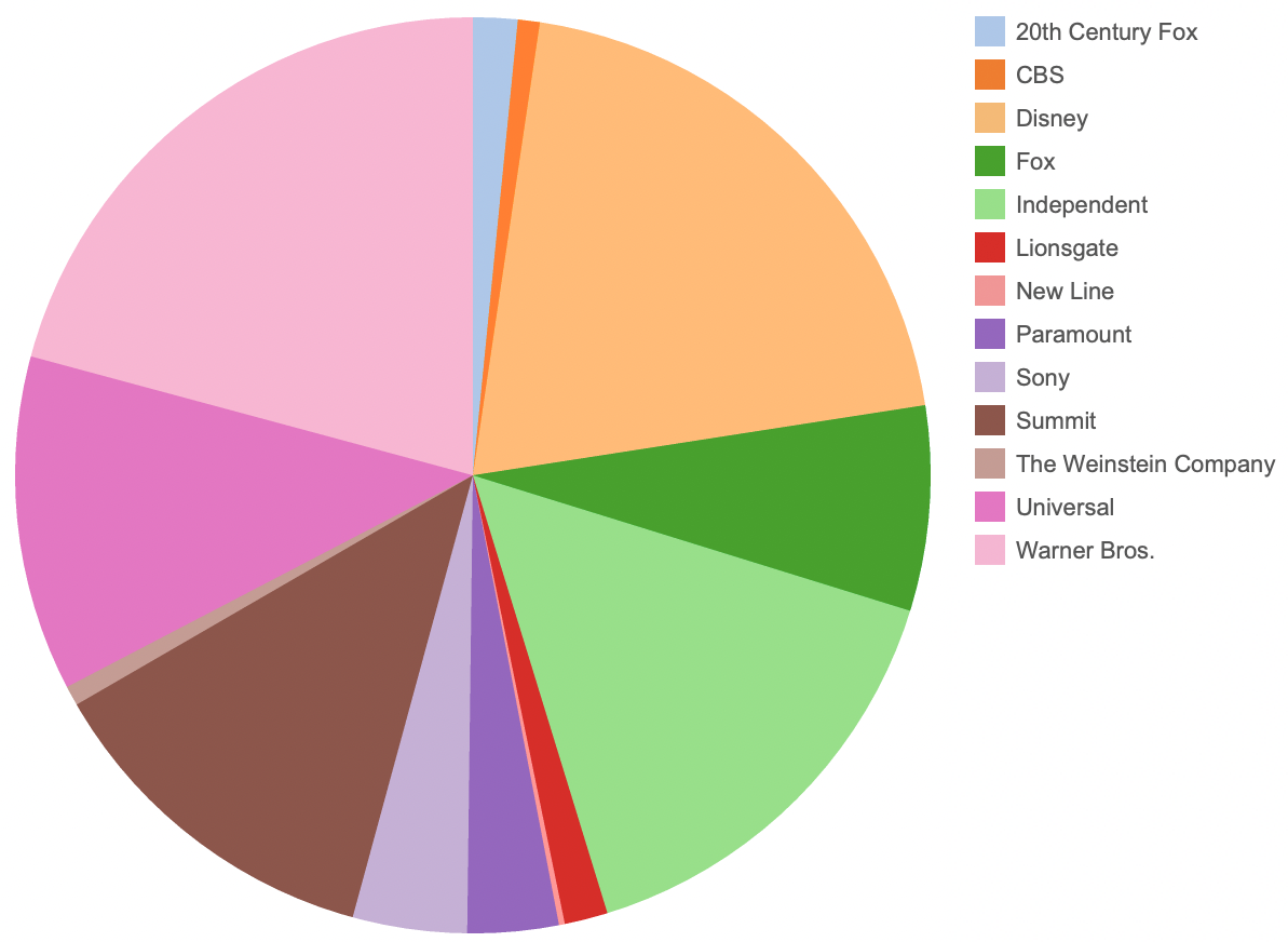
Is the pie chart above a correct chart for visualizing this data?
If not, what other charts could be used?
Would you mind sketching your suggested solution on graph paper?