Badri Adhikari
How to draw an effective concept map?
Author: Badri Adhikari
Watch this tutorial
Say that you are reading a book chapter or watching a video lecture, and you see it as important. To better ‘understand’ and ‘recall’ the concepts, you can draw visual notes or write a text summary of what you learned. A concept map is an alternative to writing a text summary or taking notes, and it is more effective.
In this tutorial, you will learn many ideas to draw an effective concept map. The tutorial starts by showing you an example concept map that describes what a concept map is. After briefly discussing how it’s typically drawn, I will discuss why we draw concept maps. I will then present six techniques to make your concept map effective.
If we do not associate a new concept we are learning to the ideas in our memory, we forget them quickly [1]. If you become better at drawing concept maps, you will also become better at learning the associations between ideas.
What is a “concept” in a concept map?
Think of a concept as any piece of knowledge, a process, or an object.
What is a “concept map”?
A concept map (or conceptual diagram) is a diagram that depicts relationships between concepts.
You can think of a concept map as a network of concepts connected by meaningful labels. A concept becomes a node (junction) in such a graph, and the relationships become edges (arrows).
Here is a concept map describing what a concept map is.
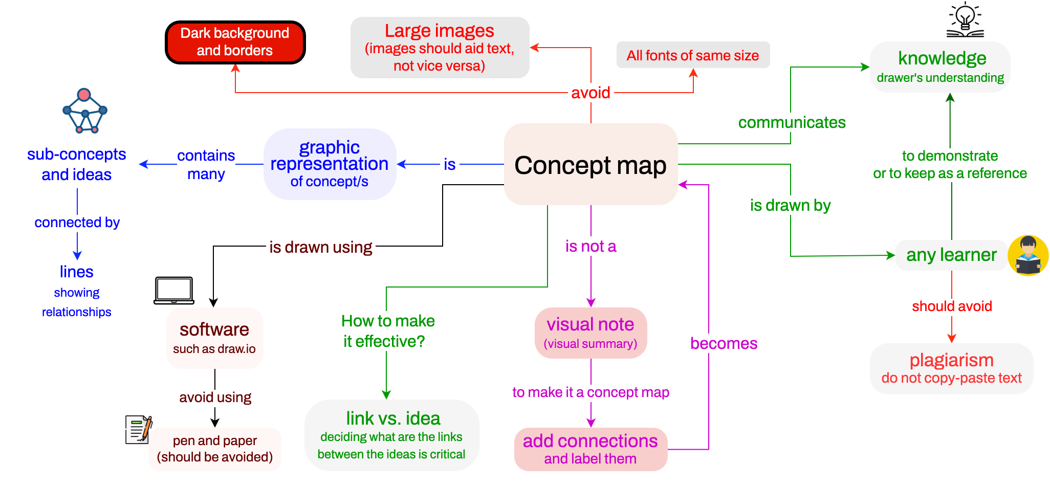
Figure 1. A concept map describing what a concept map is.
How to draw a concept map?
A typical approach to drawing a concept map is first to list all the key terms or phrases that you have in front of you. These terms or phrases could be the key ideas, details, or processes involved. Book chapters usually have these important terms and phrases as italic or bold texts. Once you have these terms and phrases, you will need to iteratively study and understand each of them and draw connections between them. Then, you will iteratively grow and enrich your concept map. Making an effective concept map is like writing: typically requiring a lot of revision. You can either use paper (along with color pencils) or software to build concept maps. I use draw.io. It is currently free and works with Google Drive. Another alternative is lucid charts.
Why draw a concept map?
A concept map can serve three purposes:
- demonstration,
- communication, and
- reference.
You can use a concept map to demonstrate the knowledge gained about the content/topic. A concept map can make it easier to communicate complex concepts to others who are new to the topic, just the way Figure 1 above communicated to you what a concept map is. Similarly, you can use a concept map as a note/summary for future reference. I usually draw a concept map of a video lecture, a research paper, or a book chapter/topic that I want to understand better and recall.
If you are drawing a concept map for your reference, it is perfectly ok to include non-English words/phrases in your concept map. For example, if you are a non-native English speaker, you can include any other words/phrases that help you better imagine the ideas and associations. For instance, I sometimes have Nepali words and phrases in my reference concept maps because my native language is Nepalese. Many Nepalese words or phrases raise a more precise picture in my mind than the corresponding English words.
A concept map is a demonstration, communication, and reference (all three).
What is an “effective” concept map?
An effective concept map is one that: best demonstrates your knowledge if you drew it to demonstrate your understanding, best explains and summarizes an idea for an audience if it is intended for communicating a concept, and helps you remember the most important ideas if you drew it for reference.
Next, I would like to discuss six ideas to make a concept map effective.
1. A concept map is more than a visual note
A concept map is more than a visual note. Consider the visual note below:
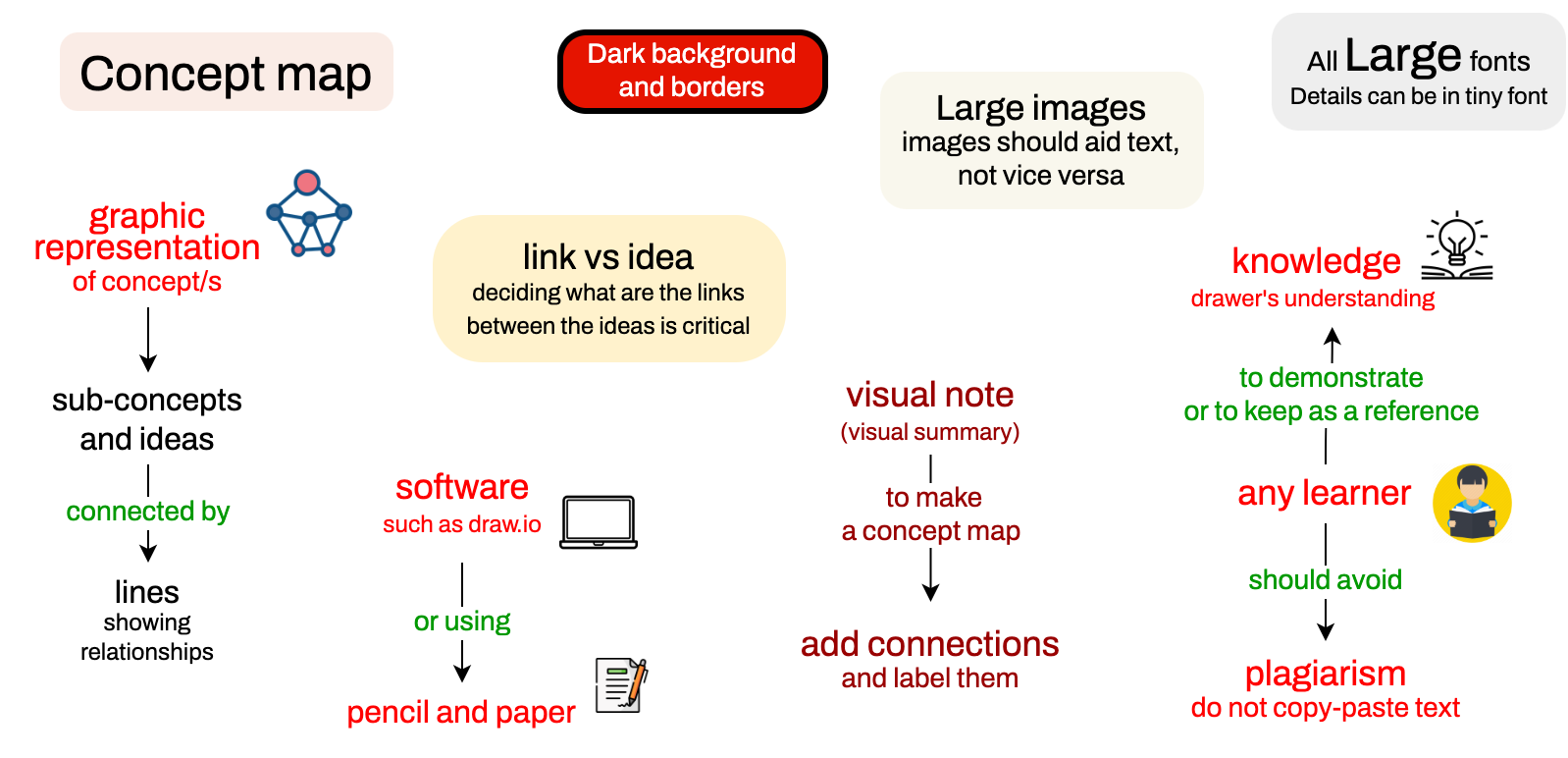
Figure 2. An example of a visual note/summary of a topic.
The visual note above is an excellent summary of this tutorial. Each chunk of concepts is wonderfully summarized in this note. But, the visual note above is not a concept map. Why? Because the individual concepts are not connected. For it to be a concept map, the connections between the concepts must be labeled.
Unconnected concepts indicate that you haven’t assimilated and synthesized the contents of the chapter/topic.
For a concept map to be meaningful and effective, the concepts must have labeled links, connections, or associations.
So, then, can you draw connections between the concepts in this diagram and upgrade it to a concept map? Unfortunately, you can’t. Why not? Because the locations of the concepts matter. Closely related concepts should be placed closer in the 2D space. Seeing two or more related concepts closer to each other helps you (and a reader of your concept map) assimilate and synthesize the overall content.
This means, to transform the visual note above into a concept map, you will need to: a) move the concepts around, so that related concepts are as close as possible to each other, and then, b) add connections and label the connections.
Labeled connections are extremely important in a concept map. Unlabelled arrows and connections are meaningless. These unlabelled arrows should be dressed by labeling, using a label that describes the relationship. Most of the arrows will be away from the origin/title of the concept map. Sometimes, arrows can have an opposite direction or can be bi-directional too.
Labeled connections between concepts are critical in a concept map.
Connectors/lines that run over other blocks are bad. This mostly happens if you create a concept map using a pen and a pencil. This is why I encourage using a computer. If you do not have access to a laptop or prefer pen-paper style, I suggest you first sketch your concept map using a pencil to erase and redraw; you can finalize it later with a pen and colored pencils. During preparation, your concept map in progress should be a fluid diagram where you can move the blocks/nodes/subgraphs around while you are drawing it.
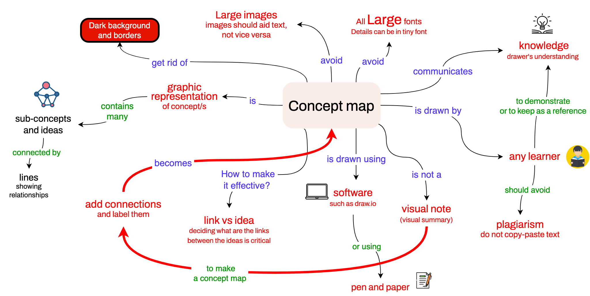
Figure 3. Try to avoid cross-links/cross-edges in a concept map (such as the one in dark red color above).
2. Dim the backgrounds and use bright/colorful texts
To better organize or structure your concept map, it is neat to assign a separate color for each branch/sub-branch. Assigning separate colors for each branch/sub-branch makes a concept map look nicer when you see it the first time because it looks compartmentalized. Sometimes, color and shapes/symbols can also be used to denote different types of connections. The figure below is an example of a concept map that uses different colors for different branches.
Figure 4. Use different color for different branches/sub-branches.
Next, I would like to talk about choosing colors appropriately.
When choosing a color for the background of a node, dark colors should be avoided. Always choose light colors that do not interfere with the text. Why? Because your text is more important than the color you assign to the node. Here is the same concept map that uses dark backgrounds:
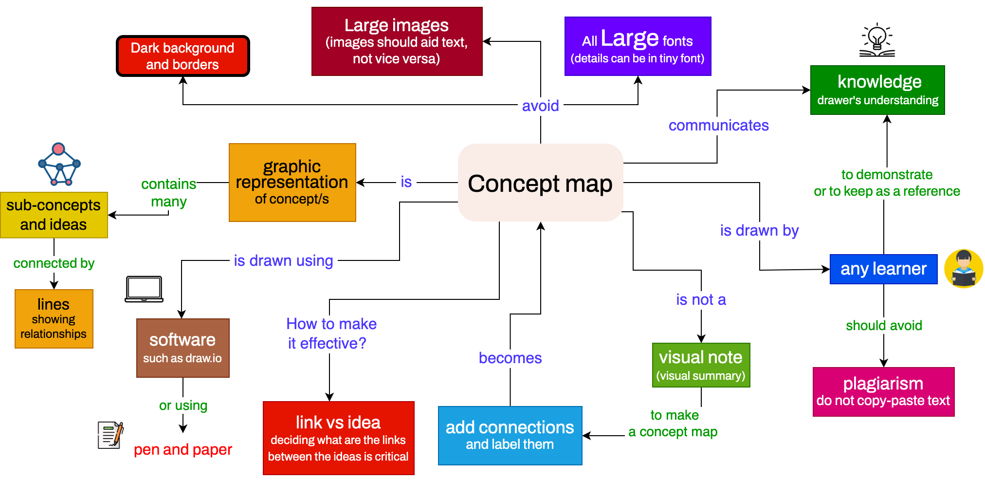
Figure 5. Try not to use dark backgrounds and borders in a concept map.
Do not use dark colors.
You may also be thinking, if the text is essential and is the meat, then why not remove the background and borders and instead color the text itself? Yes! You can do so. Below, I have redrawn the concept map removing the borders and backgrounds:
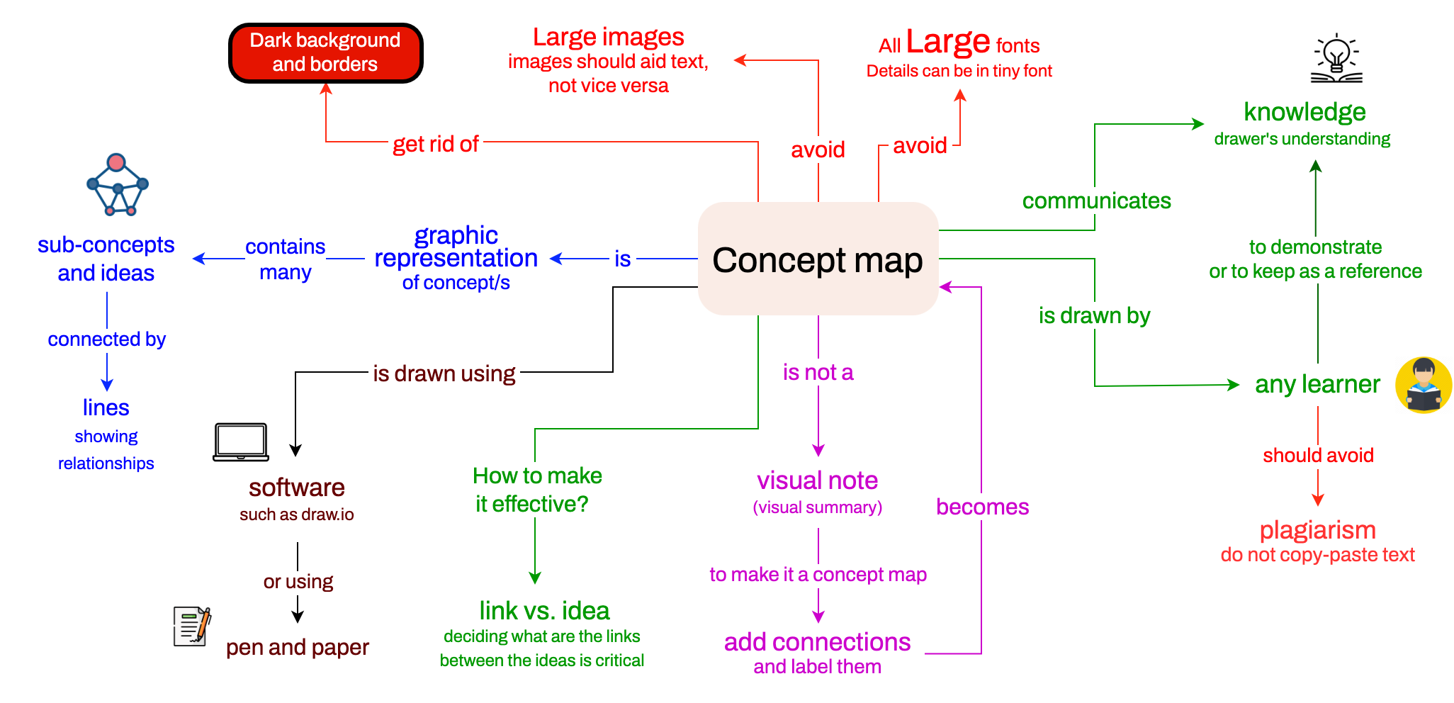
Figure 6. Focusing on the text by getting rid of the background and borders.
Using or not using a light background/shade is more a matter of style and not a principle. You can keep the shades/background if you prefer. However, dark backgrounds and borders simply make reading your concept maps difficult. Please get rid of the borders. Usually, 3D blocks are also distracting.
If you plan to use a background color for your blocks, do not let the text flow out of the background. Make the background area larger to fit the text. It is usually good to avoid shapes such as triangles or rhombuses.
When someone first looks at your concept map, they should focus on reading the text and not be distracted by the dark backgrounds and borders.
Almost always, the actual content of a concept map is the text, not the backgrounds and borders.
3. Use a variety of font sizes
If your concept has the same size font everywhere, you can improve. A concept map should be designed like a map (think Google Maps). You can read the text on a map even when you see it from far away (zoom-out view). When you focus on a region and look closely (zoom in), you see many details that you would not see from afar. It is brilliant to use smaller fonts to add details to the nodes and connections. Here is an example:
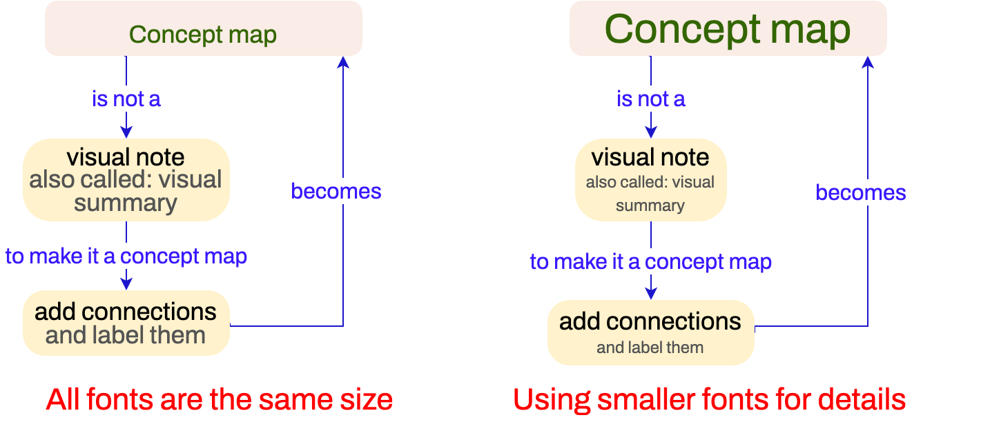
Figure 7. Add details to a concept map using smaller fonts.
Use smaller fonts to add details.
4. Deciding what is a node and what is a connection
When drawing a concept map, you will often spend much time thinking and deciding which contents should be a node and a connection. This process – thinking and deciding the links between concepts – is critical for developing a deeper understanding of the topic. Please do not feel frustrated. This process will make you remember the content for a long time. So, instead of seeing this as complex, think of this as an opportunity for you to be creative. Here is an example:
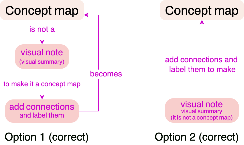
Figure 8. You can reorganize the links and concepts to reflect your understanding of the concept/s. Both structures above are correct.
Usually, contents which are nouns/ideas/concepts/details can be placed into nodes, and verbs are used as connections (think Entity-Relationship (ER) diagrams). Also, adjectives and adverbs do not make the best connectors. But, these are not rules. Sometimes a ‘mechanism/process’ (a verb) can be an important concept related to many other concepts, and you will want to place the process as a node. Similarly, nouns can also serve as connectors. Examples of connections are advantages, challenges, approaches, assumptions, types, techniques, examples, and definitions. Even complete questions/sentences can be placed as links (i.e., “How does it work?”).
Deciding the links between concepts is critical to understanding a topic deeply.
5. Embedding images
Although the text is the most important content of a concept map, sometimes pictures can accompany the text. Now, the idea of using images excites many people. This is understandable. Visuals are great!
However, as soon as we start including images in our concept map, we embed text into the pictures. In other words, the images become big, and the text becomes small. I’m afraid that’s not right. If we see a large picture first, we will want to see all the images; we are watching, not reading. Therefore, you should try to avoid large images. It should be another way around - icons should be embedded into the text. If you are not convinced, please read about sparklines, for example. The concept map below is an example of a concept map where images are small and help a reader visualize the text more easily.
Figure 9. Use small images to accompany the text, not the other way around.
Please do not put very bright/strong images everywhere on a concept map. It feels as if your images are flashing torch lights into my face. If there are some critical concepts in your concept map, then you can have a few images/icons that are bright/strong/loud. But, the rest of the concept map should be calm/quiet.
Do not use many images/icons/pictures in a concept map; when you have to, insert them as smaller images.
6. Think beyond organizational charts
Intuitively, reading top to bottom or left to right is easier for most of us. We are used to moving our eyes from left to right and top to bottom when reading. This is why many of us are naturally inclined to draw concept maps that turn out to look like an organizational chart (top-to-bottom or left-to-right style). Here is an example:
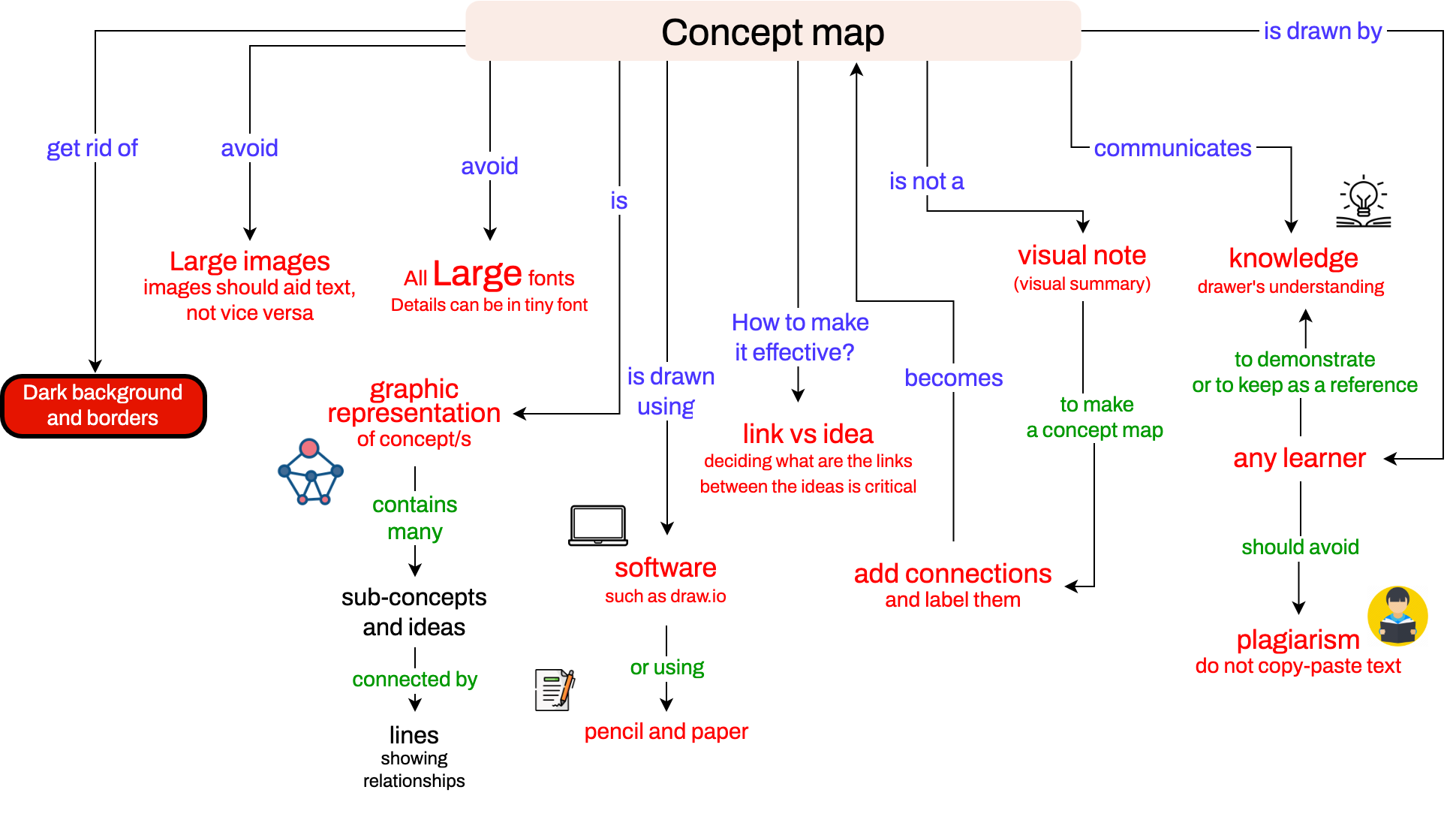
Figure 10. A concept map drawn like an organizational chart.
While a concept map can be drawn to look like an organizational chart, it is not a good idea to restrict yourself to this hierarchical style, particularly if you are drawing a large concept map.
We do not imagine in just one dimension. We think in as many dimensions as we can comprehend, 2D/3D usually. So, closely related concepts should be closer in your 2D diagram. Associations in a concept map like an organizational chart are weak because the spatially closer concepts may not be related. When you think and focus on a particular concept, other unrelated concepts should not interfere (by being around).
Use location to encode the intimacy between the concepts, i.e., intimate/related concepts should be placed closer.
If you end up making a concept map that looks like an organizational chart, it can be fixed. Once you have all the concepts in your diagram, move them around (optimize their locations) so that closely related concepts are closer in the 2D space/diagram. However, please note that a lot of white space in a concept map makes it difficult for others to navigate it.
Drawing concept map for school/college assignment
If you are asked to draw a concept map to demonstrate your understanding of a book chapter or a lecture, you should include all the major subtopics covered. You should also not steer off-topic if you draw it to demonstrate that you have read or watched the assignment.
When drawing a concept map, do not leave out topics.
On the other hand, one should be smart enough to know what not to include in a concept map. For example, the material or lectures could have redundant information about the same topic quite a few times. You should be cautious enough to filter out the redundancy and highlight the concrete ideas about the topic. It would be best not to draw a concept map like a forest. You want to think and decide the most critical concepts in the lecture that you watched or read. Some lessons are long and have many redundant explanations, which you can leave out for your concept map. You do not need to include every detail in every slide from a slide presentation you watched. Your map should cover the main topics in the lecture.
When drawing a concept map, you should avoid plagiarism and not copy-paste sentences/phrases from other sources. Also, you should not copy-paste others’ block diagrams from the internet into your concept map. Usually, you will have to use the “key” words from the text/lecture, but the rest, as much as possible, should be in your own words. Also, a concept map should not contain sentences and sentences of text in descriptions.
To avoid plagiarism, do not copy-paste sentences into your concept map.
I am thankful to the graduate students at the University of Missouri-St. Louis – Brett Huffman, Mounica Kanakamedala, Amulya Reddy Lakku, Sam Trenter, Arun Kumar, and Navneet Kaur – for many useful comments and edits. I am also thankful to instructor Kedar Adhikari at Tribhuvan University, Nepal, for suggesting valuable ideas to improve this tutorial.
Examples
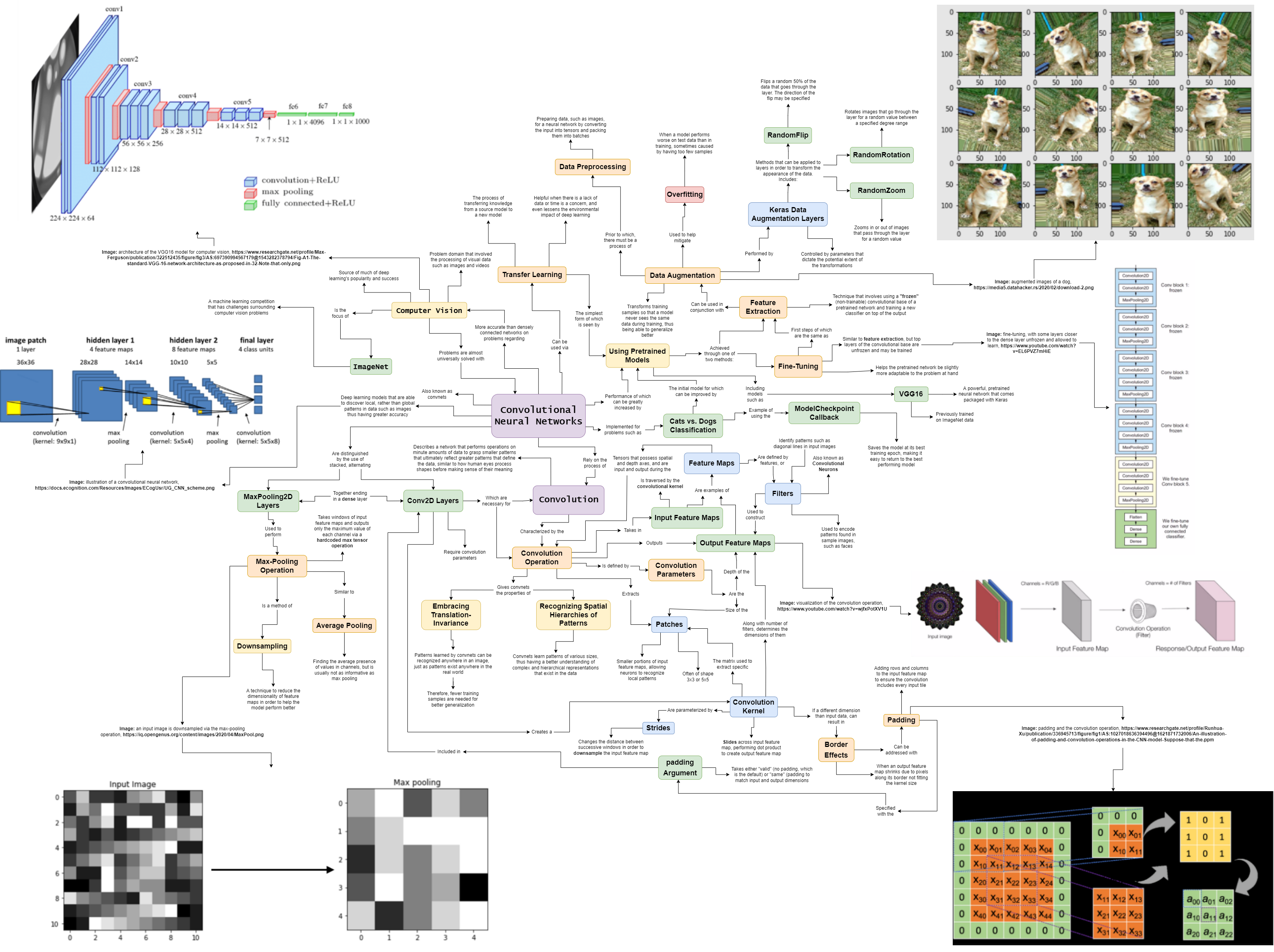
Here is an example concept map drawn by Kate Arendes, a student who took my Deep Learning course in Spring 2022.